
Last year, we retired two colors from the Miss Mustard Seed’s Milk Paint line, Apron Strings and Dried Lavender. I’d like to keep our line at 25 colors, so we are replacing them with two new colors. And one of those colors is launching today – Outback Petticoat.

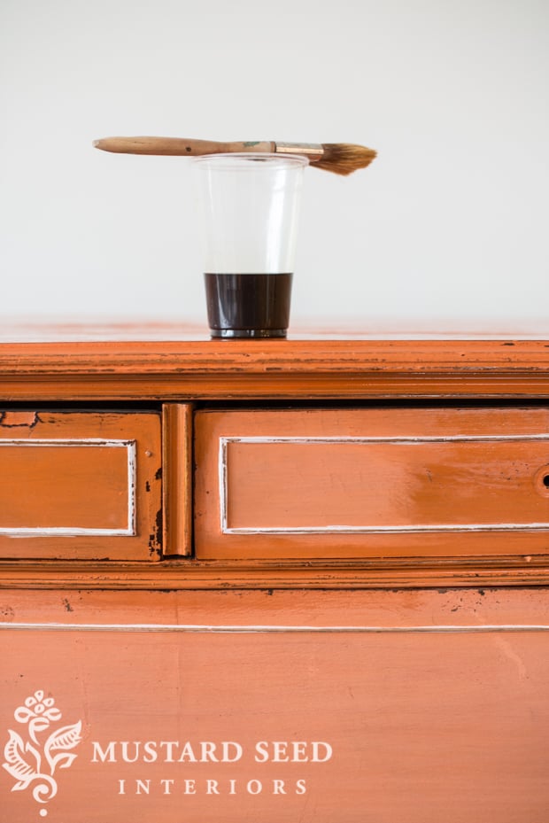
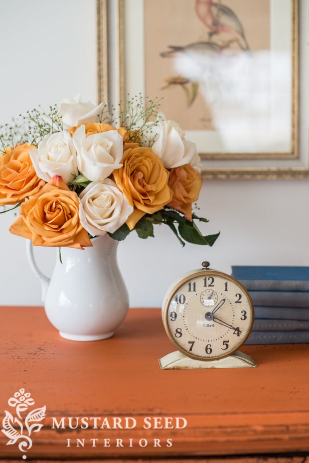
It’s orange, in case that wasn’t apparent.

Let me tell you, orange was really tough for me! First of all, I needed to convince myself to create an orange. Since I don’t use a lot of orange, I couldn’t easily envision it on a piece of furniture. But, I searched for inspiration and found loads of beautiful rooms, pieces, and color palettes featuring orange. I decided I could get on board with it.
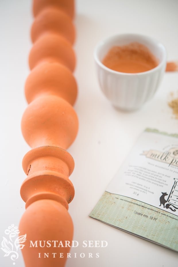
Once I was at peace with orange, the second difficulty was finding the right shade. Orange can go bad very easily. While developing the color, I ended up with all sorts of ugly oranges from macaroni & cheese to creamsicle to caution cone. None of which were suitable for a piece of furniture. I finally landed on an orange that was bold, but pretty.
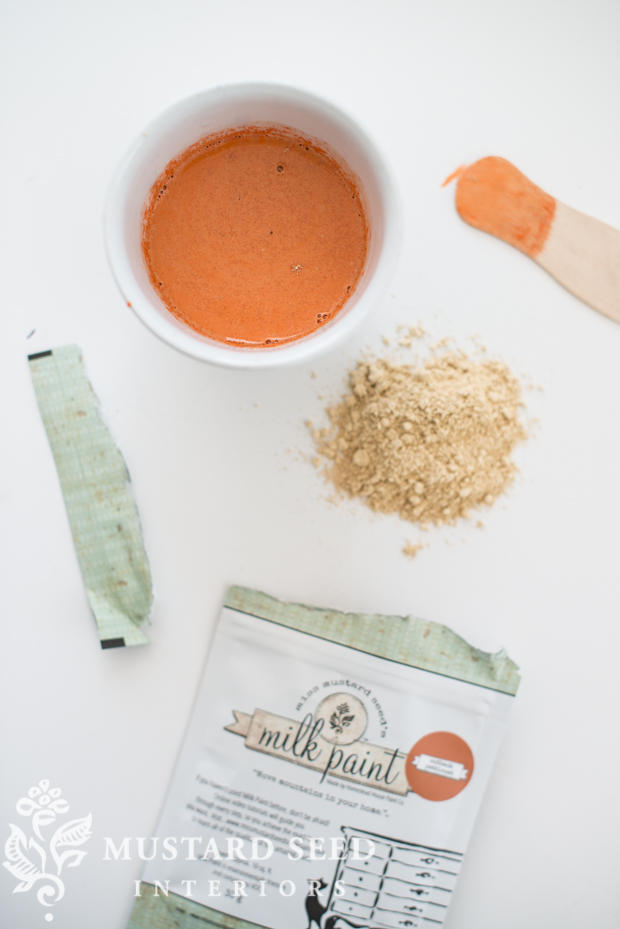
With the natural pigments, it had to be bold or the color got too muddy. I liked the idea of starting bold, so it can be muted with Antiquing Wax or by mixing it with another color.
The color was given the name Outback Petticoat by a group of our Australian MMSMP retailers. The Outback has orange soil and it used to stain the hems of white petticoats of settler women. The name immediately struck a chord with me. I love the imagery of a woman retaining her femininity and sense of style, yet being impacted by her rugged surroundings. I smile every time I think of that.
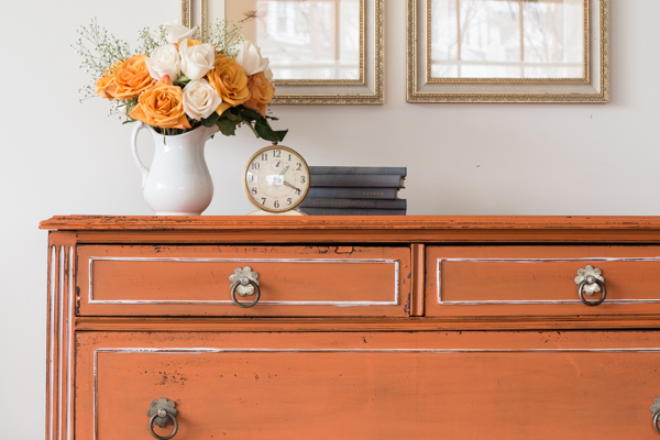
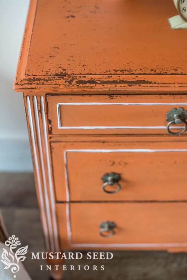
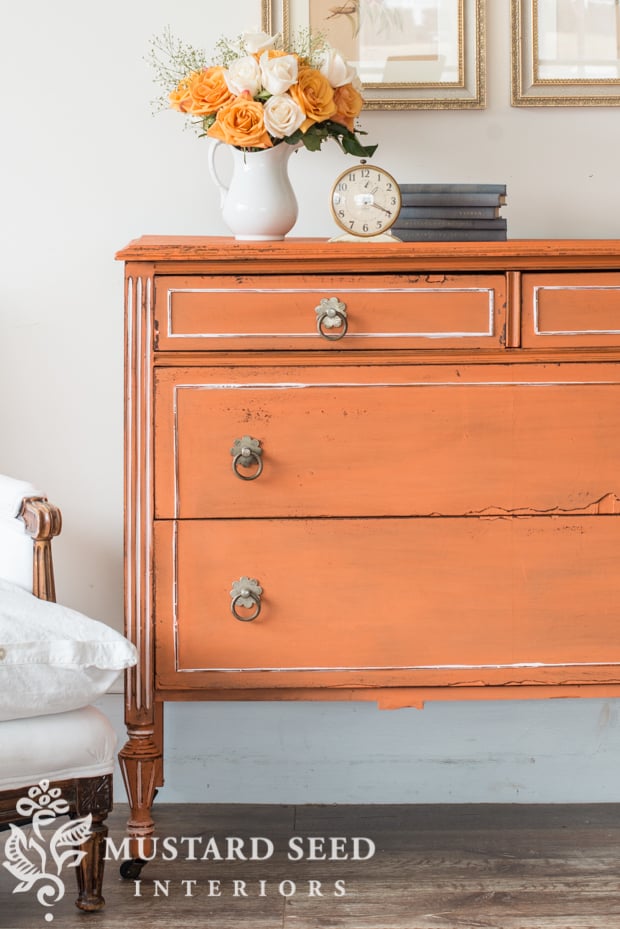
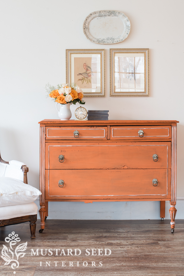
So, to introduce this color, I had to find a piece that could wear orange. I mean, not every piece of furniture can wear orange gracefully.
I was coming up empty was running out of time, so I finally decided to go for this dresser listed on craigslist, mainly because it was cheap!

I’ve talked about the “ugly stage” many times, but this dresser was really ugly during the process! Maybe it’s because I don’t use it a lot, but the orange was shocking until the final steps of the finish.

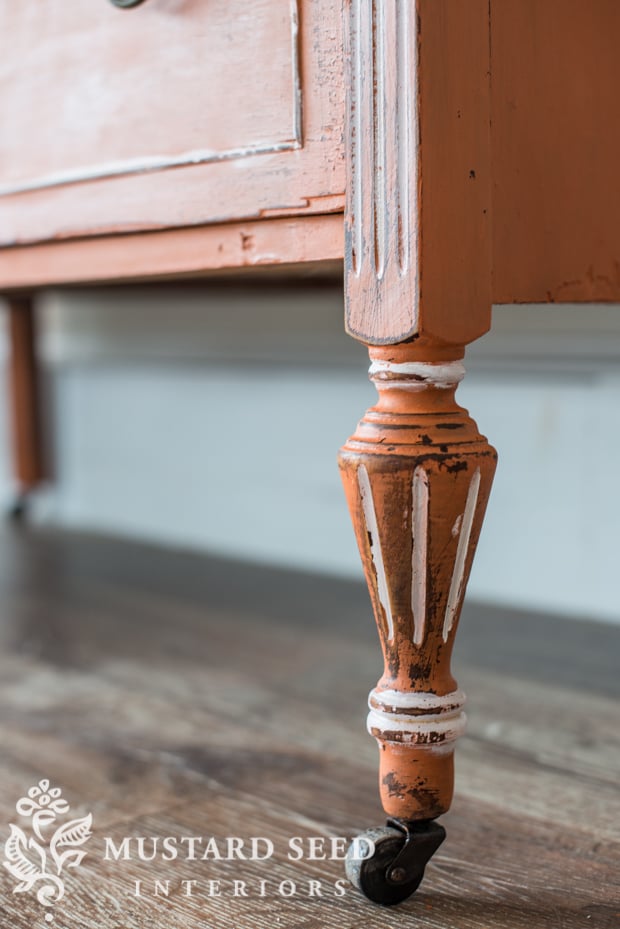
You can see what a big difference the Hemp Oil finish makes…
I also think the chipping and distressing helped to soften the bold color.
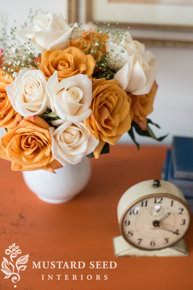
I picked up some orange and white roses just for this shoot.
Our retailers are not required to carry Outback Petticoat, so contact your local retailer before heading over to buy this color to make sure they have it in stock. You can purchase it online from your closest online retailer, though.
![]()
Before I go, I thought I would share a mishap that occurred while shooting this piece.
I snapped one shot and then…

GASP!
It was only a $10 platter, but it was a lovely old piece and I was sad to see it smash to the floor. I didn’t have a wire hanger large enough for it at the studio, so I tried using some velcro sticky-strips. I figured they would hold for 10 minutes while I photographed the dresser, but I was mistaken.
A moment of silence, please.


75 Responses
ohhh mmmmmmm….so sad 🙁
but i love the new petticoat color 😀
I think this piece looks just lovely with Outback Petticoat! I like how you highlighted parts of it with white, and allowed it to be chippy. Nice “debut” piece 🙂
That orange is really pretty. It looked like pumpkin pie filling in your photo of it mixed up in the white jar. I saw it and went ‘yum!’ Anything that looks good enough to eat can’t be all bad. 🙂
I’m not a huge bolder color girl myself but I think this new shade is lovely! I can see it on a lot of pieces. Good work!
I think it is super nice that you are offering the piece for free. Very Very kind Marion. Oh and I love the colour.
Louisiana is kinda far from Pennsylvania or else I’d be there picking that beauty up! I love, love it and your new color! Sorry about that pretty platter though.
Just curious what u used for the white accent in the dresser. Thx!!
My moment of silence is for dried lavender. My life will never be the same.
Great new color! While I have not decorated with orange before I could see how that would provide a great pop especially in a gray room
Beautiful new color!!! Can’t wait to try it. As for Apron Strings, I love it and was sad to see it go, so I bought several bags to me see through. Oh! That pretty platter…she was lovely.
Hi Marian!
I think this is so funny – I’m not a huge orange fan either, but I have a friend who is and she talked me into painting a moosehead that I had -orange. I mixed up a custom MMSMP colour using Tricycle and Mustard seed and one of the “whites”…..I can’t get over how close it is to your new petticoat colour!!
Apron Strings is gone? That makes me sad. I do like Outback Petticoat and love how it got it’s name. It looks like this orange would pair well with Kitchen Scale.
Hello Marian,
I love the piece and I love the name. I can certainly come to your studio from my home in Takoma Park, MD. I have the perfect spot for this dresser.
Oh NO!!! So sorry about the smash….
But how beautiful is this piece? I love the colour and the wonderful play off the white and the wood. I’m a HUGE orange (and red!) fan, it’s much more neutral than most people think!
Orange isn’t usually my color either but this shade looks lovely! Very soft and feminine paired with the roses.
Oh Marian, I love the new color! I have been an “orange person” for over 50 years. It’s about time the world has finally caught on to it’s beauty. I live just over the border in New York and would love to have the dresser. Great job!
Orange is my favorite color!
I happen to be pleased that you e added orange to your line! So pretty. The name is perfect!
Wish I was closer, but from Texas the free dresser just won’t happen. Finding a piece to paint with OP just might.
I think it’s a beautiful color. Can’t wait to see more of it and what other colors you pair it with.
I am not an “orange person” but it (pumpkin) is a really trendy color!
I love the color. It reminds me of the old Orange Crush soda pop bottles…. If California wasn’t so far I’d be their to load it up and have a fun pop of color in my home !!!!
I love the colour orange, especially this shade. I painted the door and woodwork in my bedroom this colour back in 1966 – my mum was very yeah ok whatever about me painting. It was called Tangerine Dream back then. Dutch people seem to be fond of orange too – we can spot Dutch holiday makers by their orange clothes! Sorry about the broken platter – mosaic table top??
xx
It would still have been sad, if it were free. The lady had a good life in your hands.
The color isn’t for me…but the name is priceless.
Don’t you just have the best time!
Your new color is fresh and Springy! Sorry about the platter, though . And the name couldn’t be better!
Love the orange. One of my favorite colors!
So sad to see the platter fall – I have the matching wash bowl.
I live in a ‘red dirt’ area in Australia. It manages to colour everything from the souls of your feet to the dog and sheets. I love the colour …you have caught it well. I will try it on the right piece.
I love the orange! I love orange and blue together just like you have there in the photo with the books and the platter. So sorry to see that platter broken. It was lovely!
I am not a fan of orange but I love the way you styled it with the white and orange roses and the complimentary blue books…it looks pretty ! I adore vintage plates and platters …so sorry yours hit the deck ! If I lived close I would make a path to your door with one from me to you ! Thanks for all the inspiration, Marion….you’re the best !……..Smiles…..Anne
Orange is the complement to blue; sprinkling more in any scheme, be it a painting or a room, will enrich the blues. ? I like the new color, but I thought the sweet coral of apron strings was lovely.
I just didn’t say enough about this orange! I have a blue provincial baby crib from France, turned into an outdoor day bed, that would look so sweet paired with this orange. I can also see how beautiful this orange would look in the fall with those softly colored cinderella pumpkins. Just loving it Marian!
Hey, so now you’ve put an OUTBACK PETTICOAT over your DRAWERS!! Much more seamly …
I think it looks like UVa orange so it works for me!
That’s right! Go Hoos!
Love the name and the story, just not the color. I so enjoy reading your blog!
Apron strings is one of my all time favorites, sorry to see that one has been retired. Not loving the orange at all. Orange is that one color that is hard to decorate with and around. Mix with black — Halloween. A little goes a long way. Not that I don’t love orange, I do actually. It’s not for me, doesn’t fit into my décor. Either at home or at the marketplace. I won’t be purchasing this one. Probably the only color I won’t have in my MMS palette. Anxious to see #2.
I think this will really bring the Mid Century Modern people to your line. I saw a lot of this color when we lived in the Palm Springs area. There are many pieces of furniture that will now be repurposed because of this color. Very cool.
Wow, the orange looks really nice. Refreshing change, it will be exciting to see how it’s used. I love all colors, tho I don’t wanna live full time with all of them.so interesting to see what others will do with it. I think greens could be nice with it. Cant wait to see more !
Outback Petticoat is growing on me…I think it would look great with turquoise! Can’t wait to see the second new color. Am sorry to see apron strings was retired; it was one of my favorites. And on another note – love your longer hairstyle! It looks great!!
I can really see this great orange with dark denim blue and white..maybe a touch of turquoise. I bet the Western states eat this up. We also have a wildflower up here in the upper midwest in late spring—I don’t know what it is, that is exactly that color and goes so well with spring greens. Marvelous choice and good luck with it, Sandi
Hope it does well for you, but no orange for me. Orange to me means…. Florida Gators, Auburn Tigers, Tennessee Vols and Clemson…. not happening in our home. ROLL TIDE!
I love orange!! And this is the perfect tone, I can picture it with so many different colors….black, blue, turquoise, peach, greens, and whites!
Love the name of the new color and its origin. Very sad about the platter. I’d love to make a suggestion. Please design and market a type of holder that would hang a large platter safely. I have several beautiful platters, but no way to hang them.?
Absolutely love that color!
I can’t do orange myself, but this is pretty. And the name is just right! Can the ironstone be reused in pieces of jewelry or a tabletop??
Marion, I just love the orange! I could see this mixed with blues in the future!
Thanks for sharing! And Boohoo on the beautiful platter.?
Suzette
I see you just painted over the chip in the laminate on the drawer. Did you do anything to the area before you painted it? I have 2 pieces that have bad laminates. One I took all of it off the other I used Bondo to repair it. I am a newbie at this and could use some suggestions????
Love this orange! I once saw a beautiful French antique armoire painted with a similar color, it was stunning! It’s giving me lots of ideas…I will try and send a photo
Being an Aussie, as soon as I read the name of “Outback Petticoat” I knew it had to be orange and the name had an Aussie origin or story 🙂
I like it!
it’s a keeper color. I think I’m in love with Outback Petticoat.
A funny to share with you about orange. I’m 64 and all my life, I had not just disliked, but hated orange – it was garish, cheap, and classless. I adore color, and the appreciation and use of color is one of the great joys and blessings of my life. But not orange; I hated orange. Four years ago, I lost my sweet husband of 40 years. I can remember the specific day when, sitting alone in my den, I decided that my life needed new color palette. Not just as a metaphor, but as a literal mission. Since that day, I have embraced orange. For instance, my wardrobe includes oranges, and I have an orange wall in my torquoise and green family room and a navy and orange guest suite. And so, I love your newest color! Congratulations!
Aw, so sad for the platter but love the Outback Petticoat and the dresser! The chippyness and the hemp oil really bring it to life!
Yeah, Outback Petticoat!! I have been drawn to anything orange since I was a kid…..orange crushes, creamsicles, cooked Maryland blue crabs, orange office supplies, and the list goes on……I’d be happy to drive up from Virginia to pick it up in my orange car. ????
Rest in peace (or is that pieces), sweet platter.
I’m not much of an orange person, either, but your new color is very pretty. One of my friends loves orange, she has an orange couch. I think there will be plenty of buyers for this color.
As a red-head since my white-blond hair took a turn for ginger when I was about 5-6, I can truly understand your hesitation for all things orange. Seriously, my hair is orange! I have tried to get on the orange bus but it’s resistance is ahem, a few years in the making! I’ve had to see how great the contrast is when pairing orange with my favorite shade of blue, turquoise….and it sure does make a great pop! I do love the subtlety of your paint color….
I love the color Marian! I have always been partial to this . I think it will do very well. The dresser looks great.
How did you add the white accent on the piece?
Who would have thought? Just a question – I am noticing the white accents on the piece – Did you do something to make them pop out? Love this blog!
I had something similar happen to me. I make “garden plates” using vintage dishes. I had one that I really liked and wanted to take a picture of it. I mount them on copper tubing which is pounded into the ground. So I thought I’ll just prop it against the table to take a picture, it should be o.k. for a few seconds. After taking the picture I turned my back for a brief second and crash! down it fell and broke to pieces. Luckily the pieces are large so I can glue it back together. But I learned my lesson.
I have two small orange & grey pieces of furniture and one picture frame in my family room that Cari painted…I have always liked them. We have our honeymoon photo with a small vial of soil from our trip to Australia’s Outback. Lovely!
I’ve also seen many folks use orange with dark blue. I hope your new Outback Petticoat does well. 🙂
Love the story behind the name…..
It’s a gorgeous shade, Marian; sure to be a color success!
I’m not an orange girl either,, but I love the story behind the color and this is very peaceful,, once again,, excellent job Marian !!
Unrelated:
I just wanted to tell you how much I’m enjoying your blog!
I’m fairly new to you – I found you through someone else through someone else (I’m sure you know how that works on the internet) in the late fall and subscribed to email notifications. I don’t often have time to actually look at your blog posts, but when I have a bit of a lull, I’ll read a bunch of posts at once.
They provide some moments of just pure enjoyment. And I noticed today, how calming they are. 🙂
Thank for this bit of respite in my day!
I’m interested to see how your customers respond to this color since I imagine most are like you and wouldn’t describe themselves as orange people. However, I think every color has its place in decor and I think you created a lovely shade. Considering orange is opposite of blue on the color wheel, I think there is the potential for some very interesting and fresh color combinations.
I actually love orange! I tend towards burnt orange, but this orange is softer, I love it! I’m thinking if re-doing my interior space to a neutral blue and white, like you have, but I wanted to use pops of orange and even red and apple green here and there,even it fits just seasonally. I was glad to see the blue books and the blue in the bird picture. Relaly pretty and still soft. Well done! I love your style!
Keep the pieces of the broken platter and use them in a mosaic. That would be beautiful with the delicate pattern. Just a thought.
Love the new color and the story behind the name.
Hmmmm, I love the white accents you added. Was this Farmhouse white or another color?
Navy and orange work well together. I wonder how it would work with Artissimo?
So many questions.
Gasp! The ironstone!! Gasp! You have created milk paint the color of a Hermes box!! Zut alors, Cherie!! The hemp oil really brought out the vive la France in it
Sorry about the platter! Ouch!! I love the new paint color!! It is so warm and pumpkiney! Great job on creating this one!!
I am not a lover of orange, but the history behind the name and the lovely dresser made me smile. Thank you for brightening a bleak winter day.
I love orange and have it in various shades all over my house. I most often have it paired with blue, but in my bedroom I have a deep rust bedspread and pale lavender walls. (Then I have pillows and artwork that tie the two together.) The color inspiration came to me after seeing the Grand Canyon at sunset. Think of a gorgeous lavender sky behind deep orange canyon walls…God is the ultimate decorator!
Hi Marian, just wondered if milk paint can be used on metal? This color looks sort of terra cotta-ish and I was thinking of painting some big metal planters for outside.
Thanks!
*hanging head in silence*
Oh, my heart sunk when you said there was a mishap. Then I looked one more time above to see the finished pic and thought, “I hope that platter didn’t fall!” I’m so sad for you. It was, indeed, a beauty.