
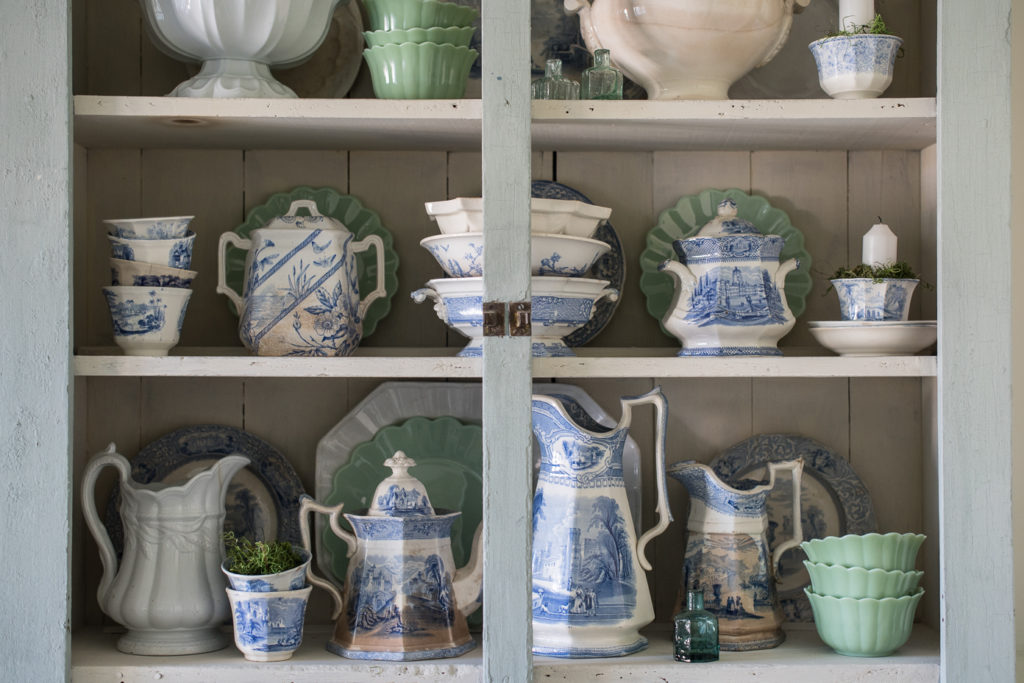
I have never really been drawn to the color of Jadeite, to be honest. It just wasn’t a shade of green I particularly liked. But, my tune has changed when it comes to that color! After using the in my green and white summer tablescape last month, I bought a few more pieces and decided to mix them into my antique ironstone and blue & white transferware. I like how they tie into the colors in the wall mural…

They offset the blue and white and look right at home alongside the antiques.


I also added a few antique victorian inkwell bottles to tie in with the green.


I love it when I can display pretty pieces that I own. It seems a shame to have them hidden away in cabinets!
If you missed it, you can see the green & white summer tablescape HERE.


30 Responses
It’s funny to hear you say this, Marian, because these colors together always remind me of Miss Mustard Seed! I guess you usually bring that green in in different ways. I love the way the cabinet looks with the new additions- lovely!
I have always love that color Jade which looks so great with your whites and blues! Your mural ties all the colors together in your dining room.
Marian,
Love the soft hues the green brings to your restyled hutch!
Those blue & white dishes are absolutely lovely!
Great inspiring post!
Pat
Love the blue and white. I have some too. I eat off flow blue and I use silver from the
South all the time. My boys tease me about how nice it would be to have silverware
after 1960.
I am a long time lover of green. I think it all looks so serene together!
Love the ways the eyes are just drawn to the Jade. I agree it makes the wall, cabinet, and table all tie together beautifully.
I love the blue and white. Forgive me, but I think the jade detracts from it. I guess it simply doesn’t work for me.
I’m with you! I love Staffordshire pottery and decorate with it in my home, but I also love early McCoy pottery, especially the jadeite color. Vases, cookie jar, plant containers – all look great in my blue and white scheme.Mi
I think it all works beautifully together!
The green adds interest and accentuates the blue. Lovely combination!
I agree with Kathie. I think it detracts from the blue and white which I just love.
The green pieces are so lovely in the hutch and the way you style your home is such an inspiration! I like to display my “pretty pieces”, too, and I love switching things up so each piece gets to take a turn in the spotlight somewhere in the house. My husband jokes that he never knows what look-but-don’t-touch piece, as he calls them, he’ll find on his end table.
I love the jadeite mixed in, but I’m surprised that you didn’t search out antique pieces. I see them all the time in antique stores here in New England.
I also collect blue and white transferware, and yellowware, lately I have been so drawn to the green glazed yellowware, and I have seen amazing collections of the green glazed yellowware and the jadite. Oh my, I am so temped, but I would have to get of something. Actually alot of something… How much is too much? And I do not have a huge amount of display space.. You have certainly shown me how well they look together. I agree with Michele. I have a blue, white and yellow color theme. I might just add a little green.
Looks fantastic! The jade really makes the blues and whites stand out. It really ties the mural in and makes the hutch more of an accent in the room!
I think it looks great together! I actually believe that blue & white pieces ( or even blue and white rooms!) NEED another color for a counterpoint!
Blue and white and green ( light or dark)
Blue and white and red
Blue and white and yellow
And on and on!
So I totally love your hutch arrangement!
Also- mixing old and new is creativity to me- not many of us can afford to only have antiques, and how boring is it would be to llimit yourself to that anyway! To me that would be the difference in doing a museum and doing a HOME! But then again, I’m likely to wear pretty old jewelry and a funky piece together, so what do I know!?
Please keep doing your wonderful creative vignettes, you’ve got a big fan club behind you!
How lovely. I have a couple of small ironstone pitchers I thought were pretty when I went thru grandma’s stuff. Mother favored creamy Lennox so I have some of that. Plus a little silver from great grandma. Somehow it all works for my “transitional” decor in a smallish condo. Thank you for the “try anything” approach. It definitely inspires creativity!
Hi Marian, I mix thePioneer woman’s jadeite along with Joanna Gaines Jadeite from Target.. along with vintage jadeite and my white ware and vintage blue willow pieces.. I love the combination of colors also.. so fresh!.. now I’m mixing in tiny orange pumpkins in my hutch alongside the blue white and green glass pieces and it’s beautiful!
Green has ALWAYS been my favorite color! I was actually shocked when you painted the island and pantry green!!! I have been drawn to blue a bit because of you. But I often felt you needed a third color and loved your goods and yellows upstairs!
you should follow @jesselauzon on IG. The best jadeite collection amongst other things….looks great and I too have my collections where I can see them…
I love the green mixed in. I think the repeated shape of the jadeite soothes the colour variation keeping it interesting without being too busy. Even though I’m sure each piece was placed with precision and definite purpose, it looks casual, effortless and welcoming. You just have that knack! Hope you’re loving your trip.
Seems that with the passing of time some of my color preferences change too. Nothing wrong with that! But Blue is a constant!!!
I’ve migrated from blue and white to blue, white and green like you. Now, I’m looking for ways to add green everywhere! I love the combination. I don’t think I’ll ever change from that now.
I love the jade, but then i love mint and teal too! I think it compliments the white and blue perfectly and gives dresser a pop of colour which it didn’t have before. The dresser would have looked to samey with all the blue and white plus the white of the dresser itself.
The green is a subtle pop of color that makes the blue and white dishes stand out even more. Very pretty!
I think there are folks that like blue and those that like green. My house goes green with very little blue. Go for what you love and let others do the same. I am not sure about the jaditite with the blue.
Your Transfer ware is so very beautiful. I love the blue and white. I would not mix myself. You do have the lovely painted wall you id with green so you can get away with it. It isn’t the quality you use usually. I like it without.
I know that you need the ads on your site but I must say that they are a monumental distraction & really impede visualization. Where i may have lingered before i now find myself closing your blog as quickly as possible. 🙁
Its sad that success has such drawbacks. I’m forever your fan, tho!
Are you viewing on an iPhone, tablet or laptop? Just wondering what experience you’re finding distracting. I do realize that the blog would look better without the ads and it would be easier on the eyes, but it would then be a very time consuming and expensive hobby. Just like advertisements in a magazine, blogs can operate because of ad revenue. It pays for our expenses (hosting, e-mail lists, technical support, etc.) and allows for it to be a profitable business.
I took doors off my dish ware cabinets. I enjoy seeing it, but wanted openness for pot luck guests to grab plates & mugs.
Usually I have delays when I type answers. MUCH better tonight! The ads are a little jumpy for reading your blog. They are distracting & of no interest to me. Sometimes it’s cat & mouse to delete them.