
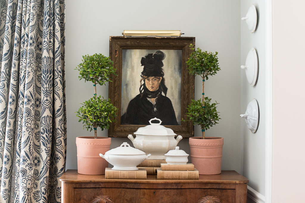
A few of you noticed the new picture light hung above my Manet copy of Berte Morisot and I shared it on my Instagram stories last week. I actually bought the picture light for the cow painting above my fireplace (Eulalie), but running the cord wasn’t going to work. It’s a small shame that there isn’t an outlet on that wall for either a picture light, sconces, or a TV. So, I decided to use the light over Berthe and it really is perfect.
When shopping for picture lights, I learned that they can be very pricey! I didn’t want to spend a lot, so I just kept an eye for one on and , and finally, one surfaced for $25. It was the right size, style, and finish, so it was a win!
Hanging the light started about an hour of decorative play… bringing in plants from the deck, arranging and rearranging.
I started with some lavender and thyme, just to try it for fun. These plants won’t receive enough light to live here, but it’s fun to style for pictures or to test out ideas.

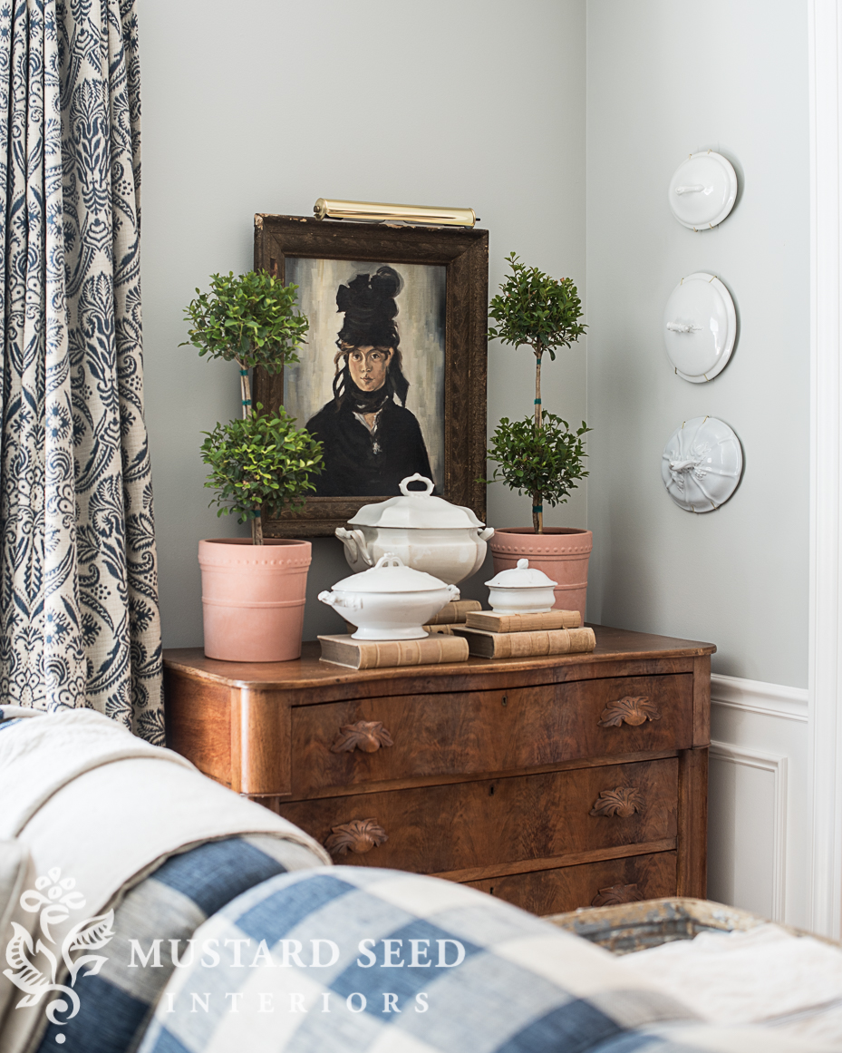
I also tried some topiaries. I really liked the formality of the symmetry with the oil painting and picture light, but again, these plants won’t survive here. Bummer!

I also realized as I was taking these pictures that the light was hung a little too low. Taking pictures of the ideas you’re testing out in your home can be a valuable way to make decisions and see what’s working and what needs to be tweaked. Next time you’re moving things around, take some pictures to give yourself a fresh perspective.
After the floors were installed and finished and I was putting things back into the room, I took the time to fix the light and the wire on the back of the picture. The frame was meant to hang horizontally, so I rigged it up to hang vertically instead of taking the time to reposition the eyes and the wire. This meant that the painting was always crooked! I would straighten it out and I tried to secure it with velcro strips, glue spots, masking tape, but none of those options were permanent. They would eventually separate from the frame and the picture would be crooked again. It really was silly that I kept trying to “fix” it without actually just fixing it!
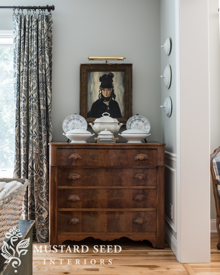
It finally did that this weekend and it took about five minutes. I hung the painting about 1/2″ lower, so the light wasn’t crowding the frame and it looks better. I also rearranged the buffet/dresser one last time with ironstone and some blue transferware plates.
This arrangement doesn’t use plants that will die in a couple of weeks, but it does provide the symmetry I liked when I tested out the topiaries.
The light does have a cord that runs down the wall, behind the painting and the dresser. I use the decor to hide it, but I could add a cord keeper and paint it the color of the wall as another option. The outlet is behind the curtain panel, so it really is perfect.
I also tried the topiaries on the mantle and they look amazing there! The terracotta pots tie into the pink in Eulalie’s nose and the scale of the plants is just right. Oh, how I wish they didn’t need full sun! I am looking for some faux topiaries that are the same size, but it’s so hard to find ones that don’t look like plastic. I know there are good ones out there, though, and it’s just a matter of finding them.
Which arrangement did you like best?
For tips on styling in your home, check out THIS POST.


71 Responses
I love that painting! And, yes, the light is now in the right ‘spot’ to the artwork.
Honestly, I think the large center piece on the buffet totally distracts from the beauty of the picture. What do you want the eye to hone on? Right now my eye beams on the center white piece that is covering her chest. Maybe just remove that one piece? The others would nicely “frame” her. Of course, JMHO.
Love those floors!!
PS – Another possibility – maybe just raise up the light and picture so each grouping has its own ‘space’?
PSS – the topiaries work too …. again the white center piece distracts…
I read the responses. The light is perfect. Painting is perfect. The responses saying to lower the middle ironstone, will possibly work better. Or remove it? It is too prominent and takes away from the painting. And maybe raise the outer plates. I do love the ironstone.. I love your ideas.
The painting is striking! Love the ironstone; might be a bit too many pieces here. Raise the plates with books for some height on both ends and leave only the large center ironstone piece (remove the books it is sitting on now). Thanks for inviting our input. (It does seem to need some greenery; maybe two small plants on either side of large lone ironstone piece).
I like these ideas! I’ll play around with them. I would like to add some greenery…
Forgive me, too much ironstone!!
Ha! NEVER! 🙂
Thinking about your fireplace wall with built-ins on either side. Maybe consider removing the left side built-in cabinet doors on top (leave bottom doors attached) to better balance with the right side built-in. Style/decorate left side to go with right side (ironstone, blue transferware, books, etc.). Thanks for inviting our comments.
Love your blog and design/decor aesthetic! Look for a post everyday. Blessings to you and family.
I have thought about that, but the left side of the cabinets are very deep…probably 2.5′ or so, so I don’t think it would look right.
I love it just the way you have it! Beautiful!
Hi
Try something that is a favourite of mine- asymmetry. Makes things just quirky enough to be interesting. Makes the mind stop and process what it is seeing.
BTW, there is never too much ironstone, or in my case blue willow, or glassware, or…
Kim
I do like asymmetry, too! Great thoughts!
To me, Berte isn’t hung quite high enough. She is beautiful and deserves not to be scrunching down in the dishes. I cannot tell how high up she is but are her eyes level with yours (or a taller son)? That is how high I like portraits, but my family is all well under 6 feet tall.
I found some relatively really nice topiaries at a Tuesday Morning shop some years ago. They are high up on a china cabinet and are not immediately visible as artificial.
I think a little bit of black on the arrangement on top of the chest would really set off the whole arrangement and tie the beautiful picture to the stone ware etc. Could just be a black ribbon bow through the handle of one of the lids or a small book covered in black leather. A piece of ebonised wood. I hope you can interpret what i mean! Or maybe a small bunch of rosemary tied with black ribbon tied onto a lid handle. Would make the room smell lovely too! Just a few thoughts.
I actually love the first one with the lavender and the other plants. Have you thought of hanging some thing over the picture? A piece of ironstone or transferware. Or perhaps even a flat basket? Or even raising it a few inches. It’s a lovely picture!
I loved the blue and white transfer ware. It looks great with the couch and curtains.
I think the picture could be a few inches higher to allow for the ironstone arrangement. Or the arrangement could be without the books underneath. Some realistic greenery would look good there also.
My 2 cents worth would be to antique the picture light with a little Rub n Buff. It just seems a little too bright…
Your ironstone is wonderful! I do like the suggestions to raise the picture about 6″ or so.
Looks lovely. I agree about asymmetry – give it a try. & lose the picture light, they always distract from the artwork. It’s nice to see paintings as they would have been seen before electricity as the light of day and night changes. Personal favorite is room lighting on dimmers, lamps, and discrete use of really good flameless candles in the area for night.
It’s a lovely painting. I am with the last commenter, the light is too bright gold. It also appears in the photo that the painting is hung a bit below eye level. I am very casual and I hate symmetry so I definitely prefer the first uneven but balanced arrangement with the herbs. You have a beautiful home!
I prefer the asymmetry in the first arrangement, but I agree with you that there needed to be more space between the light and the portrait. I agree with the comment earlier that the portrait needs to be hung higher so that there is a little space between the bottom of the portrait and the styling on the dresser. She needs room to breathe!
I, too, feel that raising the picture up a bit (so the bottom edge of the frame is above that center piece of ironstone) would help it not look so crowded. Or try it with that large piece removed altogether if raising her up it too much trouble. The portrait, including the frame, is just too pretty to be hidden!
The blue and white plates do the painting justice – keeps it the focal point. Love the topiaries but it overwhelms the beautiful painting.
Search for dried boxwood topiaries – they are so awesome, I own several and they are real- just dried. No plastic look!
BTW- we have put in outlets before – it requires drywall refinishing but so worth it when there is a needed place for an outlet. We could do because of having an unfinished basement – all they have to do is rewire a bit. My hubs does it now. Something to consider. Of course BEFORE your wainscoting work would’ve been ideal, but still – sometimes it works that way. : – ( For me, Murphy’s Law is a way of life most days, haha.
Your copy of the portrait is amazing. I had not read about it before and looked up the original…yes, your original blog post and the Manet original. Love this vignette. The frame is perfect.
I really like the first pic with the lavender.
I agree painting should be higher just above the ironstone top handle. Other than that I think it really works. I love asymmetrical displays as they are always interesting.
You really have a great artistic and design eye!
Love your posts. Sweet Blessings to you my dear.
Love the last one with iron stone. I agree with those who say the painting needs to be raised. Even with just the stoneware, she looks scrunched. Lovely painting. I envy you!
I love the basket in the first presentation but
If not, then I would just raise the picture a few inches to create more of a triangle shape with all the objects.
I’m sorry, I don’t care for picture lights unless they’re in a museum. Maybe just a well placed candle for soft light and warmth.
A great lowlight plant that takes minimal care is the zz palm. Home Depot and Loews both Cary these in small pots for around $10. I’ve often put 2-3 in one pot to give a more lush look. The leaf is roundish and dark green to medium green color. The just look healthy all the time.
You might want to look for preserved boxwood topiaries. They are pricey but last for years.
Really liked the topiaries- gave height to painting— find some faux topiaries— there are some “realistic” ones out there… and there would be less need for all the stone dishes—
Amazon has battery operated, cordless, remote control picture lights. You might consider one of those as an option for your fireplace wall?. Thank you for sharing your creative spirit, Marian. Your blog brings joy!
This is the first time I have had a negative thought about anything you do. I always love your style although I have never been a fan of matchy matchy. I think it is too crowded looking. Takes away from the beautiful painting and I would put a touch of black somewhere.
Well, since you asked us readers our opinion, here goes. I do believe your Manet picture needs to be eye level. And with all the ironstone (which I love) on the buffet and on the wall next to it, you definitely need some greenery and remove those plates. It just looks to washed out. There is some great real preserved boxwood topiaries out there. I have had mine for years. I think the light above the Manet is a personal choice and if you really like it then it should stay. I would put at least one topiary and maybe something black on other side like an old candle stick telephone. Well there you go….thanks for sharing always enjoy.
How fun to look at your photos and the different arrangements. My opinions: why a light? It is overpowering the painting and your room has plenty of natural light. It is an item I would see in very large rooms with high ceilings and more museum-like places. And the shinny gold isn’t nice, too showy.
I am a fan of symmetry, with the iron stone dishes, the beautiful center tureen is hiding the painting bottom too much, so I would bring Berthe a few inches up. The topiary solution is pretty too, you can find very good fake ones that won’t die on you and need watering. The 2 terracotta pots are a bit too rustic for this lovely corner with the antique chest and drapes, Keep it romantic, in style with Moriso’s period. Berthe will smile on you.
Like many others have mentioned, the painting looks to be hung too low. There is an expanse of wall above it and everything seems crowded down by the buffet. Notice also that the triumvirate of covers on the adjoining wall is, as a whole, higher. Maybe the painting could be centered on the space the covers take (height-wise)?
Such a great painting for that spot. She needs her own ‘white space’! Typically a painting is hung with the center of the painting at eye level which works with all size paintings. A smaller piece can be lowered and offset when it’s the focal point. In your case, along with the iron ware, her own spot with wall space all around her.
Another option to give her the lime light is to perhaps feature lower items such as your platters, bowls, and some flowers maybe??
I love the final picture. I do think the painting needs to be much higher. Just my opinion.
Another option regarding the chord is to remove the plug drill a hole in the wall fish tape the wire down the wall reattach the plug and plug it in! They even have plugs super cheap that just snap on after winding the wire around two screws. It’s a very clean look.
Oh Marian,
the first vignette with the basket of lavender and antique potted thyme just sings “lovely” to me. The 2nd one was also pretty but I felt the picture was being overshadowed and felt smaller by the visual weight of the topiaries and ironstone underneath. The third one…just didn’t have the spark of the first.
Where did you find that incredible burled (?) wood chest? It’s amazing… those carved leaf pulls have so much texture. I’m a relatively new follower, so if you have shared it’s origins before, maybe you could reshare with your “newbie” fans.
Susan
I feel the bottom layer on the dresser is too heavy for the picture. I held my finger over the large ironstone and thought it looked better with that big piece gone. Then the painting is “framed” by the china and ironstone. A small plant could go in that place. This proves everyone has different taste and ideas. You are very flexible to allow us all to tell you how to style your house.
Yes I immediately loved the basket with lavender style! I feel the painting is too low. The light above the painting works well. Love your style and missing your Oil Painting workshops!
Hang the picture higher, please. Then any of your arrangements would look good.
YES!!! Best answer!!!
Hi, Marian! Can’t resist mentioning that I like it all, however, those lids on the wall to the right are distracting.
Have a great weekend and thanks for sharing your decorating journey!
Question for you Marian, what is the smallest ironware item on the dresser called – it looks too small to be a tureen?
I want to search to find some as I love the size & look of it.
My favourite arrangement was the first one with the lavender, it added a spot of colour I think is missing from the other options, but I also think the texture of the basket works well. The topiary one would also work for me if the pots were not terracotta but baskets.
Speaking of topiary, not sure what species you have but I find Korean Box (Buxus microphylla) does very well in low light – it takes a lot more shade than some of the other types & is sold over here in Australia as being good for shady areas of the garden. I find it is also very drought tolerant so if you forget to water it now & again it won’t drop dead on you.
It’s a soap dish! There is an insert with a drain to keep the soap from sitting in the water. It would’ve been a part of a larger set including a toothbrush holder, washbowl & pitcher, chamber pot, and slop bucket.
Thanks Marian, I’ll search for soap dish. 🙂 It’s quite cute – hope I can find one similar.
Never too much ironstone. Love it as is and also love the topiaries. So much fun reading your posts.
… love that painting with the ironstone … the tops are over the top though, distract from the simplicity of the painting with the ironstone. Love that second image in total.
I think in the whole of the room, the lids make more sense. Thanks for the feedback, though!
I think maybe either raising the painting a tad bit or moving the arrangements around so the painting is not so hidden in spots. Also be careful with electrical cords plugged into outlets behind curtain panels as it is considered a fire hazard and can void some home owners insurance policies in case of fire.
Hello. Love, love , love how you styled your chest. It looks perfect both ways but prefer the topiaries. Can you share the name of the fabric for your draperies and where you purchased the fabric?
Thanks Marion!
They are Coventry Indigo by Covington.
Marian, I love the lavender arrangement the best. The casualness of the green plants feels so comfortable with the painting and makes it feel familiar. I purchased some topiaries at Hobby Lobby at least 15 years ago. They are in wood painted containers that look like they were painted with milk paint! I love them and have gotten so much mileage from them – from the dining room table, the mantle and dining room sideboard! You will find some topiaries, just keep looking!
The art is wonderful and does not appear too low. Just a few too many items on furniture top…competes with the art? I like the shine of the brass light. Every room needs some sparkle. You always get it right so trust your gut.
Not that you need any advice, Marian, but I would love to see one or a pair of vintage black gloves someplace in the vignette to give your lady a link to the external world.
Re: The gloves……maybe the fingers could just hang over the edge of the top drawer.
Well I must say I agree that the picture should be raised a little OR not hidden somewhat behind the tureen. Your painting should be the star in your beautiful vignette.
I, too, like to take pictures when I am trying to decide which one looks better. It is very helpful to me when I take the time to do it!
Lovely corner, Marian. Perhaps Berthe would like an aspidistra? They are my new favourite plant. The leaf shape would reflect the way the hair and ribbons are painted.
I want to say that I love at least one of your selections, but, as with any piece of art, we should allow for it to have a focal point. There is too much of a crowd on the top of the chest. The artwork on the wall wants to be the focal point, and that’s why you wanted the lamp….The top of the chest needs to have some breathing room and the painting will no longer appear to be hung too low. (just my opinion)
I love the lavender arrangement the best and also feel (like a lot of people) that your lovely picture needs to be raised slightly. And on a side note, you always do lovely work and I enjoy your blog.❤️
I love the look with the lavender and thyme, but I understand about the plants not being happy there long term. I have several potted plants that can’t live inside so I rotate them inside and then back outside so that I can enjoy them both ways.
The painting seems too low and the whole corner area seems bottom heavy. You often try various arrangements and ask readers opinions because you aren’t quite sure which vignette looks best. You have such wonderful taste. But be objective. The photos tell the story. Do you want a curated look attracting attention to your lovely artwork or do you want to detract from her beauty?
I love the pieces you’ve put with the painting….but, I spend time looking at them and not the painting. How about a larger plant to the right and something to the left, keeping it simple to show off the painting.
How about faux lavender? I’ve seen some really convincing ones out there. Love everything you share with us, Marian!
Hello!! I followed you from “the beginning”.
Was not online for past year :(.
Now Reading your stuff about if painting too high etc…
So I had to ask
“Where’s the cow?” Lol
Obviously this is only my opinion as a designer for decades. Your home is not an art gallery therefore the painting is not the focal point the entire vignette is the focal point. You are bringing all these elements together to create a “scene” if you will. There are guidelines but the height of the painting is based on it’s distance from the top of the chest. Otherwise it will appear to be disconnected to the vignette and just floating above it. Finally I prefer the tureens and books without the plates. The plates distract from the painting while the eye travels naturally up to the painting without the plates.
You are blessed with an exceptional good trust your instincts. ❤️
I don’t know what the cost would be in your state/area for putting in an outlet, but here in California it doesn’t cost an arm and a leg to do. I’ve had two (2) put in in different rooms and the cost was under $100. Am sure that it matters where an electrician has to go to find the electrical wires, but you should have that set-up near your fireplace. The question is whether wires could be brought over the fireplace to begin with, but worth finding out. If you’re spending any money at all to have things done in your home, this is worth it.
I love it all….but then i am more is more kinda person. I think its perfect. My question is how you hung those lids. I have some i want to hang, i collect ironstone lids with lily of the valley, and i have a collection i want to hang. But they are heavy. How’d you do it?
Here’s a trick to not having pictures get crooked. Instead of one nail or screw, put in two, about two inches apart horizontally. You can then adjust the picture to perfectly level (we actually use a level to make sure), and it will stay put unless bumped really hard.