
The boys and I had a good time over spring break, but not having my usual work hours was a bit of a struggle for me. I’m behind on pretty much everything…e-mail, errands, projects. And I really hate being behind. But, I tried to relax and embrace the time with them, knowing that the years will fly and work can (usually) wait. I do feel the crunch that is coming, though, to get in as much work as I can before school is out for the summer.
While they were home, they played a lot with friends and we even had some weather that was nice enough for backyard soccer and bike rides to the park. We went to a rock climbing gym, which both boys loved and discovered an aptitude for climbing. I took them to trial music lessons for drums and guitar from young, tattooed teachers who taught them to play songs they like and now they’re eager to practice and learn more. We also did a thorough cleaning and organizing of their rooms, which yielded two full bags of trash and three paper bags of clothes to donate.
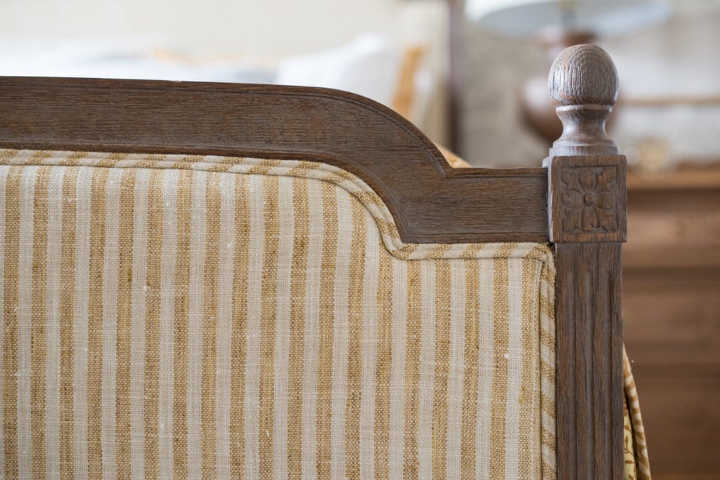
When they were entertaining themselves, I chipped away at a few projects, including reupholstering the guest room bed…

Now, I know I’m going to get a lot of I-liked-it-better-befores on this one and that’s okay. I knew going into this makeover that some of my choices were unconventional and that’s one reason I liked them! This is a guest room that’s in the basement, so I can step out on a limb a bit!
Several people have mentioned that they like everything but the gold/yellow additions, but that color is where this room makeover started. I already had the beautiful gold bedding from Pine Cone Hill and an antique German wardrobe with the original mustard-colored paint. This room was going to include yellow.

So, why pair it with a beige and cream wallpaper? I don’t have a clear answer for you other than to say that I saw the paper, I loved it, and I kept coming back to it for this room. When I put the sample with the gold, I like how monochromatic it feels. It’s soft and sophisticated, but a little unexpected.

And, you can’t judge the room just yet, because it’s not quite finished.
I’m still thinking through the nightstands, lamps, and I plan to hang an arrangement of white ironstone platters over the bed.

One thing I am still debating is painting the dressers/nightstands Aviary or a custom blue as I had initially planned.
Here’s a really lousy mockup of how that would sort of look…

The other thing with upholstering the headboard is that it took me a couple of hours and about 3 1/2 yards of fabric to do this, so it’s a relatively low commitment. If ever I want to change it, I can.

For now, though, I like it. I like how it gives the room a collected feel. It doesn’t look contrived or matchy-matchy.

As far as the how-to, I was going to make a tutorial, but the house was bustling with boys, so I didn’t. I have made tutorials that translate to this project perfectly, though. HERE is a tutorial on making custom double-welting and HERE is a tutorial showing how to upholster the back of a chair, which is essentially just a smaller panel than the bed. Because the width of the bed was wider than my fabric, I did have to add pieces to each end of the fabric panel. It’s better to add pieces on each end, so you don’t have a seam right in the middle of the panel. It’s less noticeable and looks more professional.

The fabric is Adams Ticking Stripe and the wallpaper is Antigua Oak, both by Annie Selke.

A full room reveal with all of the details will be coming soon!


190 Responses
I love the yellow …. looks more golden honey on my PC screen … but it warms up the room.
Yes, it’s definitely a golden yellow, not bright at all.
I’m surprised at myself by how much I do like the combination of the ticking stripe on the headboard. It’s certainly not a combination I would have chosen, but the overall is very nice. The stripe doesn’t shout, but surprisingly goes very well with the comforter in my opinion. —–By the way, nice job on that bed!
Just love all of it! It looks so curated and welcoming.
It’s a lovely room! The stripes really make the bed pop. Great choice! I’m not really a yellow person. That being said; the room is peaceful, soothing and beautiful. I am glad I don’t have to make the decision to paint or not to paint the nightstands. Both have their merits. Happy choosing! 😉
I LOVE the yellow stripe!
I absolutely love everything you have done. I think the wallpaper is sophisticated and beautiful, and the yellow keeps it warm. What a nice room to be a guest in.
I really like the upholstery … and a big YES on the blue paint!
I think it looks great! And honestly, I think it looks much more “you” than it did. Even the wood frame looks richer and warmer!
I love it! I would probably Paint the nightstands in the same colour as that light grey door in the mockup picture, and maybe try some other lamps 🙂
Love each and every change you’ve made. Lovely room!
It is gorgeous! I love all the color and patterns you have introduced to the guest room. And YES to the blue paint!
Warm and Yummy! I was not much of a yellow fan until I painted a dark stained sideboard in Mustard Seed…..what a fun warm color! Love your combo!
I like the bed both ways, before and after. But I don’t think I’d like the night stands blue. Too much going on for me, but you always have a way of pulling it all together to make it look stunning in the end. Anxious to see what you decide to do.
The room looks so warm & inviting! Please do not paint that little dresser! Truly, i’ll buy it from you to save it! Your home is really coming together beautifully,
Beautiful room for guests! I’m on the “no paint” team. Love the golden tones of the wood with the yellow accents. I always appreciate your sharing of ideas!
The room looks amazing and so inviting for guests! I love how the wallpaper turned out and the headboard is beautiful. I am glad I am not the one deciding on whether or not to paint the nightstands, as I think the current warm stain harmonizes well with the golden colors, but I am also a fan of a blue and yellow color scheme in a room. I do like Carrie’s idea for leaving the furniture “as is” and painting the lamp bases blue as it would be a way of combining both looks. There are so many great options and I am sure whatever you end up doing will look incredible (as it always does). Thank you for sharing all of your ideas and projects with us.
I’m usually not averse to painting wood at all – but I feel that the warm tones of the pieces you are using as night tables work really well with the golden yellow in the bedspread and the new ticking strip on the bed. I would leave them alone and bring in other colours with perhaps the lamps – bases or shades.
I really like the low key look of the golden yellows and the neutral backdrop.
I so agree with you about the warm wood of the night stands complimenting the lovely yellow, and your suggestion of bringing in the blue with other elements.
I absolutely love the headboard within the ticking stripe, especially against the wallpaper. Its such a lovely, interesting layering of colors and textures but the overall effect is serene and beautiful. This is shaping up to be one of my favorite rooms in your home! I’m on team Aviary. I love the unexpected pop of blue in there.
I actually love the yellow/gold tones in the room with the wallpaper and your beautiful hutch! I even like the washstands the oak color but if you do decide on the aviary or custom blue, I’m sure it will look beautiful adding a bit of color to the room.
If it were me, I would leave the dressers as is and paint the lamp bases blue instead!
Love your upholstery fabric you chose…it is a perfect compliment to the beautiful wallpaper. Loving this room…with wood stain dressers. But I love painted furniture too, so I am certain the blue with the yellow will be stunning as well…
It’s classic and gorgeous!! Mustard yellow is one of my favorite colors! It’s also “on trend” these days. 🙂 My own bedroom is full of mustard yellow items for about 15 years now.
It looks great. I was questioning the stripes myself, but they look awesome. It’s so nice to see something outside of the norm and have it come together so beautiful. I think sometimes with the advent of Pinterest, blogs, and Instagram, our homes start looking a bit like clones—myself included. I used to make decisions based on my own inspiration (and a little bit of Pottery Barn Catalog and Romantic Homes Magazine) and was able to just go pick a paint swatch I love without days and weeks of “researching”. Now I have found myself questioning classic things I love because they might be too passé or overdone. I almost didn’t press forward with my craftsman’s window trim and traditional wainscoting that I have been slowly DIYing through my home. My rambling point is thank you for doing following your own creative vision. The room is layered, textured and beautiful. It’s definitely inspiring me to change things up in my blah bedroom.
I love the yellow. I have been gravitating to deep golden yellows lately, it just seems to make a room happy and it’s such a great neutral.
Love this room! The golden yellow I think is beautiful with the wallpaper. Sometimes decision don’t “make sense” in the beginning but in the end it couldn’t make more sense! The room looks collected, warm and inviting. Love the reupholstered bed as well!
This is what I have been waiting for since you first introduced the idea of recovering that bed! It looks even better than I imagined! Ahh LOVE IT. I wish my husband’s favorite color was mustard yellow instead of orange because I would much rather decorate like this rather than how we are now.
I can’t wait to see the entire room finished. I know it will look great.
Love the yellow and yes, paint the night stands. It’s all so yummy and rich!
The room looks lovely & so inviting. I still can’t get over how beautiful the wallpaper turned out. The sample you posted wasn’t very attractive to me, so I continue to be amazed at your artistic eye. It’s inspiring to me to realize you have trained yourself to be able to imagine the ‘big picture’ point of view so cohesively. I like the contrast of the upholstery, as you said, it’s unexpected.
I’m one of those who have trouble painting beautiful wood furniture. I think the stained wood dresser really grounds the warmth of the space. Using blue would really unbalance it for me. And I would be very nervous sleeping with ironstone platters over my head no matter how securely they were hung?.
Perhaps displayed on another wall?? Thanks for sharing your process, you really are inspiring?
I love everything about this! It’s just beautiful!! Although, I’m not sold on painting the nightstands.. what about painting the lamps blue instead?
This is so pretty! I love the yellow/gold color, it’s a really elegant room. I say no on painting the dresser. The wood tone blends so well with the colors of the room, the blue would ruin it.
I love the gold and the warm wood tones together. This is gorgeous! I felt like the blue dresser takes away from the collected- over- time feel. I cant wait for the total reveal!
The yellow is my favorite, I think it all looks wonderful. It would be sad to see that chest painted blue, it works just as it is, great job! Plus you have done a great job of mixing patterns.
I would almost always vote for painting furniture, but I love the color and feel of these pieces just the way they are. Just perfect in my opinion.
I personally adore the mustard yellow colors you’re using. I applaud you for using a tricky stripe…so hard to get straight and it looks wonderful. I’m kinda lovin’ the blue on the nightstands. such a sunny combo for a basement bedroom. I’d hang my hat in there any day!
Beautiful room! Please don’t paint the night stand!!! Love them just as they are.
YES paint the dresser.
Gorgeous. Looks like a very high end bed and breakfast!
I love the room, NO BLUE PLEASE. the addition of the ironstone above the bed would be very pretty.
I LOVE the yellow! You have inpired me to add it in my grey and red accented kitchen!
At first, I was slightly startled by your choice of the gorgeous wallpaper with the golden hues of the bedding and other accessories. But then the startled feeling gave way to one of really liking the combo – sophisticated, unexpected, and it gives the room a sense of “history”. You have inspired me to think outside the box more often! The room is just wonderful…..all your hard work (and your mother’s) was worth every minute!
Thought it interesting you felt a need to mention the tattoos. Face piercings, tattoos, and non-natrual hair colors and styles all seem to be identifiers these days. Since they are here to stay, I hope we as a society can learn to look past them. I know it’s not always easy. The room, by the way is charming. And I’m glad you took time to play with your boys. That to me would be the priority. Kudos!
I have a visible tattoo and a nose ring, so it wasn’t a judgment at all. I was trying to succinctly say that they were rock music lessons from “cool” teachers and my sons really responded to that. I’ve tried to teach them guitar, but learning from your mom isn’t quite the same.
I love the wallpaper and I like the stripes – just not together.
I love it! I love how the stripes allow the headboard to stand out against the wallpaper now. It all flows beautifully and as you mentioned it does look like it’s been pulled together over years instead of weeks. Can’t wait to see the final reveal.
Beautiful! I’m in the “no paint” camp.
I give it a thumbs up! I love how it isn’t matchy matchy but it is well thought out. I think the blue nightstands will pop so give it a try!
I like it. Like it all. I think the gold makes the room. Brave choice. But I have loved the gold since the first time you showed it in your other house. Inspires us all. Thank you.
I LOVE it all…just the way it is. NO!!! to painting the dresser/side tables. I think you could add “blues” with throw pillows and extras….the blue dresser just isn’t right…(in my opinion). Maybe an extra blue design/quilt blanket hanging off the end of the bed folded up? If you do paint the end table I would only do the one on the right…the other one has a LOT of character and texture that would be lost. The “scene’ of the left side table is just perfection…just the way it is.
Yellow/gold, blues and ironstone are a GREAT combo!!! Love the headboard!!!!
My favorite room- I love the sophistication of the wall paper with the companion French bed. I wouldn’t pant the nightstands either, I love them as they are.Classy, simple, elegant.
I do wonder if you were to add a tiny filigree of a mustard gold gros grain ribbon as a substitute for a molding at the top of the wallpaper to add that color to the wall as well? I’ve seen it done by M.Stewart, and it looks wonderful..
*paint* ..not pant 🙂
Hey, Marian! I love painted furniture, but I think I’d be inclined to leave the dressers the way they are, as they are the wood tone that ties in with the bedding (how the bed frame ties in with the wallpaper). They also tie in beautifully with the mirror frame, and the frame on the little antique dress. My question is, if you paint the night stands, what will you do with those two pieces, since their companion wood will then be blue. I think some beautiful ceramic lamps, which will provide a reflective quality against a lot of matte finishes in the room, would be beautiful in a lovely shade of blue, cream, or even green. As an aside, the desser to the left of the bed is my favorite of the two; would be lovely to find a closer companion to it. That was such a score! ??????
Looking forward to seeing where your design esthetic takes you to finish out this room! ?
I am not usually a big ‘yellow’ person, but I absolutely love how beautiful, subtle and calming this room is! I never imagined that the yellow stripe would look good against the patterned wallpaper, but it looks perfect! Really admire how you have such vision for what will look beautiful and not too busy. I’m in the ‘don’t paint the side dressers’ camp…I love how all the golds and yellows just compliment each other, but I know you have an eye for what looks great! Anxious to see the finished room. As a previous reader commented, it looks like a beautiful bedroom at a bed and breakfast…maybe in Gettysburg!
This is probably my favorite room in the house….love that gold. I looked for the bedding on our link but could not find it. Sold out perhaps?
I too favor blue and white in my house and love the gold accents.
Dee
The bedding is retired, sadly! It’s such a pretty pattern.
I absolutely and always will LOVE ticking. I love your fabric choice. The bed looks beautiful. The yellow is a fun choice. I’m just not into the blue nightstand.
Love the room! Altho I’m not a fan of mustard/gold, the combination with the beige-gray neutrals is great. The stripes are terrific with the comforter & shams. I really prefer the wood dressers rather than the painted in this room. It feels very calm.
I have several older dresser that were painted & have been stripped & restained. (Not by me!) I LOVE them. But I have other things that were stained & I love them painted. Depends on the wood, the style & where I use them.
Can’t wait to see what you do next!
The nightstand is beautiful as is, no paint, please!
Hi
forgot to add my two cents worth on the side stands for what its worth. Now I really really love this room….the wallpaper- much to my surprise; the gold bedding the headboard, the bed and mainly the German chest. I would love to see white stoneware and blue and white plates over the bed but I really like the idea of leaving the side table/stand wood as they are. I think that large chest needs a few friends in the room and I love that wood armoire!
Dee
I really, really love these colors and everything you’ve done so far!! Live the headboard!!! If I can vote…I’d leave the side tables in wood…it’s a beautiful warm contrast to the other colors.
I absolutely love the print combinations you have used in the room…everything just compliments the other. I love the wood on the dressers…they just seem to ground the other wood accents/pieces! Beautiful, beautiful, beautiful!!!
Love Everything. Criticized you months back for too many advertisements, I think it was the very expensive mattress. I am so happy to see you get back to your “roots” and I applaud all of your new ventures. The very best, keep it up, and please put my vote in the keep the nightstands as they are. Not everything needs to be painted and they look lovely.
Thanks, Pat. I appreciate that!
Love the room- everything about it! The nightstands are perfect either way, painted or natural. Muted blue gray might provide a nice contrast.
Yes to painting the nightstands! The intro of another color and snippets of that sweet blue in accessories etc. would be divine.
Yellows make more sense when showing the wardrobe. Very pretty. I feel like you can add some touches to tie everything together. More blue pillows on the bed. And some mustard seed yellow stenciling on the lamps? Or around the handles of the aviary dressers? That’s a nice choice to coordinate with the doors.
The bed looks custom now instead of a bed straight from the store.
I wouldn’t have put the beige and yellow gold together but I like it ! It is unexpected and it doesn’t clash. Maybe a piece of art that has both yellow and beige tones in it will continue to draw everything together.
But I really like the wood tone of the side table that goes with the cabinet. I’m all for painting a great deal of the time, but I appreciate the way it is right now.
One word…Perfect!
I love lemon and all things yellow, i have a lemon and white house and i have a lemon and white bedroom…i love what you have done to the bed, its more subtle with the golden yellow…brilliant job!
Marian,
I quite like what you have done in here. I agre it’s sophisticated. While it’s monochromatic like oh said, it reads cozy. Looking forward to the finishing touches you will put on the room.
I love the yellow and that you stepped out of your blue comfort zone! It looks amazing!
I tend to do that in guest rooms! I think it’s a perfect place to experiment. I’m not in the room enough to get sick of it or miss my blue & white.
I love it! Ticking stripes are a favorite of mine.
My house is beige with a golden yellow door and french blue shutters. How about that….we think alike.
Mel
Oh, lovely!
I am in the no group for painting the nightstand and in the yes for painting the lamp bases blue. The room is lovely!
It looks beautiful, as always. I have a chair in my guest room that combines grey, yellow and blue. It’s more modern, but the color combination is like yours. I’m loving your inspiration!
Absolutely love the ticking stripe with the room! It really adds a nice layer of texture Since you already have the beautiful yellow antique armoire in the room I would keep the nightstands natural. You don’t want too many focal points in the room. I think another painting piece we just diminish the armoire. Let it be the star. ?
I have so enjoyed watching this room evolve. Every time you touch something, you make it more perfect than it was before.
Beautiful! I absolutely love the yellow! I personally would not want the nightstands painted blue, but I am partial to wood and/or your Mustard Seed Yellow.
A very nice re-do in my opinion! What a cozy place for your guests.
Susan
Well I Love it!.. I might add a touch of blue and some green.. But I get Tired of so much blue..
Good job girlfriend
I love the colors in this room, including what looks to me like a mustard color. However, I don’t feel that ironstone platters above the bed makes sense for a bedroom. If it were my room, I would look for another idea for above the bed, possibly a painting with the bedrooom colors plus some others, maybe blue or green. Possibly a lovely painting of yours?
You always know what to do!!! Just when I think it’s perfect you go and make it even BETTER! I LOVE the blue, it lightens up the room beautifully!
You should reread your post, you accomplished a lot over spring break!!! You and the children got lots of good fun time and spring cleaning rooms and bags for donations! Good job! Also, I love, love, love the yellow ticking on the head/foot board. And the GUEST room looks great but I will look forward to your little touches.
Ha, I did get a lot done, but I had to set certain projects aside during that time. I am always hard on myself when it comes to productivity!
I absolutely LOVE it just as it is. Gorgeous, soft, inviting. The beautiful wood pieces, complete the space, perfectly!
Simply beautiful and very serene.
Love, love , love this room. The colors complement each other beautifully.
I’m absolutely in love with this room. The neutrality of the wallpaper and mustard yellow combination is so restful and soothing. Very impressed with the upholstery on the bed and adore your fabric choice. I will have to weigh in on the blue – my vote is no. I’m partial to the present color scheme.
I love what you’ve done with the room already–and my favourite colour is honey/mustard/yellow/gold, whatever you want to call it! I really think you should go for painting the dressers blue, that looks so nice with the yellow.
Do.not.paint!!!! I almost always paint furniture, so I can’t believe I am saying this – no paint!!! It’s perfection! LOVE the room. Thank you for sharing.
For what it’s worth, I love your gold in this room! Looks beautiful, just like the rest of your house.
I was thrown off by the closet door color in the room with the colors as they are until you brought the blue dresser in–I like it all. Anyway, could you NOT incorporate blue in there somewhere? That’s your color!
P. S. I agree with Connie Huffman about not putting platters above the bed. It’s almost too dining room of a look. Also, somewhat casual for how pretty and classy the room looks as is. That said, I don’t live there, and you have your own style. 🙂
I love the stripes. And the color. Makes me miss my yellow and green master bedroom ?. I lean towards painting the side tables!
Understated, welcoming & warm…
very beautiful?
Love everything you have done to this room! You have such a knack for combining fabrics, wallpaper, paint—making it all look so cohesive. I always look forward to your posts and seeing what amazing things you are doing. You have really made this home a “forever” home. Bravo!!!
I like what you have done with it! I also vote for painting the lamp and leaving the dresser as is.
I think it all looks beautiful. Your such an inspiration, and you have such good taste.
I love how you play with color. Your guest room’s combination of mustard, natural wood, and beige wall paper looks amazing together. Thank you for sharing what looks beautiful to you. I love it too!
I think the entire room is gorgeous, but honestly, it matters not one iota what anyone’s opinion is. If you love it, that’s all that matters.
I agree with Peg 100%. 🙂
I am loving this room. The gold cabinet, the gold ticking on the bed, and the mustard colored bedding just makes me smile. I agree with the “no blue on the 2 bedside dressers group”. I think it may take away from the mustard/yellow that really makes this room pop. Whatever you decide, it will be beautiful. I’m looking forward to seeing the whole room when you are finished. I thought your bed was pretty before, but I now think it is outstanding. Thanks for sharing with us. God Bless you and your family.
Hi Marian! I’m so in love with everything in this room! From the armoire, the wallpaper, the wooden lamps the bed upholstery, bedding, dressers, just everything!!!! That bed upholstery just makes the bedding shine! I love the idea of painting the nightstand blue, but in more of that new blue I’ve seen around on Instagram a lot lately. More of a deep ocean blue with a tad of green in it but still blue, that I think would go with the bedding better, but that’s just my opinion. I’m sure what you choose will look great! Even a black dresser would look fabulous in there as well. It would add a little drama and tie together all those golds, beiges and tans. I just love how you’ve done this room, I just can’t say it enough! It looks very sophisticated but understated, you know? So glad you upholstered that bed! Good job Marian! Have a great week! ?
Please don’t paint the stands. They look beautiful as is. Everything else looks good.
I d leave the warm wood nightstands and paint the lamp bases blue. Love everything else!!!
Well, a lot of people had a comment on this post!! lol I wanted to tell you how happy I was to see the gold introduced into the room! I was actually smiling. I LOVE the gold and I think I will do the same thing in my bedroom. It is happy, out of the ordinary (I am very tired of blue, blue, blue, turquoise, and, oh yeah, blue.) and it is just enough that if you get tired of it, it is easily changed. Great choice! I would love if you would leave the cabinet wood color though. It’s your room, make YOU smile!
LOVE the way the gold stripe pairs with the gold in the armoire and the quilt! I envy your guests! I seem to remember you have a goldenrod like color in milk paint that you did a dresser with that free form stencil look you do so well. Is that not an option for one of the night stands? I live the golden color in in Eastlake dresser and how it pairs with the gold in the pic frame/armoire/quilt. MMMMM
Everything looks lovely…I am in the “please don’t paint the nightstands” camp, but agree with others about doing something with the lamps to tie them in more. To me, this is a great place to add your blue or put a blue throw or pillow on the bed.
I think you should hang some of your beautiful paintings over the bed instead of the dishes. A grouping of landscapes would look lovely and I’m sure you have some with blues in it that would pull everything together!
Thank you for welcoming all the comments!
I have learned to hold my judgement with your choices in decorating until you complete the projects and your vision comes to life. I thought at first I would not like the striped fabric on the bed but I was wrong … it is so well done.
Now about the blue paint….. have you thought about painting the bed frame blue? I like the idea of blue in this room and the frame would be a nod and not a leading player. I am looking forward to what you decide.
I am having fun watching you turn this house into your home.
I love it! The yellow reads soothing, classic & neutral. Definitely not a yellow that screams.
I would prefer red polka dots on the head board, and I suggest hot pink on the dresser. Blue is so yesterday and yesterday is gone. ………..April Fools. Looks great.
The gold upholstery on the bed is the finishing touch. Combining the yellow with the wallpaper is what makes you a designer, not choosing the matchy, matchy options that most would do. I also think that while painted furniture has its place, the natural finish on your two bedside chests makes your room stand out. I will say that the one suggestion for painting them black would give a very sophisticated look to the room, but I still vote for leaving them as is. As for bringing in blue, surely you could paint a picture for over the bed that could do this.
Bottom line, the room is gorgeous.
LOVE IT. Would never have thought to pair any of that together and you nailed it! You sure are talented, missy.
Now – my opinion? Don’t paint both the side table dressers blue if you do. The one on left has such gorgeous woodwork – maybe one on right or not at all? I love paint – and you DO sell it so I can see the inclination to want to – but seriously that room looks awesome as is.
BUT if you must, only do right one. My 2 cents worth.
I love your blog, Marian. Makes me want to buy you a plane ticket to here so you can help me. I feel lost lately with where I need to go for some changes. ♥
The room feels cozier and more inviting with the original wood on the dresser/nightstands. Beautiful inspiring room. Thank you!
So very lovely! What a wonderfully inviting space—any guests will feel quite pampered, I’m sure. I love your painted furniture, but I LOVE those nightstands as they are. Paint would seem to hide the pretty lines & carving that makes them special. They look richer in their current state to my eye. Thanks to your tutorial, I am finally going to attempt making double welting!
I love it, especially the gold. I don’t think you should add blue in the nightstands because then the gold will look yellower. I love the earth tones it currently portrays.
I like the nightstands as they are but think painting the lamp bases would look great. I really like the fabric choice!
I’m not a big yellow fan, but I like it – it’s a classic look with the stripes & the texture in the fabric softens it.
Not sure about the blue dressers though, I’m enjoying the natural wood which when I flick between your photos I find has the effect of layering the natural tones & adds depth. The blue seems to blend in more to me, lacks something.
I would put your ironstone above the bed first to see how it affects the look of the room design before changing the dresser colour & you can always add a dash of blue in other ways.
That is the most gorgeous room , so perfectly done and sophiscated, warm, layered , justLOVE it. Definitely would not not paint the washstands. Thanks so much for sharing. I haven’t seen a room I loved so much in a long time.
Love your work ethic and creativeness., but my so impressive that you accomplish so much.
Blessings,
Judy
I love the room. The one thing I agree with is not painting that beautiful wood nightstand. The wood balances the wood on the bed and makes everything richer looking. Just a thought. I always enjoy seeing all your inspirations. Thank you for sharing.
I love everything about the room. I love how all the patterns work so well together. I like mixing patterns and I feel the striped fabric pulls it all together. I am a big fan of painted furniture, but really like the natural wood in this room. This is by far my favorite room…so far.
I think it looks great! I don’t usually prefer yellow, but I really love the bed upholstery with the bedding you already had – it coordinates beautifully and is such a nice touch. Looking forward to seeing how you finish the whole thing up.
I love the upholstery- beautiful job and the color is great!
Marian,
I’ve always loved the Pine Cone Hill gold linens and the upholstery on the headboard and food board is amazing and I love it. I confess the mock up you showed us of the nightstands in their original color—blue—is wonderful. I think it’s a nice addition to the neutral wallpaper and the gold bed linens and head board. Still, you have the best taste, I know I’ll love whatever you decide to do.
xo,
Karen
I love the wallpaper and the new upholstery on the bed. Of course, I’m not an artist, but my thought on the chest on the left of the bed would be more of a whitewash or pickling?
Beautiful, all of it and I love the blue you are thinking about!
I love the wallpaper and the headboard looks fabulous. I like seeing how different things, that aren’t obvious to me, can be put together
So beautiful and I love the upholstered bed !!!! Not a fan of the potential painted nightstands. With all of the trim and molding that you added to the walls The nightstands give a nice glow or warmth to the room with the wood,
Absolutely beautiful ❤️ Love your style!! Where is the bed frame from?
It’s the Vienne bed from Restoration Hardware.
White antique alabaster lamps would be pretty.
Looks great! What about instead of painting the nightstands blue, you paint the bed frame the darker color in the wallpaper? Or dry brush it with that color? I think if you streamline the color of the bed frame(wooden part) the bedding would pop even more and the nightstands would shine… just a thought!!
I love everything about the room!!!
spanish dictionary
It looks so inviting!
I love the way the room turned out. I usually lean towards painted furniture but in this case the nightstands look lovely as they are. I wouldn’t change a thing. You have been blessed with so much talent.
Love everything just as it is. The striped fabric added another dimension to what was already a beautiful room.
well, I love it too. No, don’t paint the bedside chests blue, they are lovely as they are.
Ann in the UK
Love everything as is. Don’t question your love for yellow here.
This bedroom is so soothing.
You are truly amazing, I just LOVE it Marian, beautiful. My opinion, I wouldn’t paint the side tables the natural is beautiful, love the wallpaper as well.
Beautiful! I agree, don’t paint the wood. I think it pops because it is in front of that great white wainscoting you worked so hard on. I know you are a blue gal, but since you are trying new things, I think that gold needs some purple. Add some rich lavender in lamps and other accessories and of course, some of your own paintings on the walls.
What a great idea! I was liking the idea of painting the lamps blue to bring out the blue of that one pillow. But purple could open up all kinds of possibilities and surprises. I love how different shades of purple together create such richness.
I do love the upholstery on the headboard, but I have to agree that paining the side furniture seems like it would make the room more busy and when I see it unpainted, I say ahhh… it is calming and cozy!
NO PAINT ON DRESSERS!!! The room has a beautiful calm feeling, I think the blue paint would throw everything off. Don’t get me wrong, I love blues, gold, cream colors, but it seems as if it would stick out like a sore thumb. I really love your style and you know when enough is enough, it shows in everything you do.
I love the yellow stripes! I’ve been in love with yellow and white stripes since my parents took me to visit the Homestead when I was 8 years old. We moved the next year and I asked to decorate my new room in yellow and white. It’s as timeless a combination as your favorite blue and white!
I love this room so much that I am considering a similar color scheme in my bedroom. I am squarely in the camp of not painting the bedside chests though. I would leave them as-is. I love the new bed fabric.
The room is wonderful! Please don’t paint the tables. The wood is beautiful! I am not a fan of painting over precious woods! The grains are art.
Love the blue nightstands! Love the whole room actually. Can you tell me where the gold color bed quilt came from…please.
It’s from Annie Selke, but it’s been retired for quite some time.
Looks great and I love that you just go for it! It’s inspiring!
Beautiful ! I wouldn’t change a thing! Without the splash of yellow, everything would all melt together. Forget painting anything.
I love the nightstands natural. They pull out the mustard color on the beadspread. But I am also a natural antique lover and prefer the original wood to painted.
I love it. Love yellow, love gold, love anything botanical, and love the subtle stripes and now even love the framed child’s dress. (Hard for me to let go of that lovely bird.) Love the wainscoting and framing. Love the fabric on the bed. Love the natural wood side-chests. A very restful room. I would love to be your guest.
Keep the nightstands as is! Pure perfection….but blue base on lamp might look nice. The stripe added such warmth. 57 years ago when first married had pink matress ticking wallpaper in kitchen and items looked so neat hanging on the stripe! Always been a fan of stripe and mini prints!
I love the room. But. Please do not hang more ironstone platters on the wall. I love ironstone. I collect English Ironstone and I display it. But I don’t think hanging dishes is the do-all, end-all of original wall decor. Every room just doesn’t need a row of suspended platters—it dilutes the freshness and uniqueness of the idea when used in every room in the house. Perhaps do a painting of an ironstone display with some gold/blue flowers in a pitcher? Or a painting of a gold and cream cow. Hang anything except another wall of dangling platters. As you said…”this is a guest room that’s in the basement, so…step out on a limb a bit!”
Lovely room. I think what is slightly off is the wooden lamps and bed are the in the same color family and the night tables are oak. So, maybe change/paint the lamps, paint one of the night tables and use a metal or a skirted table for the other?
I’m sure whatever you do, the room will look lovely. Have to say I’m with others who don’t like the idea of painting the nightstands.
I absolutely love this room, I wouldn’t change a thing! The choices you’ve made have come together beautifully. I know that you’re thinking about changing the nightstands to that beautiful blue color, but I personally think I would leave them alone. The color in the wood play off the fabrics beautifully and pulls it all together. If you would like a touch of blue in the room, why not add a soft blue lamp with a nice linen shade.
Love the blue furniture! Gives it a pop but still keeps the calm overall feel.
How lovely! I am not a lover of yellow so it’s not something i’d ever see in my house, but everything melds together beautifully and it’s wonderful to see your creativity! I love how you mix patterns to create a cohesive look!
Hi Marian ~ long time admirer and follower . First time commenting ~
I’ve always loved using the colours gold & taupe in a room . One is for warmth , the other more texture & depth . However , I would not paint the wood dressers ! They are lovely as is ~ and , I think if you added a pillow~ possibly a large Bella Notte velvet / linen bolster in the neutral wall colouring or a thick throw hanging at the end of the bed over the footboard . Keeping it serene , warm and inviting …. the blue pillow throws off the balance to me . Any pillow having the 2 complimentary colours would look lovely ~
I love it!!!!!! The mustard color is cheery, bright and fun. I love the night stands the color they are it gives a great collected feel.
Good morning MMS,
Cindy’s comments helped me understand why I find your guest room so warm and inviting. As she suggests, the warmth can be enhanced with textures and complementary shades of the gold and taupe. Also, because it is in the downstairs, it stands on its own without needing the blues you’ve carried throughout the upstairs. Colleen’s suggestion about changing out the lamps was intriguing. Perhaps, a shade of mustard like the wardrobe or a shade of taupe! Have fun playing with all of our suggestions.
Diney from Camano
Love what you have done with the room. I guess I am one of the small percentage of people who love gold/yellow. I would do the chest in a gold.
How do you do it? I love how you are like I didn’t have much time on spring break so I just re-upholstered a bed! It’s absolutely beautiful fabric. Would love to get as good as re-upholstering as you are!
I love it! It perks it up with just a little sunshine ?. And I would think that would be an especially good thing in a basement room. (My vote on the night stands would be to leave them as is ?)
I may be late to the party because I popped back here from the next days post, but I like that nightstand the color it is. You don’t have any other blue in there.
I have always loved that bedding! The upholstered head and footboard looks amazing Marian.
Just beautiful, you are wildly talented!
I love it! You have SUCH a good eye!!
I love the reupholstered headboard. It helps pull the beautiful golds together. I also like the wood tones of the nightstands. It really warms up the space and gives a balance to the more neutral wallpaper. Love it too!
I love the colors in the room and I think you should paint the nightstands blue. Blue and yellow look so good together, especially that shade of calm blue. I also like the idea of white ironstone plates or a white cornice made out of molding with fabric hanging down.
Yellow is my very favorite color so I would feel right at home in your guest room. It is beautiful!
I love all of it! Where is the yellow quilt from?
Love the gold color! Room looks great!
Gosh there are so many good thoughts here~. I love the room and the warmth of the natural wood. How about some ironstone with a pop of blue hydrangea in them. Can I sleep over sometime 🙂
Take care!
I love the colors and the pairing. So relaxing! I think the nightstand would be beautiful in that blue color.
Please don’t paint the nightstand on the right side as you face the bed. The wood is gorgeous as is.
I’m fact, don’t paint either one. They both look to be in excellent shape. I like painted furniture, but when a piece looks as good as these two, I couldn’t bear to paint them myself
The room looks fabulous. I love the rustic wood on the chest-nightstand. I think it harmonizes nicely with the bed and the wallpaper without screaming look at me.
Your guests are going to love the room. The only issue will be getting them to go home!
I love very thing you do. I fine peace at watching and listening to you talk and teach. You are very inspirational. You have a calmness about you that helps me. Thank you for giving of yourself.
I really do enjoy your blog! Your home is inspiring and so well decorated because you use colors you like and can live with. This goldie yellow room is gorgeous! What I especially enjoy is the comfortable warmth that the fabrics, and wood tones of the furniture yield. I agree with several others that painting the nightstands might change this warm inviting effect. I like th idea of adding a touch of blue and I would suggest that you add a painting! Maybe one that you can change out with the seasons. For example, paint a still life of daffodils in spring, zinnias for summer and sunflowers for autumn, arrange them in a red wing pottery crock on a table with a blue background…..
I love this room! I feel like the mustard/gold reads as a neutral. I use it in my home as well. I love the nightstands unpainted but I think the blue would really pop and be a great accent It will be beautiful either way. I’m loving this room!
WOW, the headboard/footboard look amazing!!! I love the mocked-up blue nightstand; blue and yellow is a favorite combination for me! I can’t wait to see it!
I LOVE the golden tones! I was afraid when you installed the paper that it would no longer be a part of your scheme. But the whole room looks beautiful, warm and inviting. Good job! I love the side chests as they are, if i got a vote! Impressed with all of your work.
It’s beautiful! I’m not a fan of yellow, but it works so well here. I usually LOVE painted furniture, but I would leave that wood alone. It’s beautiful as it is and helps ground the room.
I LOVE your combination of colors and patterns–they work wonderfully together! My two cents: I think blue nightstands would look intrusive in the space. The wood contributes to the monochromatic feel, and I like that better. You did a fantastic job on upholstering! Love your style!
I’m catching up on back post (I was off work for my birthday week, just hanging out in my home, cleaning and gardening), but i have to say I knew that fabric was going to make the bed better a long time ago, when you posted a picture with the sample on the bed. I LOVE IT. This room is great. And I am going to vote for leaving the dressers/night stands oak. It warms the room up nicely. Maybe a pretty bench painted blue under the window would be nice.
Don’t paint the nightstands. Good job on the bed.
So pretty, I love that bad and it’s such a bummer because RH doesn’t carry it anymore. We were getting ready to order it in a King.