
The primitive blue hutch has been one of my favorite pieces of furniture for several years, but it is a little too primitive for my current home. The shape is simple enough, so I think it has more to do with the color and distressed, worn paint. I have been debating painting it for months and I finally did it!
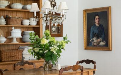
Here is how it looked originally…

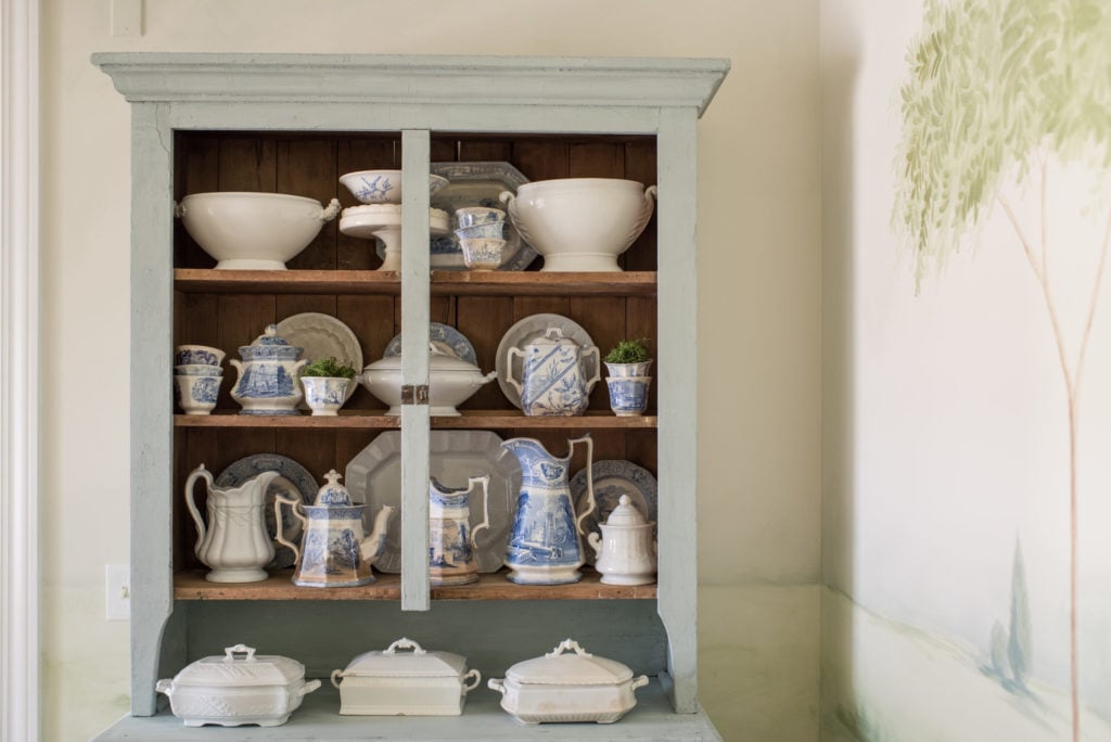
And how it looks now…

I know the blue paint on the cabinet looks like it’s old, but it had been repainted before I acquired it (I could see the roller marks) and I repainted it when I brought it home (to tone down the blue a little bit.) All of that to say I wouldn’t have painted it if the paint was original.
The new coat of paint is Shutter Gray mixed with some Lucketts Green and Linen MMS Milk Paint. It made a soft, blue/green/gray color that coordinated beautifully with the mural. I decided not to distress this piece at all, but left the milk paint unfinished, so it will wear over time and the color would be soft and have more variation. It still looks and feels like old paint on an old piece, but it’s freshened up a bit.

And the color is quieter and allows the mural to be the star.


I am now debating on painting the interior, but I’m planning on leaving it alone until I refinish the table and get some other things done in the room. I can then decide if I like the dark wood interior or if it looks too dark compared to everything else going on in the space.


Right now, I am leaning towards leaving it wood. It’s always easier to paint something than to “un-paint” it, so I’ll wait until I’m sure. Until I decide, I tidied up the shelves and I’m enjoying the new look.

In other dining room news, I broke down and ordered a reproduction mirror to hang over the buffet. I was hoping to find something antique or vintage, but I have been looking for a couple of months at antique malls, thrift stores, consignment shops and on craigslist and I’ve come up empty. The reproduction is just the shape and size I’ve been looking for, so hopefully it looks good in person! Of course, I’ll share it when it arrives…


88 Responses
I like the softer color and would definitely paint the wood. It looks unfinished to me. The mural is stunning!
The new color is so much better with the mural now! Love it! I would leave the inside unpainted, looks great as it is and gives a nice contrast for your dishes. Well done!
I agree, I do like the wood look and your dishes show up well too…
I like the new color; it is much more quiet. Maybe the interior will depend on what you do with the table?
I would like to refinish an old corner cabinet my Mother left me….I collect blue and white porcelain ware. ..I thought of painting it bright white with a cobalt blue interior. ..I saw something similar on years ago and it made the cobalt on the porcelain really pop…
Perhaps it would do the same for you if you painted the inside of yours the color the outside used to be
Love the hutch. Both ways! I am moving the end of the month. The wall mural gave me a great idea. All those freshly painted white walls are crying for help. Thanks for the inspiration.
I love the custom gray you painted the hutch! Gray can sometimes be so battleship-ish, and make a space feel harsh. This has enough blue green to soften it an it’s so pretty! I think though the blue trannsferware is competing with the dark wood interior. Maybe try all white ironstone before you make your mind up about whether to paint the interior or not!
I totally agree on dressing this hutch with ‘white only’ pieces. I am really distracted by the blue pieces now.
Your mural is FABULOUS!!!
Nice work! I notice that the dishes stand out more with the lighter color on the exterior, esp the transferware.
As soon as I saw this hutch painted gray my first thought was the inside needs painted. The gray looks great with the mural. Can’t wait for more transformations!
I’m a fan of the wood interior. It really showcases the ironstone collection.
I love the warmth of the unpainted interior, I think it keeps it from looking too sweet or cottage-y.
The cupboard is very pretty in either paint color and would take either in a heart beat, it’s nice to freshen it up for your new room though as well.
The paint looks wonderfully soft. I suppose the paint the inside or not to paint inside debate will depend on the rest of the wood in the room and the flow of the eye. Paint isn’t the only possibility though…
I’ve always liked fabric at the back of my shelves. Just wrap a piece of foamcore with your hot glued fabric of choice and pop it in. (You can also do side pieces.) Easy to try, easy to change. I like the little bit of texture it can add. I’m partial to linen look fabric myself, but I’ve also used burlap.
Thanks for the great fabric-over-foamcore idea, Mary! I have been thinking about ways to line my cardboard-backed shelving units and that may be the answer!
Paint color is really soft and pretty. MaryB’s idea about using fabric on foam core is good. Maybe even a textured grass cloth lining the inside of the cabinet? Would even the color out and soften it. I think that could look great with your blue and white pieces.
Love the grasscloth idea Karen. That would be beautiful.
I love the new color on your cabinet! It looks much softer and really blends well with your mural painting! I actually like the natural wood on the interior but like you said, you’ll get a better feel for what works once you refinish your table.
I wonder… do you have doilies or table runners in your stash that could line the wood and lighten it up a bit instead of painting? Or a really soft pale gingham fabric you could line the back with? Or or or, but it isn’t as permanent as paint?
I love your room! the mural is beautiful, so soft looking. I like the scale of the hutch and the new color, it is softer. Have you thought of backing the hutch with one of your beautiful new fabrics? Look forward daily to your posts.
I thought as I started to read this article that the repainting would result in a fantastic deep blue color to make the blue in the pottery “pop”. Repainting in this soft grey color is boring. Everything is grey these days thanks to HGTV. What ever happened to color?
The mural is beautiful. Please do not paint the natural wood in the backing of this piece of furniture. It’s beautiful as it is.
I agree with dc. I like the deeper blue but not the distressed/antiqued parts. The deeper blue picked up the blue of your pottery pieces displayed on the shelving. I would have repainted the hutch in the deeper blue and not distressed the item. The new soft grey color is too close to the colors used to paint your wall mural. The new color makes the hutch appear to “fade” into the corner.
The soft color is beautiful and looks better with the mural. I like the raw wood shelves, but I like other people’s suggestions of lining the BACK of the cupboard with a fabric! Lots of ideas here to try.
Everything looks rich now. Leave it the way it is. More paint on any of the furniture will take away from the original beauty.
NICE OF YOU TO SHARE WITH US. THANK YOU.
The new gray color gives the hutch a much softer, cleaner and updated look and it helps the piece from looking so primitive. It also blends nicely with the new mural but I agree with the above post that a deep navy color would have looked great as well with more contrast and “pop”.
That color is beautiful. I like the wood contrast but a contrasting painted interior would be pretty too. Whatever you choose I’m sure will be great. You seem to get it right all of the time?
I love the new color and please leave the inside as is…such a nice contrast and it pulls out the trunk on the tree in mural and the tabletop as well. That mural is just amazing…love, love, love!
Love it all! I get a lot of daily emails from various websites, but I look forward to yours the most!
Love the wood interior.
Yes, I like it. I think the blue detracted from the mural a bit and the grey-green competes less with the soft colors on the wall. As for the inside of the cupboard, I’m not sure how I feel like you. I think you’d have to paint it a color other than white so the ironstone stands out, which it does against he wood tone. I’ll wait and see what you decide and I’m sure I’ll love it!
As for the mural–to me it’s a marvelous accomplishment! You are such an amazing artist, Marian! Always something new and wonderful in your bag of tricks!
I love the new color and love the interior left natural wood. Especially if you keep the caned chairs. I like how those gray-brown tones play with the tree trunks on the mural.
Most of all, I’m so excited to see what you’ll do with the butler’s pantry! That’s one of my favorite features in your house, and it’s just been begging for a Marian treatment! It has been a delight watching your house come together over the months. I didn’t discover you until after you’d moved to this house, so have loved going back to see the other house too. I love how you’ve made this house so unique and so your own.
Very pretty…but I do miss that distressed handle. My fav?
Maybe if you do paint the interior, do your 50% color trick with the color on the outside but in half the strength. I know you used 3 diff. colors to achieve it, but you probably could figure it out.
I love the original color best, the gray makes the cabinet disappear. Everything is gray anymore, the popular color for a little while now. I love the mural, it looks amazing.
Nice match with the color -it needed a new dress to wear!!!
I’ll probably get poopooed for this suggestion but if it were my piece, I would remove the center bar seeing as without the doors, it serves little purpose other than to interfere with the display of your beautiful pieces and as the piece is not intact currently, you would not be taking away from the value. I think that without the center bar, the wood interior would appear lighter and you may be happier to leave it unpainted. Just my opinion….
Just what I was thinking about the center bar and the wood interior!
Love the new color, Marian, …. it really does quiet the room in the best possible way. Beautiful!
I think removing the center bar would cause the shelves to say in the middle over time, with the weight of the dishes. We did 3′ long shelves in a mudroom closet just a few years ago, and they’re sagging with less weight than this. Maybe pretty wooden brackets under the middle of the shelves would help, if she did in fact remove the center bar.
Beautiful color Marian!
Love the new paint color of the hutch and the mural is just exquisite!!! You do amazing work!
Beautiful new color!
Looks much better painted now, I would paint the inside wood also.
I totally agree with Cher, the center piece has no function at all and could be removed. It takes away from the displayed pottery. This is a great piece, and I love the new color
The transformation is beautiful.
So glad you chose painting the hutch over selling it. The color looks very good with your mural. The inside of the hutch would look great ?? d with just a shade darker than the exterior. The natural wood is nice but the dishes in the back get lost. Good luck
The new color is beautiful on the hutch and it seems so much more your style. It’s been interesting to watch you in your new place. You do such a good job.
The new softer color blends so much better with your new home. Your style appears to be a bit more ‘formal’ in this new home making distressed paint look a bit out of place. The mural is just AMAZING and I am so impressed with your painting ability coming from especially a brief period of time. You have amazing talents. As for the hutch’s inside, it would really be lovely painted as well.
I liked the old color but really like the new one! I use poster tack to hang bead board wallpaper in the back of my cabinets that I don’t want to paint. That way I have the option to change it back to wood or change it to another wallpaper if I feel like I need a change! It’s a fast easy non commitment way to try a change out or to not damage an antique piece…just an idea!
I think you made the right choice with painting it the lighter color. I agree it was too primitive before for the new home/room. Great new color!!
The interior looks dark to me. If you want it lighter but don’t want to go too cottage-like by painting it, how about using a beautiful wallpaper inside? I used a lovely blue & white floral WP in my hutch topper which added lightness and just the right formality for the room without being serious. Perhaps a subtle toile.
Marian, with the repaint it now looks like part of the mural!!!! Amazing what one little coat of paint can do for an item, isn’t it!
Your trained eye has done it again!
The soft color(s) you chose is very elegant and makes this wonderful piece partnered with your room/mural. I think you’ve also chosen wisely to “live” with the natural wood on the shelves for a while. You can always paint later!
Masterful work!
How beautiful! I would be clueless on the paint vs wood options. On the one hand, the raw wood ties in with the tree and the tabletop…but I can see paint added also…but would paint cause the furniture to “disappear”…LOL. Which is why you are the artist/decorator and I am not! Either way, I know you will make it look beautiful!
Did you strip or sand down your hutch or did you paint on top of the blue?
Nope, I just painted right over it.
What a beautiful curated color. It is the perfect contrast with the mural. Can you provide rough measurements of the color mix? Shutter gray:Luckett’s:Linen?
I would guess it was about 2/3 Shutter Gray, 1/6 Lucketts Green, and 1/6 Linen. Just tweak the ratios from there.
I love the contrast on the inside of the cupboard. The mural is beautiful
Love the piece painted so softly to combine with the beautiful mural. When you look at the side view, the wood interior makes the trunk and limbs of the tree “pop.” I love both the furniture and the mural. If it were painted dark, I think I would feel differently. Since it is wood, it is a softer color and contrast. Thank you for showing all the changes and thoughts you have. I feel included.
I like the new color much better!
I absolutely LOVED the blue it was before. But, you are right. The new color blends much better in the dining room with that fabulous mural. I look forward to seeing each new thing you do to your house!
Marion,
I have a stepback that is almost identical to yours, save the drawers. I have milk painted it about five times, all different colors. I love this new color you created and would like to do the same on my piece. Would you be willing to share the formula of the three colors. It’s just beautiful and this color would look so much better than the red It’s painted now.
Thank you so much.
I didn’t measure it, but I would guess it’s about 2/3 Shutter Gray, 1/6 Lucketts Green, and 1/6 Linen. Start with that and then tweak it if you want it lighter, more gray, or more green.
Oh my!! So much better!! Soft beautiful color – so soothing… LOVE IT!!
It looks absolutely beautiful this color!
What a difference a little paint can make!!!
So glad I found you years ago!!!
You keep me motivated to do things in my home I would never do!!!?
I definitely liked the original color better, would have repainted it a similar color to even it out. New color does look washed out, I liked the way the darker blue contrasted and brought out the blue in the mural plus the dishes.
Love the new color! I would leave the natural wood in the inside tho. I like the contrast with the new color and your dish ware. Amazing mural too!!
I loved that piece so much in its “before” state and really hesitated to get on board with the idea of painting it. I thought it should have maybe just been moved to another room. That said, you absolutely made the right call in painting it, and that new color could not be more lovely, or perfect for the room. It’s an amazing transformation!
I love the softness of the painted cabinet – just perfect! I’d leave the interior alone – I like the warmth of the wood and it highlights your dishes beautifully. Perfection!
I join the chorus and say YES it looks just perfect with everything around.
I absolutely love it!! It looks like a completely different cupboard!! It looks stunningly beautiful with the new walls, but I feel that the stained interior is perfectly calling the eye back to say, look at what’s inside. I felt the previous color was detracting from the beautiful soft blues of the items inside. I just think you nailed it, Marian. Last year, we renovated our diningroom and I had a huge stained bookcase that I showcased blue and white dishes in. I had painted the sides white, but covered the back with some ticking wallpaper. I need to repaint the side walls a different color, which meant the wallpaper needed to go. The back boards were slatted side to side and there were some gaps. I decided to go with it and left it raw. Some of the boards even had old inked advertising. I wasn’t sure if I would like it, but decided I could always paint the back white also if I wanted to later. It was a good call and today I love it that way. It dressed the room down just a tad. I have so enjoyed all your transformations and look forward to seeing the new island color and butler pantry………when you said “green” you had me. Your eye never fails you. Thank you for inspiring us all. Linda
I think the new color is beautiful and works so well with the room. Also, I really admire the way you are able to blend paints and come up with just the right color for everything. You are so talented!
your taste is evolving…as it should!
The mural is so lovely! You did a great job! I love the way you just jump right in 😀
The hutch looks softer now and I’m really enjoying all the wonderful suggestions.
I’m reminded of two very similar hutches my Grandmothers used back in the day. Everything was Country Blue but my Grandmother in the city, displayed dishes and tried to make things look spiffy with Ducks & Geese & Hearts & Ribbons & Baskets & Wreaths.
My Grandmother in the country, had the real Farmhouse look that was totally utilitarian, simple & making use of everything you had. Her hutch was on the large enclosed back porch and displayed her collection of Vegetables & Homemade Pickles in Mason Jars.
Love the mural. I really liked the blue before but this colour does look really lovely with the mural. The mural and the cupboard “play well” together. I would leave the inside unpainted. If you leave the inside the natural wood, you will have more options for displays inside. I don’t think the blue dishes would look as good sitting directly on shelves painted the same colour as the outside. …just my opinion. Besides, natural wood mixed within the same piece as something painted is really in right now.
Love the piece in all colors! Particularly love the new shade and am anxious to try it on some dining chairs for my daughter’s apartment.
I love the soft blue! I was wondering what did you have to do to repaint the cabinet?
I also have a cabinet that I painted 5 years ago with your paint. I would like to repaint it and use another color milk paint. Should I sand it pretty good before I repaint?
Well I didn’t think it could get any better but it sure did ~ you have such soft, gentle eye. Very nice work
I like the back unfinished! It gives some warmth to the hutch. Very Miss Mustard Seed!
It’s so funny how we all react in different ways to the same décor change. I love the new color on its own, but just adored how the bright blue served as an accent for the entire room. . I think the piece fades into the room as well as the wall mural. Everything now is in the same shadings while before the piece was a nice pop of color and showcased the actual piece of furniture. The “before” seemed very reminiscent of the look you see in English or French country manor homes. But, now you do, indeed, have a serene and harmonious dining area. Enjoy!
I love the new color and it doesn’t compete with the mural
I like the layout and layout in this room. Thank you for sharing.
Beautiful job as always Marian! I love this softer blue green paint shade with the ethereal, pastoral tone that you set with your wall mural. Very well done. You’re such a wonderfully talented lady! I enjoy following along with all your progress with your Minnesota home!
Looks beautiful & updated. I’d really like to see an old sign or basket above the hutch for more warmth.
I enjoyed reading all the comments. I like the original dark wood back, the wood tones connect to the table. It’s also a reminder that this is an old piece, painting it would make it feel like something you could buy new today-nothing special or unique. At first, I liked the idea of taking the center post out but again I like that it’s original & part of it’s character. I love that you are updating your pieces to fit the style of your new home and not replacing them.
Your walls are stunning! The mural really adds your personal touch, and all your recent painting has really honed your skills. The muted tones add color but don’t distract from the whole.
I personally think the interior wood of the hutch plays nicely with your table top. Its amazing how the colors of these two very different pieces compliment each other.
However, after living with all the changes for awhile, you will know if it feels right to you. Really lovely room. Bravo!
I have read through other blogs, but they are cumbersome and confusing more than your post. I hope you continue to have such quality articles to share with everyone! I believe a lot of people will be surprised to read this article!
A great blogs i have been ever read, I have read various blogs but i reallu admire with you.
Very helpful article, Thank you for sharing. I love you
verry nice, thank you the posst.
Great recipe, I have successfully made my child bring it to school, the kids really like it. thank you very much