
Notice anything different? I’m sure you do because my site got a complete overhaul!
My business has changed quite a bit over the past few years and it was time for the website, blog, and online shop to reflect those changes. In addition, I wanted to make it easier to navigate all of the content on the site (there are over 3500 blog posts, an online shop, art courses, resource pages, home tours, and we’ll be adding more. My hope is that readers will be able to quickly find the things of most interest. We’ve been working on the new site for a few months and it’s finally here! “We” includes me, Heidi (my assistant and graphic/web designer), and my “tech people” who manage the technical aspects of my site along with the hosting.
Since we just launched, there will be some housekeeping and tweaking that needs to be done, so please shower us with grace if something looks a little wonky or isn’t working properly. We have a long list of things to address and we’ll be fixing it all over the next week or so. (That includes better navigation on the blog home and post pages.)

Aside from the focus of my business shifting from selling antiques and refinishing furniture, there are a few other reasons it was time for a new site. First of all, I wanted to be able to have a nice online shop. The previous design was really made to be a blog, not a site to host online art classes and function as an online store. This new site is designed to function in all of those ways. I’m excited about how it will make things easier to find (like your digital shopping cart) and it will allow me to continue to add new classes, have more sales, and continue to adapt the site as my business grows and changes.
A few tips… The site is now set up as a website, so the blog is just a part of that website instead of being the home page. To get to the blog, click “blog” at the top navbar. If ever you want to get back to the home page, click the Miss Mustard Seed logo or “home” on the navbar. If you’re trying to login into your account to take an art class (free or paid), then go to the home page and click “account” at the top right.
It’ll take a little getting used to for all of us, but I think it’s an upgrade and I’m so happy with how pretty it is.
While we’re talking about new things, I wanted to let you know that I have added a few new prints to my Society6 shop. I’ve added my latest still life pears…

This scruffy cow portrait…

And my latest cow portrait…

The original (9 x 12 on oil-primed linen panel) will be available in the next sale.


28 Responses
Have you ever considered painting a Scottish Highland cow or coo as I would have said it if I were still living there.? I think it would make a fabulous addition to your cow paintings.
Yes! I would love that, also!
Yes, please they are beautiful animals!
The new website is great!! Easy to navigate on PC. Did not see any glaring errors. Only comment is that the pictures in this post are HUGE. For example the cows picks are larger than my whole screen. Yet the copy size is fine.
Site loaded ok on my tablet. Again the cows are life size!! 🙂 Popups are annoying.
. Great job to your team!!!
Geesh! Meant to say “..cows are larger…”
Excited for you and your business as it grows and changes. Congratulations!
I was doing a search through missmustardseed.com, looking for furniture ideas. I’m not sure if I just happened upon the blog as the new website was being launched, but I could not easily navigate the menus and found the font and placement (to each item on the menus, both the main menu at the top as well as the newer drop down menu) quite confusing. Again, it may just have been a glitch or poor timing or too much internet exploring on a cell phone…but there you have it, for what it’s worth.
Thanks! I appreciate that. We will be making some updating to the navigation, but some of it might just take some getting used to, since it’s different than the last site. We’ll continually make adjustments and improvements, though, to try to make things easier to find.
Hi Marian,
I think the new concept overall is good at organising the content. The new look at first glance on the main site home page feels a little colder/harder in some ways, maybe the darker blues, but as you scroll down & see the warmer wood tones in the photos it balances out.
I’m a web designer & found a few things that need tweaking to pass on to your web designer – I’m viewing on a desk top.
Your right of page Hello intro, the READ MORE link doesn’t work – no link.
If I land on the blog page as I did from your email it isn’t obvious straight away that the blog menu in the blue strip relates to the blog. Going from the main site home page to the blog it does but not everyone will arrive on the blog that way.
No main Home page link in the menu on non blog pages – clicking the logo gets you back there but not all readers know you can do that.
The blog menu is left hand of the page but all other menus are right hand – this lacks continuity to me, but maybe the intent was to differentiate the blog from the rest of the site?
Some of the images are fairly heavy & large in file size & dimensions – the home tour pages took ages to load for me as I’m in rural Australia so internet is OK but not at city speeds. I don’t think the photos need to be so big – ones I tested were in the 600+kb size, would be better to bring that down to improve page load speed.
Lastly your email was devoid of any photos.
Can’t comment on pop ups someone else mentioned as I have an ad blocker installed – I do recall your last site though had loads of adverts so hopefully this new one is better. I try to avoid pop ups on my sites as so many people click them away without even reading them.
I do think the new everything art, everything business etc is a good idea – it does make it easy for people interested in a certain area to find content that interests them.
Hope that is helpful – change can be hard & it takes time for readers familiar with the previous site to sometimes warm up to the new way of doing things, but overall I think it’s a good change & was a huge job no doubt. 🙂
Thanks! I appreciate the feedback. Several of the things you mentioned were already on my to-do list. Lots of tweaks to be done!
New website for me shows two Mac bars, can’t attach anything here to show you. Pop ups are super annoying when on a phone because they consume so much space. I realise ad sponsorship is an opportunity for people with websites but sheesh it’s a big turn off. Otherwise the site design is really clean and tidy and easy to navigate.
I’m not seeing pop-ups on my end, so I’m not sure what you’re seeing. I shouldn’t have any pop-up ads on my site. You can e-mail me a screenshot if something isn’t looking right. marian@missmustardseed.com
I noticed the 2 standing rabbits with the basket on it’s back. Are they for sale? I would love to purchase just one. Please let me know. I am liking your new website.
I sold them a few years ago! I don’t know if they are available any longer, but I’m not currently doing retail. They are so sweet, though.
Do you possibly remember the source where you obtained the rabbit? Thank you for any information you can provide. I have so enjoyed your blog. Especially the upholstery and painting furniture.
I bought them from a wholesale company called HomArt. If you own a business, you can open an account with them and see if they still carry them.
Thank you so much, Marian!
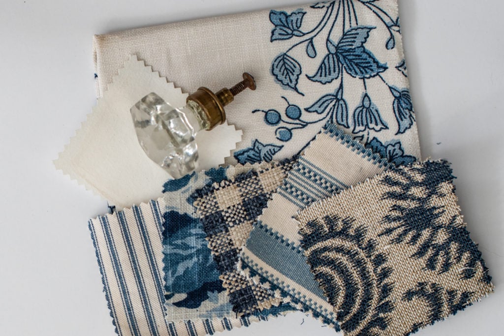
I love the new look to your site and the material at the top is something I am very interested in. It’s beautiful!!!! I’m excited to search more in this site.
Thanks for putting the reply button on the right side. It helps us lefthanded people from hitting when scrolling on the cellphone.
Love the new site! Hate/ LOATHE all the ads! The pop ups especially, because they sometimes cover content.
I am not seeing those pop-ups, but a few people have mentioned them. Are you seeing them on a mobile device or computer?
I like the clarity of the navigation. Agree with the other poster that one needs to scroll down to find your signature warmth and aesthetic. For me, I find the headings font is too busy—and worse when in all caps. I know how much work it took to revamp the blog! Hope my comments are meant as honest feedback a from long-time fan.
Yes! I agree about the font and that is on my list to change in some places. It doesn’t work everywhere we’re using it.
I’m thrilled that I can easily find that shopping cart now! I had an original in my cart but could never figure out how to check out, this will make it much easier, great idea! Also, I looked around a bit and I don’t think that I had ever seen the cover of your new book before, I must have missed that in stories, I pre-ordered my copy right away.
Yes! We have a shopping cart now! And yes, I’ll be sharing about my book this week.
The pop-up ads are the worst, at times they cover most of the laptop screen, and I agree with the other comments about the size of the photos.
I can’t wait to familiarize myself with the new layout – it looks great so far!
Congratulations on accomplishing what must have been an enormous task! The new site looks great! As with any large complicated project, there will be tweaks along the way. I’m looking forward to exploring more 🙂
I LOVE THE BLACK AND WHITE COW PAINTING! I don’t know why but lately I have been loving cow portraits! He is so adorable! Do you know how much he will be?