
I started painting with oils over seven years ago (in the fall of 2017), and my palette has evolved over that time. I think this evolution is a natural part of the process of finding oneself as an artist. Being one who loves color, paint, and trying out new art supplies, I was quick to buy way more colors than I needed! In addition to buying colors I was curious to try, I bought any colors recommended in books and by artists teaching online classes. I think it’s a natural tendency to think that if you use the same tools and colors as Sargent, Payne, or Seago, perhaps you’ll paint like them. I felt like that to some extent, but then I read a line in a book that was a great reminder that often a simple, limited palette is best. The author pleaded with the reader not to buy a hundred different colors, which is expensive and entirely unnecessary, but to buy just a few and learn to use them well.
I do still love testing out different colors to see if I want to use them for certain subjects or to add them to my regular palette, but I pretty much stick to the palette of colors I’ve been using for a couple of years. It’s simple, it’s less expensive because I can buy large tubes of the colors I use the most, and I’m not constantly trying to learn a new palette of colors. I know what my colors do, which makes mixing easier.
There are almost as many approaches to putting a palette together as available tubes of paint colors. Some use all earth/natural pigments. Some use palettes specific to a master, like the Zorn palette. Some select one warm and one cool of each color. (For example, a warm yellow and cool yellow, warm blue and cool blue, etc.) Some use a strict primary palette plus white. As with most things art, there isn’t a right or wrong philosophy. There is just what is right for you.
I started pretty early on with colors traditionally on an Impressionist Artist’s palette – Ultramarine Blue, Burnt Sienna, and Yellow Ochre. While I’ve tried out Cobalt Blue, Transparent Oxide Red, and Yellow Oxide, I keep coming back to my staple colors. I know exactly what they do and, if I only had to use three colors, those would be it. I can make any color I need except bright greens (I need a stronger yellow for that) and bright red. For that reason, I’ve added other colors to the palette over the years to test out, and this is where I’ve landed.
If you’re brand new to oil paints, you can find the palette I recommend for beginners in THIS POST. All colors can be for beginners and professionals alike, but I like to suggest a limited, less expensive palette for those who are just learning. This gives you time to get to know the paint and then explore more colors once you feel confident with mixing.

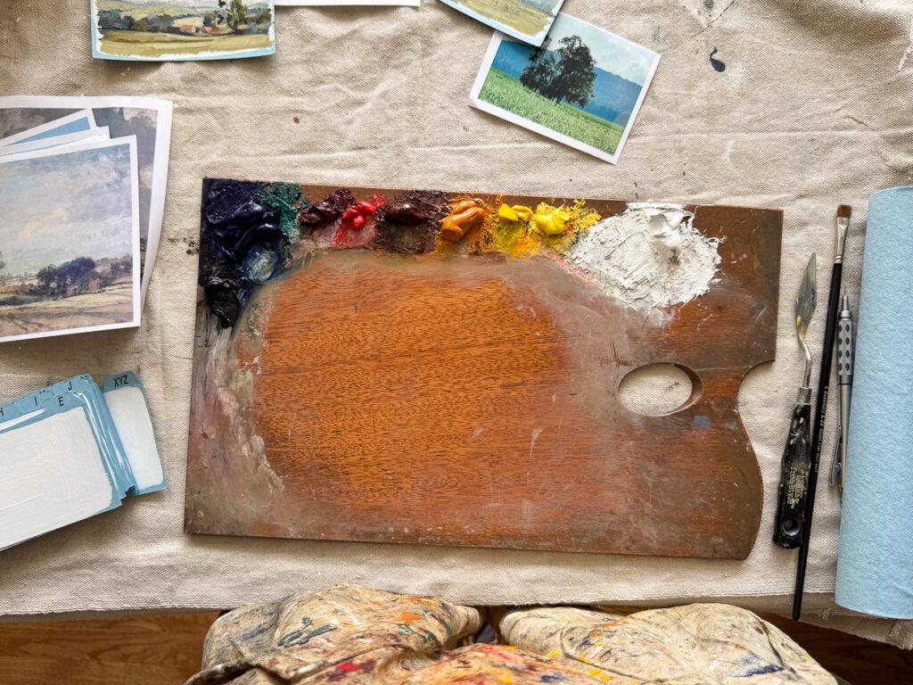
This is my typical palette. It has black and blue, three reds, three yellows, and a white.
Ivory Black (Michael Harding) – I only use this color for portraits, so I can get pure black in the shadows on black fur, and I use it for the pupils, eye line, inside the nose, etc. I do mix Ultramarine Blue and Burnt Sienna to get a nice black, but it’s not quite as black as Ivory Black. I don’t add Ivory Black to my palette when painting still life and landscapes, though, so this one comes and goes as I need it.
Ultramarine Blue (Michael Harding) – Ultramarine blue is a staple, and I don’t know if I’ve ever not had it on my palette! I use it to cool down reds, to tone browns and oranges, and to make purples and greens by adding either reds or yellows.
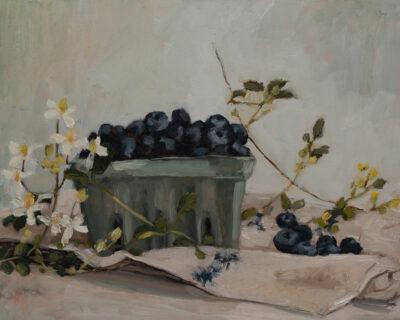
Rose Madder (Michael Harding) – I used to use Alizarin Crimson, but I switched to Rose Madder a couple of years ago after reading Carlson’s Guide to Landscape Painting. In the section on color, he said he does not recommend Alizarin Crimson because, “It is an aniline color and a too-free use of it causes it to ‘bleed’ or saturate surrounding tones.” Instead, he suggested Rose Madder, and I have fallen in love with that color. It’s a gentle pinkish red that’s perfect for noses, around eyes, and for adding pinkish tones in a pet portrait. I also use it for touches of purple and pink in clouds and for some fruit in still life paintings.
Chinese Vermillion Genuine (Michael Harding) – Chinese Vermillion is an expensive pigment, but I just use a tiny bit here and there, so a small tube lasts me about a year. It is a wonderful red that isn’t too aggressive, making it perfect for portraits. I don’t use it for landscapes and rarely for still life, so it’s mostly on my palette for portraits.
Burnt Sienna (Winsor Newton) – This is another workhorse for me! I have tried many different brands, and they lean too red or aren’t transparent enough. W&N Burnt Sienna is transparent, jewel-like, and leans orange, so it balances out Ultramarine perfectly to make a neutral black and grays. It can also be mixed to make flesh tones, browns, and can even read red if I don’t have Vermillion on my palette at the time. I use Burnt Sienna mixed with Ultramarine for sketching and for toning panels. I would be at a loss without this color on my palette!
Yellow Ochre Deep (Michael Harding) – I’ve tried several variations of yellow ochre, but one has become my favorite. It has good tinting strength, but it’s not overpowering. I use it mixed with ultramarine for making muted olive yellows in a landscape, to add warmth to whites, and almost always add it to my blues to help them lean a bit more green. Like Burnt Sienna, this is a must-have for me.
Cadmium Yellow (Michael Harding or Gamblin) – Cadmium yellow is a bright, sunny yellow that I use on my palette to get greens that are more saturated and sunlit. I’ll add it to white when I want that perfect sunny white. I also use it for lemons and any time I need a punchy yellow
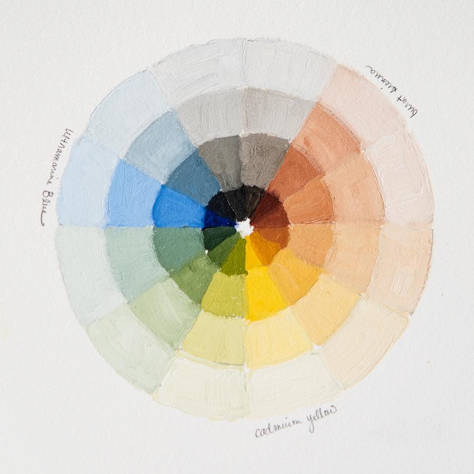
Genuine Naples Yellow Light (Michael Harding) – This color was introduced to me by the portrait artist Jen Gennari and, even though it’s an expensive pigment, I find it hard not to keep on my palette. It is a wonderful sunny yellow, but it is very gentle, so it’s a great way to lighten colors without adding white. I use it quite a bit in portraits and sometimes in landscapes and still life when I need a gentle, light yellow.
Flake White Replacement (Gamblin) – I have tried a lot of different whites over the years and have become decidedly anti-Titanium White. It’s just too opaque and makes colors too chalky. I like Lead White, Cremnitz White, and Flake White, but they all contain lead. I do have and use them sometimes, but Flake WHite Replacement is my go-to. It’s inexpensive, and it’s a gentle white.
Those are the colors I consistently have on my palette, but I do add a few now and then for convenience or for specific subjects.
Bice (Varasi) – This is a wonderful mid-tone blue that is a perfect convenience color for skies. I still mix it, but it gets me much closer to the sky color I like than Ultramarine. I’ll put it on my palette for landscape painting when I want to save a bit of time.
Foundation Greenish (Holbein) – This is another convenience color that’s a light gray/green. It’s similar to the color I mix for many of the backgrounds in my still paintings, so I’ll use it to save time and mixing.
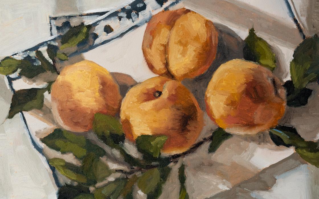
Cadmium Orange (Michael Harding) – I’ll pull this color out when I’m painting oranges and I’ll sometimes use it to mix with Ultramarine in landscape. Most of the time, though, I add it for specific orange subjects.
Pyrrole Red (Michael Harding) – This is a punchy, highly pigmented red that I’ll use when I need a bright red, like painting cherries, red apples, or strawberries.
Veridian (Michael Harding) – I almost always mix my own greens, but I’ll sometimes add Veridian to my palette if I need a specific green that I can’t get with the colors typically on my palette. This is pretty rare, but I do keep a tube on hand just in case.
For those who want a video tour of my palette, here you go…
While I think there is a lot of value in keeping a consistent palette, I do think a painter’s palette is a dynamic thing that can always evolve. That’s a part of the exciting thing about being an artist! Other than following guidelines to keep you safe, there really aren’t any rules or boundaries. Your palette and how you use it are completely up to you!
Let me know if you have any questions or requests for future fine art posts. You can find more posts and tutorials about oil painting HERE.


7 Responses
I love the explanations, thank you. Rose madder is one of my favorite colors.
How do you store leftover paints when you have completed a painting?
Wonderful post. Could you do a similar explanation on why you select the brushes you use, much appreciated!
Good information for any beginning artist, but Just to mention…though rose madder is a lovely color, it is also fugitive, meaning that it will fade. Because I hope my work survives a number of years, I have turned to quinacradone rose, as it is more permanent, and gives me the same look. I am always concerned about the light-fastness of my paints. I have never heard before of Michael Harding paints. I should check them out.
Meant to mention, I would also encourage beginners to buy Artist Quality paints, as there is a big difference between that and Student quality. Lots more pigment in the mix means more beautiful paintings.
I meant to mention—I would encourage beginners to buy Artist Quality paints to begin with rather than Student Grade. There is a reason for the difference in them. A few excellent quality tubes is better than a bunch of lesser quality which will later be discarded.
Veridian green, Vincent van Gogh’s favorite green. I learned it by looking at old masters, Rembrandt van Rijn, old Italian masters, Bellini, Da Vinci, Michelangelo, and Raphael. And all the impressionists, the rounded colours of Renoir, Monet’s refusal of black, Degas sketches in pastel, Pisarro’s deep blue shadows, and Gauguin’s daring use of colour. Now, my basic education was in art, so many things were handed to me. You find that all on your own. I love Royal Talens Rembrandt oil paint. And aquarel. The pigments are so colour solid.
Thanks so much for this post. I would love to hear what surfaces you use and how you varnish.
nice