
It’s time to say hello to another color in our new European line for Miss Mustard Seed’s Milk Paint – Arabesque. (You already met Bergere in October and four more are coming soon…)

I’m not generally what you’d call a “pink person”, so this color was harder for me to create than others, but what we arrived at just might convince me to use more pink. It’s a soft, dusty pink with lots of warmth to it, so it’s not sweet or babyish. It’s sophisticated and has a neutral quality about it, even though it’s pink.

Of course, it’s named Arabesque after the ballet move.
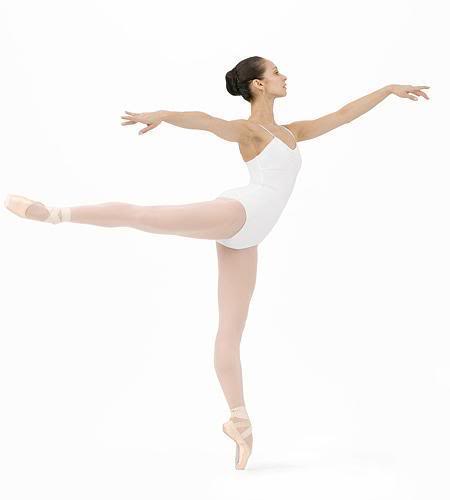
(via dance.net)
As I was thinking of color names for the pink, I immediately thought of ballet and knew I wanted to use one of the French ballet terms. Arabesque just seemed to fit…graceful, feminine, seemingly effortless. Notice how Arabesque is almost the exact color of her tights?
So, here is how the dresser looked before…

It wasn’t bad at all, just a little worse for wear. I love the trim detail on the upper drawers and around the knobs on the larger drawers. And, as always, I was smitten with the turned legs and little wheels.
I painted Arabesque in layers, without the bonding agent added. I love the variation in color that happened naturally.

The chipping happened perfectly as well. The dark wood showing through breaks up the pink and adds some dimension, showing off the fluting.
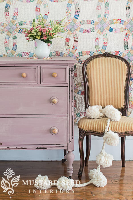

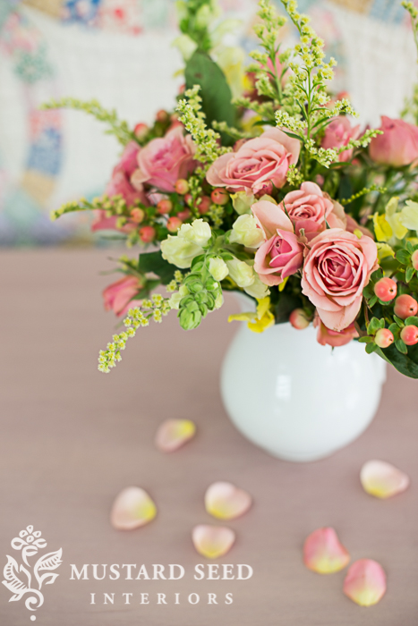
Kriste and I styled this piece with an antique wedding ring quilt (from my husband’s grandmother), an French chair (waiting to be recovered, but worked perfectly for this shoot), some fresh flowers from the grocery store and a felted wool garland from Anthropologie. The pinks, yellows, greens and wood tones all went together perfectly. The quilt was just hung temporarily with safety pins and the draping at the top initially bugged me. As we put everything else in place, the loose drape really worked and I left it as is. By dropping some rose petals, allowing the felt garland to trail to the floor and keeping the drape in the quilt, we creating a scene that is soft. Pretty, but casual.

The knobs are from Hobby Lobby. We liked the touch of yellow in the knobs, because it was interesting and broke up the pink. I originally tried painting the legs in Mustard Seed Yellow, but I just couldn’t do it. I love the dip-dyed thing that is popular now, but it’s just not me. It’s bit too modern and felt inauthentic. I’ll just enjoy watching others do it.

I finished this piece with a light sanding and one coat of Furniture Wax.


We styled this dresser another way with glass knobs and I’ll share that look tomorrow along with Arabeque pieces from a couple other furniture gals. This piece is for sale for $285, so send me an e-mail if you’re interested!
The European color line will be available in mid-January at our European MMSMP retailer locations and will be available on a limited basis in the US & Canada. (“Limited” meaning that we are not requiring our US/Canadian retailers to carry it, but the colors are available for them to order. Just contact your local retailer to make sure they have what you want.)


26 Responses
As a former ballerina, I think you picked a great name for the color. 🙂
I’m not really into pink either but this is very sophisticated and muted Marian, well done and I love how you have painted the dresser and the photo styling. I’m sure it will sell quickly for you
cheers Fiona
Another “not into pink” person but this I like! Pretty soft color, I picture it on pieces in a summer lake cottage.
This would really look pretty in a little girls room. Love the name!
What a gorgeous color. Even though I don’t decorate with pink or lavender they are my two favorite colors. I think this new color is a bit of both, I love it. One day when I get to design my studio those colors will be all over it. I will definitely be using Arabesque.
Marian, you nailed it! That’s my kind of pink….not too sweet. It has just the right amount of grey cast. So chic looking with your French chair and quilt.
Flat-out flipping fabulous, Marian! Reminds me of a professional ballerina’s kitchen cabinets that I saw years ago. Pink, and I was surprised that I liked them. Such a soft, soothing color you created! Also, wishing you and your family a very Merry Christmas!
Stunning! What an elegant color to add to the collection. I am not a pink person either, but this would be so lovely paired with grays. Looking forward to seeing the other new color additions!
Oh! I love this color. I can’t wait until we can order it. I have a desk that I am going to paint with it.
Oh, my gosh! This color is truly gorgeous. The knobs are perfect. I am looking forward to seeing more of your European paint line, Miss Mustardseed!
Love the 1 photo before/after view!
Just lovely.
I am not a “pink person” either, but I can definitely see this dresser in a nursery or a little girl’s French country style room.
Gorgeous! Merry Christmas to you and yours!
Gorgeous color! Can you explain what you mean by layering? Did you use multiple colors? I love this and have the perfect dresser for it when it’s available in the US ! Thank you & Merry Christmas!
Yaaaay! I’m in love with this pink! I’m a ballet dancer and teacher and so of course I’m totally smitten with the name and the color. It’s literally the perfect shade of what I would call a ballet pink. And, I’m so excited to purchase this color and upscale a Craigslist dresser find for my baby girl that is due in one more week. Yaaaay for pink! Well done.
By the way, great picture of the dancer en Pointe that you included too. Perfect example of an arabesque for all those reading. 🙂
Oh, and I agree, thar the color is very close to the color of her tights. There is a slight peach-ness to the color of the pink, which is the dominant color of most Pointe shoes- called European Pink. And I spy just a whisper of that in your pink. Okay, I should stop commenting now! 🙂
I AM a pink person and it suits me to a T !! My monitor shows it has a lot of lavender to it! I was getting ready to paint something pink and now I will probably have to wait. Hurry up and get it stocked retailers!! Merry Christmas to you Marian and your boys, large and small! xoxo
LOVE the color……great addition….
very pretty! my little dancer and pink lover is going to like this color a lot!!!
On my screen it resembles a light mauve. Very pretty and a great addition. In the photos I love how the color of the chair brings in the yellow in the quilt. I always come here for staging ideas. 🙂
You know, I thought I really disliked pink as a colour for my home, but this is gorgeous. Well done.
Did you sand it before painting? Please let me know if you can!
Thanks!
Do you think the value of a antique piece of furniture goes down when it gets milk/chalk painted?
Also, is that one or two coats of Arabesque?
Thank you,
Tracey
“Big Admirer!”
It’s two coats of paint in this piece. As far as devaluing a piece, it really depends on the piece. Obviously, if it’s a fine antique in pristine condition, if would devalue it to paint it. If it’s just an old piece with imperfections, etc., it doesn’t.