
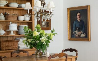
With everyone “going white” in home decor, do you feel a little like you’re getting lost in a sea of neutrals? There is a fine line between the boring blahs and wowing with whites. One of the keys is to add pops of color. The color doesn’t disrupt the white, it sets it off and gives your eye a place to land.

My bathroom was feeling a little one note with all of the neutrals. Almond, white,ironstone, Irish Cream, olive shells, and linen towels. It needed some pop to set it off and the hints of brown weren’t doing it.

In came eggs, an urn with bright green sprigs, fluffy towels, oval plates, and a painted tissue box – all in shades of aqua and blue.

If you’re moving towards the white look, don’t neglect color all together. Use it in the right way and in the right places and your whites and neutrals are going to look even better.


38 Responses
what a beautiful scale!!! are those real eggs?
I was just having those same sentiments about my family room. In my effort to lighten up the colors and go more neutral, I neglected my colorful accessories and that left the room "missing something". Thanks for the reminder. I'm searching my stash of treasures right now.
Love the addition of those greens and aquas – my all-time fave combination. I think that an injection of a little colour can work wonders, and still keep things fresh and clean. Great post as always! K xx
I agree. The little pops of color are a lovely addition!
I can't go without color. PERIOD
I am moving to whites, blacks and neutrals so that I can add whatever color I want and not be limited. I love so many colors and it will be fun to change out accessories to change the color!
I tried the white look but I just couldn't do it. I have to have color. Your words about white are so wise!
Have a great day.
Karen
Ladybug Creek
Love it!
I am not even attempting to go "white" but I admire others talents and tastes.
Becky K.
So true! I have been leaning to the all white look, but I just can't seem to go all the way. I guess it is just in me….color! So I did the same thing. I added pops of green/blue. I love those eggs and scale. Lisa~
I love your beautiful pictures ~ I was really thinking about just that thing yesterday because I want to change my home to creams ~
xoxo
Lori
Love your pops of color and texture. So funny that your last two posts relate to what I'm working on. New neutral paint in the dining room and plates to hang. I just put my first coat on last night and wow, I'm going to need some pops of color!
Londen
Well said. Whites can be soft and relaxing or they can be jarring. If you need to wear sunglasses in the room then that's a clue! 😉
Beachy gray blue is my absolute favourite accent colour, it goes so nice with white, cream, chocolate brown, black…I could go on!
XO
Lenore
What beautiful pictures. I do love the look of the "all white", but I agree that pops of color are good. Love white with chocolate and aqua!!
good advice Marion…blah is just that, blah….
This is the year I am learning to EMBRACE COLOR!
I like the look of white in everyone's home but I am a bold, warm color girl! Right now, white would stand out so much in my home. So guess I'm not in with the trend right now!!! That's okay, I just LOVE color!
Give me color!!! Lots of color and I will add touches of white! Ha!!
Such good advice…Thanks so much!
Hugs
SueAnn
Yep, green and aqua with lots of white…that does it for me!!
Beautiful vignettes and a wonderful post. I agree a room does need some color to contrast with the white. Thank you for your fine examples how to achieve that with accessories.
Deborah
Love it! what color paint did you use??
Love the pop of color, and i really love your old scale. It looks great…Kathy
While I love looking at the neutrals, and especially love how you do them, I am glad that you said that about color. I love how you are showing your colors with the neutrals, while keeping a fresh perspective with it all 🙂
I've begun to feel like I am on an alien planet because I currently am not in the 'white phase' PB look-alike decorating. Although my bedroom is shabby-chic, lots of roses, etc, the rest of my house is reds/golds/soft greens with touches of black. It works for me – my bedroom is my restful sanctuary and I love the colors in the rest of my house.
Pale blue is my new, favorite color. We drug a dresser home from the curb, and I painted it the palest of pale blues and distressed it. Love!
I love those eggs, can you believe that they don't know what robin egg's blue is over here?!
And that scale stole my heart. My love would have a fit if I a) put a kitchen scale in the bathroom, b) even brought a rusty scale like that into the house, and c) put eggs on top of it, in the bathroom!! but what does he know about vintage, home decor LOL I love it.
Love the pops of color. I so agree that it really makes everything pop. Seems like some rooms are just tooooooooo white. Pretty but not nearly as much as if they have a few plants or pieces or art with a touch of color. Hugs, Marty
I have too much color and I am wanting to lighten and neutralize. I love your style and always enjoy your posts. Keep up the good work!
I'm sure I violate more than one rule of design but I have some rooms that are neutral or white and others that are green, terracotta, yellow and a blue one soon! I think if you keep the intensity consistent it flows. Anyway, these are pretty pics and the color is so pretty against the white!
I've been changing every piece of furniture in my townhouse to white.. I have painted everything.. and also have been adding accent colors here and there.. your so right about 'too much white'… nice post
sandy
thewondersofdoing@blogspot.com
I have to agree with you on too much white. I'm loving all the little pops of color you've added to your bath.
Take Care, Carrie { the vintage wren }
BEAUTIFUL!!!!!! I love your posts and photos! Have a great weekend!
Bonnie
I saw your dining room post earlier today and wanted to make the comment about LOVING that you had the beautiful blue color in your room! I think I got distracted by my kids and didn't leave it, but, it was my exact thought…love the freshness of the crisp whites, but with pops of color…linking to you tomorrow my laundry room with some pops of aqua! http://www.threepixielane.blogspot.com
Love the post. Love the eggs. Well said.
My husband and I bought and gutted our first home. We did all the wood work in white with dark cherry floors. I have my neutrals mixed in with bold.
Love neutrals mixed in with bold color!
Love the way you decorate, you put a nice touch to everything.
I'm one of the few not going neutral (unless one counts yellow, blue, red, and green as neutrals. LOL).
I was neutrally 15 yrs ago. Now? Now I'm sunk knee deep in color and I am loving it. LOL
Also love the scale. Delish. 😉
You have no idea how much I love going through your blog.