
I’m getting things lined up to start “dining room mural take two.” I painted the mural in my last dining room with very little planning. I just had an idea in my head and used MMS Milk Paint and some acrylics that I had on hand. I was just going to throw the paint on the wall to see how it worked. It’s just paint after all and I could always paint over if it wasn’t working. I kept it very loose, drippy, watery, and light, so I was able to finish it in just a couple of days.

For this mural, I decided to use Farrow & Ball paints so there is cohesion with the paint colors (Light Blue and Card Room Green) used in adjoining rooms. I also like the idea of having a palette of colors instead of mixing my own colors. I’m sure some amount of mixing will still happen because I can’t help myself, but when I’m working on such a large scale it will be easier and more cohesive to use a set color palette. I think it will also help me to design a loose “paint by number” approach where specific colors live in specific areas instead of colors blending into each other.

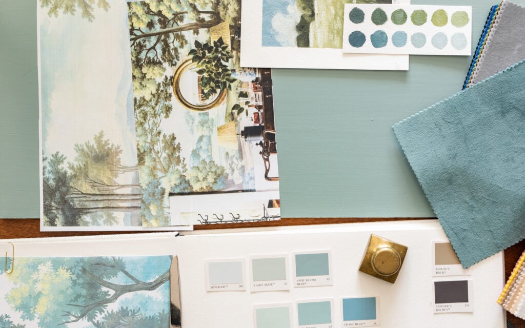
So, I spent some time with my Farrow & Ball paint decks and swatches to put together a palette. I started with colors I already had and then ones I liked that would bring something new to the palette. I was also considering values (lights, mid-tones, and dark), the colors I needed for specific subjects (like shadows on the tree trunks), and a range that would read monochromatic without being boring. Here is the palette of colors I am going to play with…

- Chine Green No. 35
- Calke Green No.34
- Card Room Green No. 79
- Green Smoke No. 37
- Olive No. 13
- Breakfast Room Green No. 81
- Cooking Apple Green No, 32
- Churlish Green No. 251
- Hay No. 37
- Skylight No. 205
- Light Blue No. 22
- Oval Room Blue No. 85
- Teresa’s Green No. 236
- Dix Blue No. 82
- Stone Blue No. 86
- Tanner’s Brown No. 255
- Mouse’s Back No. 40
I will use a pure white paint and create some off-whites using these colors.
The cool thing about these colors is that I naturally mix similar ones when I’m painting and making color swatches. I think I’ll be able to create a nice hybrid of my own style and the classic mural style I’m going for with these colors.

In addition to the paint, I’ll use a clear medium to extend the workability of the paint and water to thin it for the base layers. I’ll be figuring it out as I work, but I will make a video and take pictures so I can share the process. I’m also going to do some initial sketches prior to working on the walls and I’ll share those as well.

For now, it’s just been fun playing with color and dreaming about getting started on the mural. Of course, I still have painting and trim work to do first, but sometimes it’s hard to resist diving into the fun part…


15 Responses
Love, love the color selections. You really are a master of understanding all aspects of color.
Looks like you’ll be doing another landscape scene which, to me, will be calming against the other busy features in the room. Do you know which wall/s you’ll paint?
Also love the curtain color and velvet fabric vs the darker examples you showed. Totally agree that having ‘live’ samples of fabrics and paints in hand makes all the difference in making final decisions.
Can’t wait to see another Marian masterpiece!!
love love love …. your posts refresh me and make me smile 😉
How exciting for both you and your followers! I love the blues and greens together. I always thought your previous dining room was beautiful. Fun, fun, fun!
Can’t wait to see the process and the finished room! I have a feeling it’s going to be outstanding.
What a gift you have! Soooo looking forward to seeing the unveiling. Thank you for walking us through your process.
Golly gee – you are such a talent!!!! Can’t wait to see!
I am giddy with anticipation….I know it will be stunning, like nearly everything you do!!
And your generosity, sharing all the details with us, is astounding…gives hope for humanity…seriously! It will be returned to you, ten fold, I just know it.
Oh I’m so excited to watch this unfold. I want to do a mural up my stairs- I’m so lucky you’re figuring it all out for me! Thank you so much for sharing like you do!
Are you using the print you showed in your post? O
I love the colors you’ve selected for the mural. So soft, muted and peaceful. I think the drapery fabrics is gorgeous.
I love the light and airy feeling of your previous dining room. I have no doubt that your new dining room will be just as beautiful, a perfect escape for the imagination!
Marian,
Your mural is absolutely Beautiful
How exciting! Thanks for sharing this with us.
Love the color combinations- feels calming and soothing… can’t wait to see the finished project…
Hi Marian,
As a professional muralist and decorative painter, I can recommend using pre-mixed colours as this makes it much easier to maintain and touch up your mural in the future too.
We keep a sample book with all colours used on a particular project and its so much more efficient if they’re coded or pre-mixed colours we can easily have re-mixed when clients call us two years later, because they have moved a window, or changed some pictures around .
You just never know !
Gorgeous job !! I absolutely love your technique.