
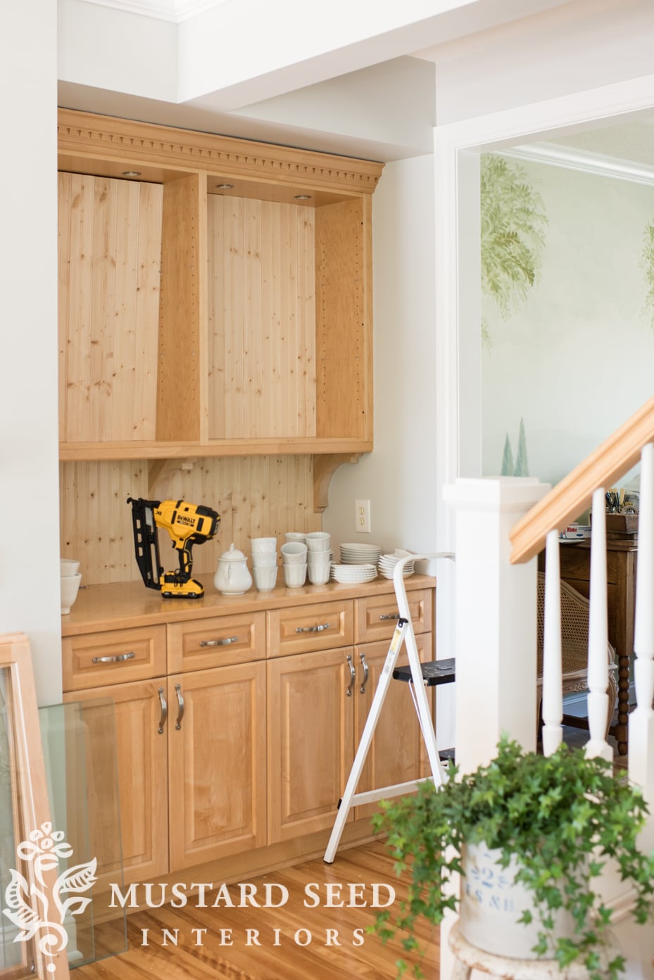
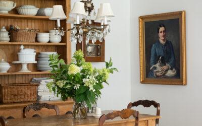
This week, I finally tackled the butler’s pantry! I don’t know what took me so long and it’s hard to believe it lasted as long as it did without being painted, but I do think my patience has improved with age and experience. I also painted a lot of cabinetry when I first moved in and I needed time to think about this space and how exactly I wanted to finish it. I finally could see it in my mind’s eye, so I bought the paint and materials and went for it.

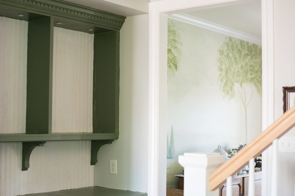
The main thing I wanted for the butler’s pantry (which sounds fancy, but it’s really just some cabinets between the kitchen eating area and the dining room) was to make it look like a piece of furniture, instead of just cabinets. I also wanted it to fit in better with my design aesthetic. Painting it all white would’ve been an obvious and easy choice (and not a bad one), but I wanted it to be a feature.
Originally, I had planned to remove the upper cabinets entirely and build something custom to replace it, making it look more like an old hutch that filled the entire niche, but Jeff talked me into scaling it back. I’m glad he did, because then I was able to work on it myself and have it done in just a few hours with a few materials.
So, the new plan was to remove the upper cabinet doors, replace the glass shelves with wood shelves, add bead board to the back of the shelves and backsplash, and add architectural detail with some simple corbels.
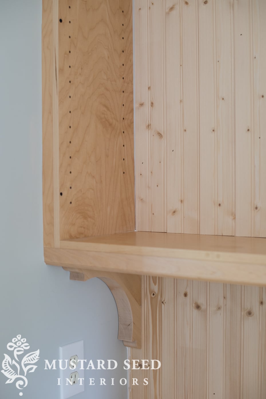
I bought four packages of and three of (affiliate links), and had 1″ MDF cut to the size of the shelves, all from Home Depot. I also used three scrap pieces of 2 x 4’s from our garage project as spacers under the cabinet. Our cabinets have a trim piece on the underside that hides under-cabinet lighting. It’s a nice feature, but it would’ve hidden the top part of the corbels if I had attached them directly to the underside of the cabinets. I used the 2 x 4 scraps to position them low enough, so they would be fully seen. It also gave me an easy way to install the corbels.
I inserted three 1 1/4″ wood screws through the top of the 2 x 4 scrap down into the corbel, attaching them together…

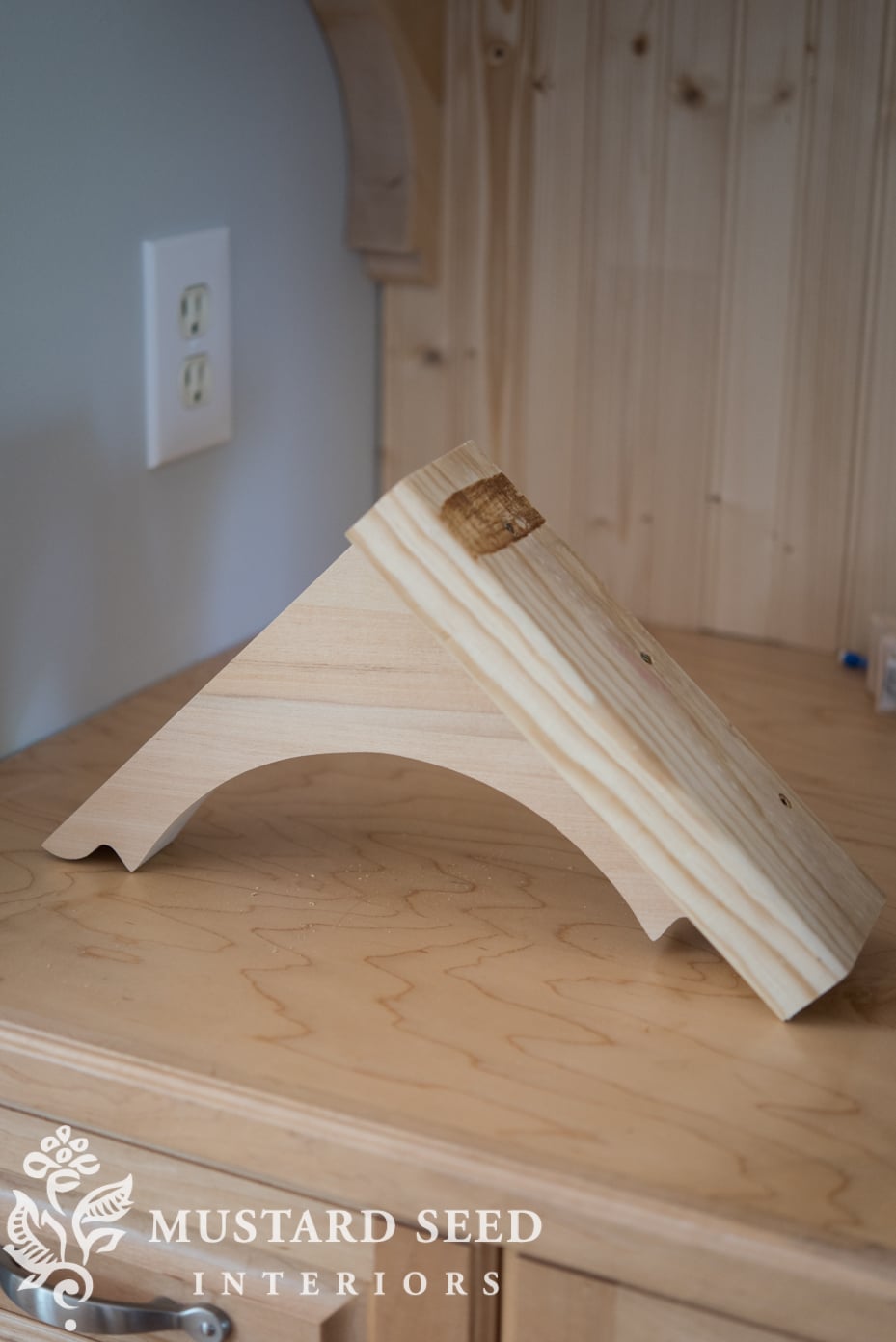
I then inserted more wood screws through the bottom of the 2 x 4 scrap up into the cabinet.

Once painted, it will all look cohesive. Do you see how the 2 x 4 positioned the corbels even with trim?

For backing, I used thin tongue and groove bead board planks and cut them to size on a chop saw (mitre saw). I dry fit all of them (meaning, put them in place without any nails) and then I inserted a few 1 1/4″ finish nails once everything was cut and fitted. I didn’t need a lot of nails, because the tongue and groove held all of the planks together.

Before painting, I filled in some of the seams with paintable trim caulk.

Once the caulk was dry, I lightly sanded and then primed everything with Zinsser Bullseye Primer. I was excited before the primer even went on, because it was looking so much more like a custom piece of furniture!

Once the primer dried, I applied the first coat of paint, which is the same paint I used on my kitchen island. It’s Advanced in a satin finish by Benjamin Moore and the color is a custom match to Boxwood from the MMS Milk Paint line.
Before I started painting, I had this idea to paint the bead board white and everything else green. To see if I liked the look, I painted everything green and left the bead board just primed.

A part of me liked it and how the white lightened up the green and accentuated the corbels. I was torn, though. My original vision was painting it all green, so it looked like one piece. Would the white chop it up too much? Would the white ironstone get lost on the white background? Would all green look too visually heavy and dark?
I was so torn, I even took a poll on instagram and over 70% of my followers who voted said to keep the bead board white. That’s how I was leaning, too.
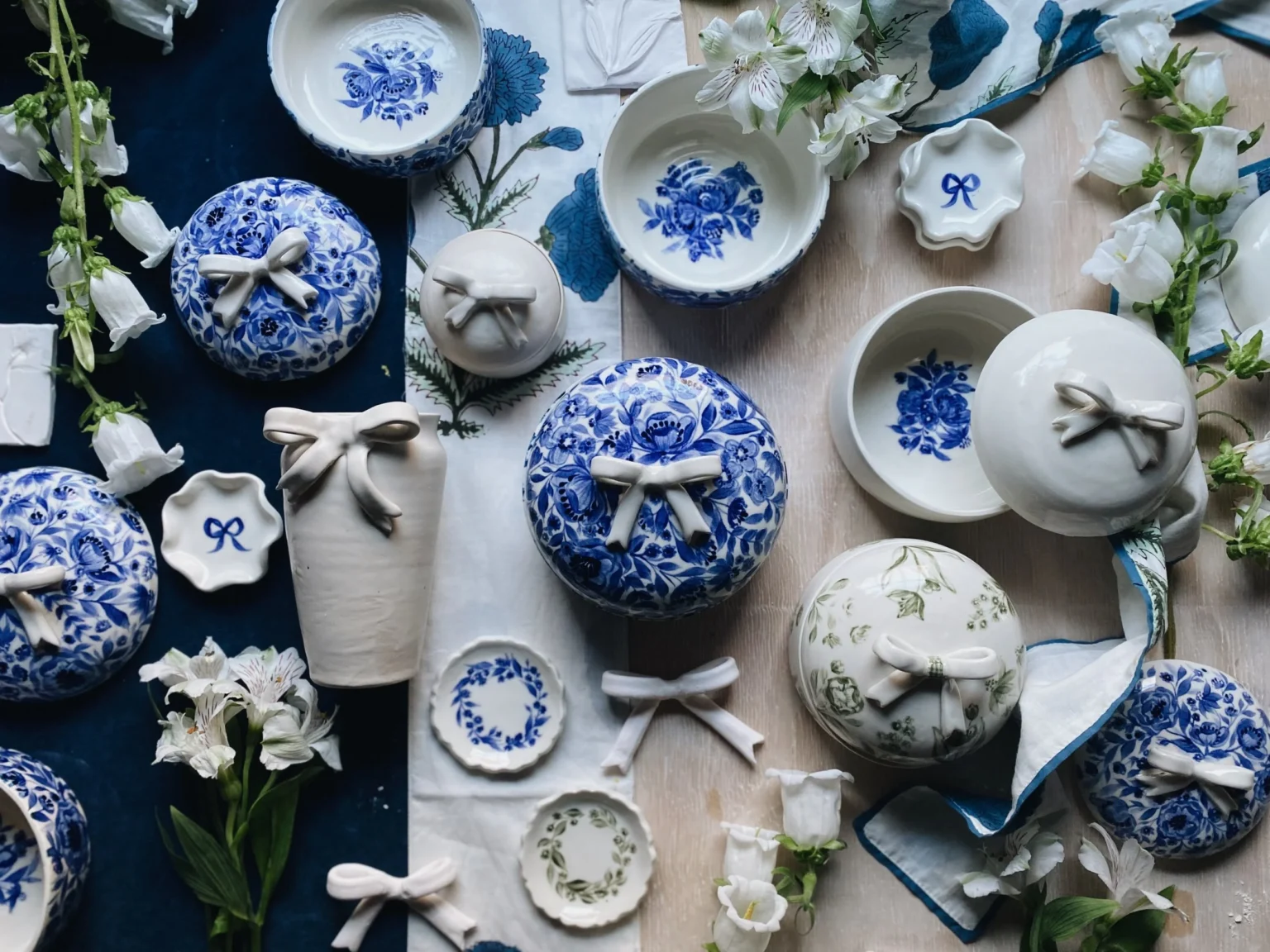
The next morning, I decided to play around with the space before breaking open the can of paint again. I used the doors to cover the shelves and backsplash and experimented with some different looks for the accessories… blue & white, all white, cutting boards, totes, linens, etc.

The decision became clear to me. The white would look too busy and disjointed and it didn’t really relate to anything else in the room. All green would be bold, but it would look more cohesive and it would tie into the island.

So, I went against the poll, followed my initial instinct. and painted it all green…

And it looks amazing.
I can’t wait to show you…


65 Responses
It does look amazing!!!
It looks beautiful! I think you made the right decision.
How come you didn’t use your milkpaint to paint the pantry? DId you use a roller or brush?
I wrote a whole blog post about that, but I want all of the trim and cabinets in this house to have a consistent, satin finish, so I’m using an enamel paint.
I think you made the right call, Marian. We sometimes forget the reason that we have furniture is that is serves a purpose. In this case, it’s to store and display the pieces that you love, and look good doing it. Leaving the back white would have been beautiful, but it wouldn’t have served the purpose as well.
I voted white on your poll…..but you were right to go green! It looks amazing. This is why you are the expert!
My vote was for green, to let the sculptural lines of your ironstone shine, and in the photos above, the ironstone pieces practically glow. I love how it’s turning out!
This is so fantastic! So glad you went with your plan and ignored the poll!
Before I even read what you decided, I thought you should go all green as it would make it such a beautiful custom piece of furniture and the white dishes would really stand out against the green. I’m glad you went with your heart. I can’t wait to see the finished product!
I’m with you, Linda… I have been picturing it all one color since they moved in! I was practically yelling at my computer when I read the result of the poll. Glad Marian made the right choice. Can’t wait for the reveal. I’m crossing my fingers that she changed out the hardware.
Glad you went all green. It looks just like the piece you were hoping for. Beautiful!!
Glad you went all green. It looks just like the piece you were hoping for. Beautiful!!
Oh, that dark green is going to be fantastic!!!
It’s lovely all in that luscious green!! All white is so over-used & often looks so cold. And all your beautiful blues will play so nicely with the gorgeous green! Can’t wait to see more; I have enjoyed your stories on IG on this makeover too.
Terrific decision. With two colors, it looked like a wall-mounted shelf above a buffet, rather than a single piece of furniture. It will look lovely
Yes, I agree! It was a cool look, but just wasn’t working for me and the look I wanted.
You were right! No doubt about it. The white and blue/white pottery will be gorgeous against it.
That really pulls everything together, looks great, now for the knobs, what have got in mind? White china?
You made the right decision.
I think the Boxwood looks better, and I love the “I ignore the polls” meme:)
It’s probably too late, but you could have also stained the bead-board green (if you could find a color match) and let the grain show through. If you didn’t like the stain, you could have then painted over quite easily. However, I like what you have done!
Love the Boxwood color used on the entire cabinet! Just gorgeous and adds so much life to the space. Green just does that!
Ah the suspense !
I hope the reveal is soon…..please ! ❤️
I voted white too. Still not completely sold on the dark green & would have gone with a lighter shade (the island looks awesome in it though). But you make everything you do work so kudos for going against the poll. I would have been tempted to paint the beadboard the same grey as the walls.
Love the green. As soon as I saw your path, I knew all green would be the way to go. And BM paint is the way to go.
Definitely all green! The only choice if you wanted it to look like a piece of furniture. Will tie into the mural and the island and show up the white pieces so much better.
I’m Giddy!! LOVE, LOVE, LOVE IT!
I voted all green!! Looks great 🙂
I have no opinion of my own. Everything you do looks fabulous to me. I just am laughing so hard at “I take polls and then ignore them!” That is something I can relate to! 😉
Definitely the green – it looks like a hutch that just fit there. Love the white ironstone against the green. a little red with silver jingle bells and you have Christmas covered
I think most people like whatever you put in front of them and have a hard time comparing it to something that is not there. I thought the white and green was not a good choice. Glad you decided to go with the green all around.
Can.Not.Wait.For.The.Reveal!
Definitely the right call! Leaving the beadboard white would be contrary to having it look like a furniture piece!
Love what you are doing here. You always make everything wonderful. I don’t understand why they didn’t put the crown molding to the ceiling. That gap would drive me crazy. Excited to see the finished project. Love the green.
It looks like it was at the ceiling at one point and there was some settling, maybe? I can see what looks like an old caulk line and some of the nails are visible. I might add a small piece of trim (it’s too wide to caulk), but I thought the gap might lend to the look of it being a separate piece of furniture.
I like the choice you made!
LOVE IT!!! <3 🙂
Love the all green. It’s what I voted for. It all looks great and I think I see a magazine feature in your future!
I could not believe you were painting the island that shade of green and then the pantry too! Just last week I painted the inside of my hutch that shade of green. My white dishes just pop. I love it and have been searching for something else to paint that color. Hmmm, you give me ideas. Love your island and pantry!
I think the all green is the best choice! It looks beautiful !! I am so loving that green myself!
Absolutely gorgeous!
Disjointed…..perfect analogy….green snugs it in! So goes the gut!!
I have quit giving my opinion to bloggers because they rarely have taken my advice. I figure plenty of people will jump in and rather than waste my time pondering a solution, I will just sit back and watch. After all you are the ones with the blog. Anyway, you are doing just fine without my two cents.
Absolutely lovely. Can’t believe you painted some color! Love it. The color adds personality. Beautiful.
All green is lovely! I guess I missed the poll, but I would have voted for all green. It makes more of a statement.
Oh you tease! I can’t wait to see the whole thing all dressed up. I would never think to use this color and it surprised me when you did, but I love it! You have vision.
As soon as I saw the first picture of the green next to the dining room mural – with that green tree – I hoped you would do all green. Can not wait for the reveal!
Do you have the formula for the color match?
Yes. I will share the color recipe.
Love it! Now what are the plans for the handrail on the nearby stairs?
I forgot to say that when I was a working decorator, I always recommended that people make this section of cabinet quite different from the rest of the kitchen. This part was quite common in Texas in houses of a certain time, and we came up with some really creative solutions with the goal to “make it look like a piece of furniture.” Fun to see what you do!
I’m not sure, yet. I painted the newel post and spindles white, but I’m leaving the handrail wood for now, because it ties in with the floors. I am planning to rip up the carpet this summer and work on the stairs and I’ll make decisions then.
So glad you ignored the 70%. They were wrong!
Is this the most brilliant thing you’ve ever done??!! Maybe! Love this!
I, too, would appreciate the color recipe. I have several pieces of furniture that I have been wanting to paint in a satin enamel finish rather than using milk paint, and the boxwood green is beautiful!
Love what I am seeing so far! I was hoping you would go with the same paint color as your kitchen island to make the areas tie together. I think painting the area all one color was the right decision and will contrast nicely with all your white Ironstone.
Speaking of Ironstone, I was in one of your old hunting grounds last week (Rebels Roost) and saw the dealers booth that featured all the Ironstone which had some beautiful pitchers and platters.
Bravo! Sometimes the polls are wrong. Going with your gut on this produced a beautiful custom look. I love the addition of the green and it will look fabulous with anything that’s placed in front of it. I love white, I truly do, but in some cases it’s just not right.
I guessed right! Sorry I missed all the excitement with the poll 😀 When I scrolled down to see how you set up your Butler’s Pantry the Ironstone against the Green background reminded me of something from Martha Stewart. It looks great!
What kind of finish ( if any) did you put over the painted island? I’m thinking some kind of polyurethane, as kitchens can take such a beating.
I missed the green island! Now I have to hunt for it. I’m not in love with green for myself, but I love what you’ve done. The butler’s pantry will be gorgeous. Can’t wait to see it all dressed up.
Glad you went with the green – very nice!
A friend of mine who is a designer once told me that one of the hardest things is to encourage clients to be brave and follow through with a plan. I think sometimes ones first ideas are the best, but people sometimes get cold feet on the follow-through 🙂
Your going with the green all over was daring, but made all the difference!
Well done
It looks great, love the green…..now I see a banister railing calling your name.
For the love of green!!!!!
Love how it turned out. Have you thought about adding some type of furniture feet to make it look even more like furniture?
Love this laundry room. You have inspired me. Where did you the fingernail brush and holder on the left hand side of the sink? Love the green