
Dear reader,
I understand this one.
You’ve been burned by colors before. You tried to take a walk on the wild side and ended up wasting a day and a gallon of paint and all so your walls can look like the side of a school bus. And your disappointed. So, you have to spend another day and another gallon of paint to get things back to a comfortable, safe beige or white.
Or perhaps you were talked into a colorful upholstered piece or a rug and you ended up with buyer’s regret. And now the only question is which shade of brown…
So now, your world is neutral. Beige, brown and white. And it’s not because you love neutrals, layered with rich textures, curated with a discerning eye. It’s because you’re afraid to pick anything else.
How can you end up with a home you love when you’re making decisions like that?
So, first. If you love, love, love neutrals, do neutrals. There is nothing wrong with neutrals. A lot of the walls in my home are painted in pale, neutral colors. A lot of my furniture is white and brown. Almost all of my rugs are neutral.
Thumbs up for intentional, I-picked-this-on-purpose neutrals. If that’s you, just go about your day. This post isn’t for you. (If you need a little help with making your neutrals look even better, you can read this post.)
But, if you live in your neutral space by default, let’s talk.
I think, for a long time, I had the opposite problem. After living in military housing with white walls and in homes where my mom liked white walls and in apartments with white walls, I hated white walls. There wasn’t a white wall to be found in our first townhouse. White walls meant military housing and rentals and moms who won’t let you paint your room red and I was done with them. So, I went a little overboard with wall color.
I’ve since learned there are thousands of whites and you can pick the perfect white and it can be beautiful and nothing at all like military housing.

Whites are colors, too!
And this brings me to my first point about colors and neutrals…
“Neutral” doesn’t have to mean white, beige or brown.
It’s really amazing how many colors can read as neutrals when used in a space. In my house, blues look neutral, because that is the main color theme throughout my house. Several people were surprised when I shared all of the paint color used in my home. They thought they were all white, but there are actually different shades of whites, grays and blues.

Start with just a pop…
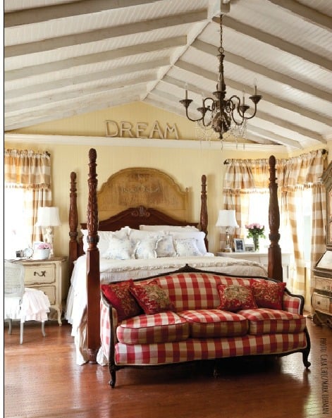
I love how Courtney, of French Country Cottage, added this red buffalo check sofa to her neutral space. It’s just one pop of color and it makes an amazing statement in this bedroom.
You don’t have to start with something as big as a sofa, though.
Start with something small & inexpensive…
Start with just a pillow, a plant, a few paintings or prints. Those little touches of color are easy to change out if you get tired of them or if the color isn’t working for you.
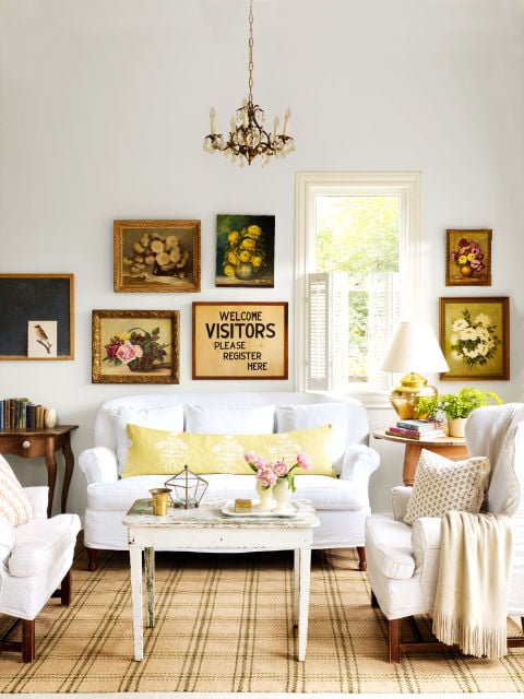
Photo via Country Living. House belongs to Christi of The Brown Shed.
Start with one color…
Pick your very favorite color and just add that in. Don’t worry about coordinating colors and complimentary colors. It’s simple if you just start with one color.
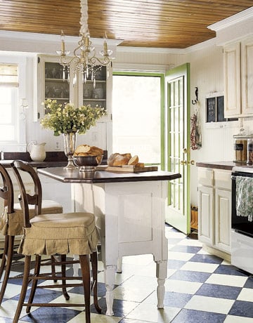
photo via Country Living
I love that green door in this neutral kitchen. Isn’t that a fun touch?
Balance color with neutrals…
This isn’t always true, but I think colors can be more impactful when they are balanced out by neutrals. So, if you’re just getting started, try using color on the walls, but keep the furniture neutral. Or have neutral walls with one colorful piece of furniture. Remember, color doesn’t have to mean crazy! You can use a whisper of a color

And lastly, there are no wrong color choices…
We all have color preferences. Clearly, I’m a blue girl.
There aren’t any colors that are or should be off limits. If you love the color, then it’s the right choice for you.
There are all of these color rules and decorating rules, but there is always a designer who comes along and breaks those rules and it looks spectacular. So, don’t worry about rules.
They’re like the pirate code…more like guidelines.
So, don’t be afraid anymore.
Pick a color and take it for a spin.

Until next time,
Marian


17 Responses
Love this post Marian, I am obviously a fan of colour so this is a post close to my heart! Your advice is always perfect and I think this will resonate with so many people who are scared to try colour.
I think you secretly climbed in my head and wrote this post for me :). Part of my color aversion is because I love, love, love sunlight. And whenever paint goes on the wall, you’re possibly impacting the brightness of that room.
I’d lived in a pretty condo with vaulted ceilings and thought I chose the right green. Struggled to paint 12 foot ceilings only to wake up the next morning and hated that the light and airy feel was gone. Repainted the whole thing with a paler tan! And was much happier! LOL
I’m working on my 30-Day Room Challenge Makeover on my blog right now and my family room is getting a makeover. I chose Bayberry Frosylt which is a soft green amd very light and still a little scared it is creating some darker shadows I don’t want. But after this post, I’ll resist my urge to repaint a light tan! Lol. I’ll roll with it for while and pull in some lights and whites elsewhere.
Thanks for this post!
Serena @ Thrift Diving
I totally agree, Marian! As an artist, I’m not afraid of color, but I’ve come to the realization also, that the walls feel better neutral (as we’ll as the bigger foundation pieces of furniture). Then I can add color(S) to my room whenever I want! I change out colors for the season…beachy mineral blues for the spring/summer and vibrant reds for fall and winter. This way, I’m never bored, and it refreshes the house at least twice a year! Pillow covers, throws, sheets and table linens are my inexpensive ways to change it up!
Marion, thank you for the advice. I painted the walls in my living room Bing Cherry, (yeah, I did). Now I want a neutral color, but white made the room blah and dingy. So I’ll try some of your suggestions and see how the “whites” turn out! I’ll send you some before and after pictures. As always your amazing! Gracias
YES! You always have such great advice, Marian. I have always loved that your neutrals were still beautiful blues and greys, fabulous base colors that you could build on. When I look around my own home I see that as well and love the flexibility it has given me with adding fun touches in the form of pillows, or throws, or a statement piece of furniture. It also makes it fun and easy to change things up for the season, shopping my home, and adding a new little ‘collection’ here or there.
I’m a neutral girl on purpose but lately I’ve been craving a little more color so I loved and learned from this post. Thanks!
Great post and great advice!
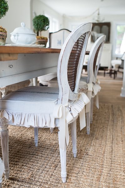
I am afraid of colors that are very strong, I prefer softer colors, washed out colors. I love your rug under the table and chairs.
Great post! A new slant on an old idea. Well done!
I love the comment from Pirates of the Carribean, a lot of times you’re comments like this make me laugh and feel connected.
Big fan, God Bless,
Caroline from Colorado
Ha! I’m glad some people catch my inside jokes and random references. 🙂
Love that bit about the pirate code, Marian. Now ladies get listening to Capt. Jack and play with color. Savvy?
Love love love Christi’s room! The citron pillow and paintings have just the right pop!
Yes, I am the intentional I love neutrals gal but that doesn’t make it any easier for me to pick paint colors! I have always preferred neutral, softer paint colors but finding that perfect grey, beige or cream with the right undertones can be daunting at times.
What I have learned is to never pick a paint color because it looks beautiful on someone else’s wall. The natural lighting in someone else’s house can be totally different from your own and what looks like a warm light grey on someone else’s wall can look like mud on your wall.
When I am considering a color, I always have a sample size made up to give it a test run. This way I can see what it looks like at different times of the day when as the lighting changes and to better judge the color.
Love the post! Where did you find the cow painting! It’s fabulous ! Thanks,Cindy
Love this post ! I am trying to incorporate more color in our home. View my progress and all our family adventures at http://thespilledmilkmom.blogspot.com! Thank you for all your great information! Love MMS!
Marian,
What is the name of the manufacturer & pattern of your blue plate? Thanks