
I’ve been making and selling color charts on linen for a few years. My first one was inspired by color charts found at an artist’s estate sale. I was so smitten with them when I first spotted them online – the colorful squares in oil framed by age-stained fabric – that I decided to make some of my own. I made small color studies on antique linen and hemp scraps, testing different ways to tape off the squares and apply the paint. As I was working on a new batch for my original art sale earlier this year, I had an idea. What if I could stamp a color chart template onto paper and/or fabric and then apply the colors? Would that work? Would it look good?
I tested out stamps I already had to label the back of my paintings to see how well the ink would transfer to nubby antique linen. I also tested it on watercolor paper to make sure the ink wouldn’t run. Oh my gosh…it worked! Now, I just need to design the stamps.
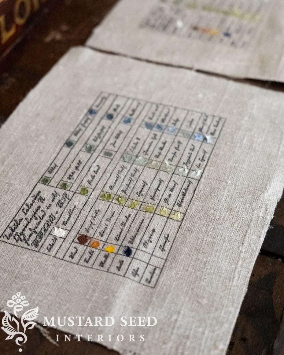
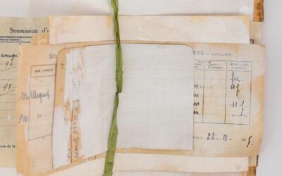
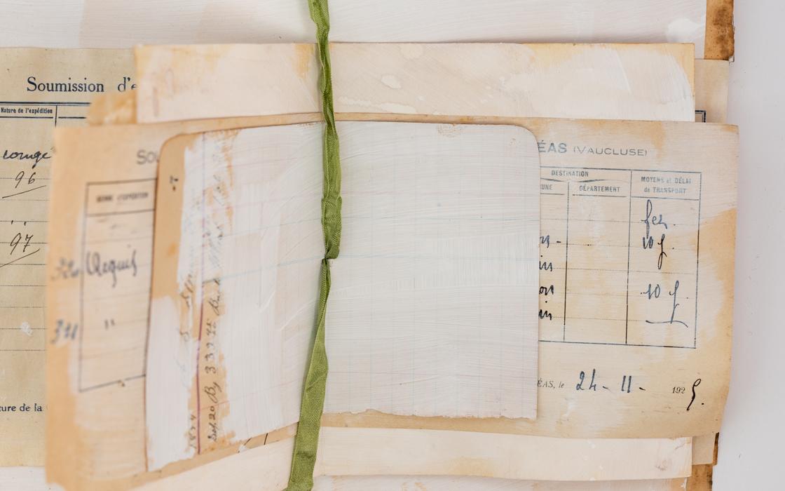
The first stamp was based on A. Boogert’s Treatise on Colors Used for Water-Based Paint, 1692. I actually bought a replica of this almost-800-page book and often flip through it just to admire the color swatches. I’ve seen prints made from this book sold online, and I thought the design would be perfect for my idea.
I made a graphic with text and squares and had it custom-made into a stamp. I was giddy the first time I inked it up and pressed it into the fabric. It looks so good! over the weekend, I wanted to work on something creative, so I ironed some antique linen from my stash, cut it into 6 x 8″ pieces, applied the stamps, and smeared on the paint using a palette knife. I made blue swatches this weekend, but I’m going to make some more color studies.
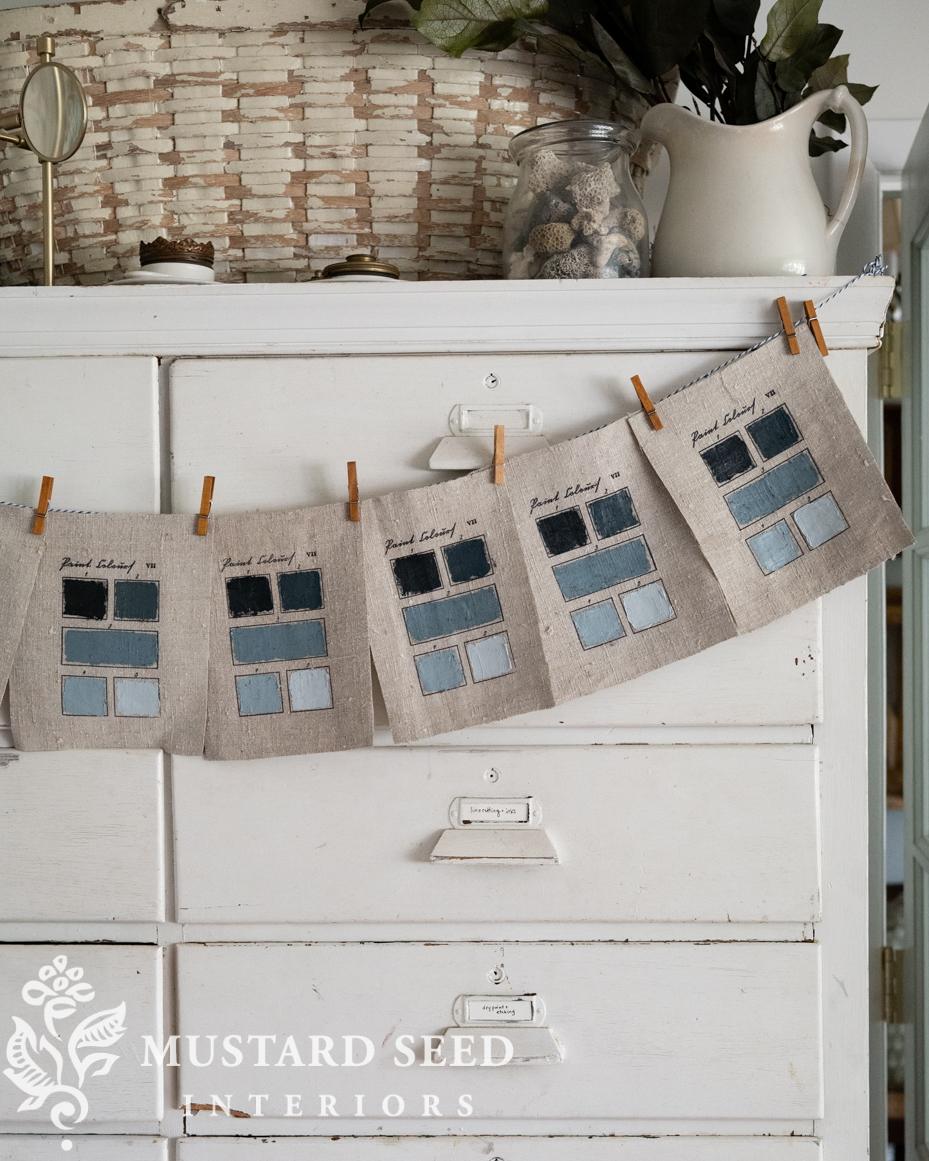
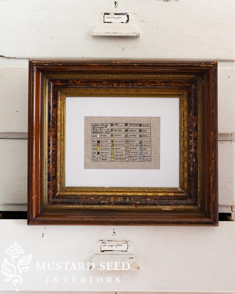
They’ll be sold in my next original art sale, matted in an 8 x 10 white mat, so they can be popped into a standard frame.
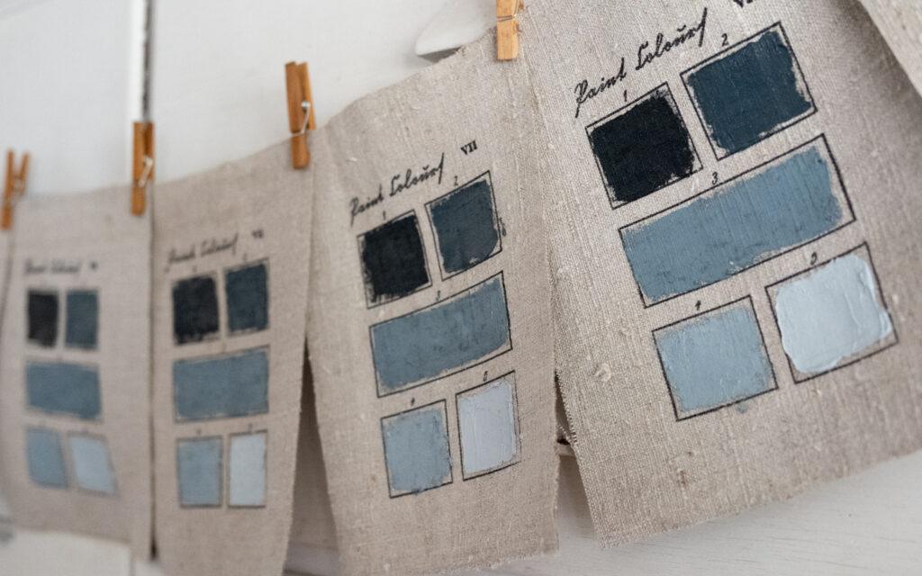
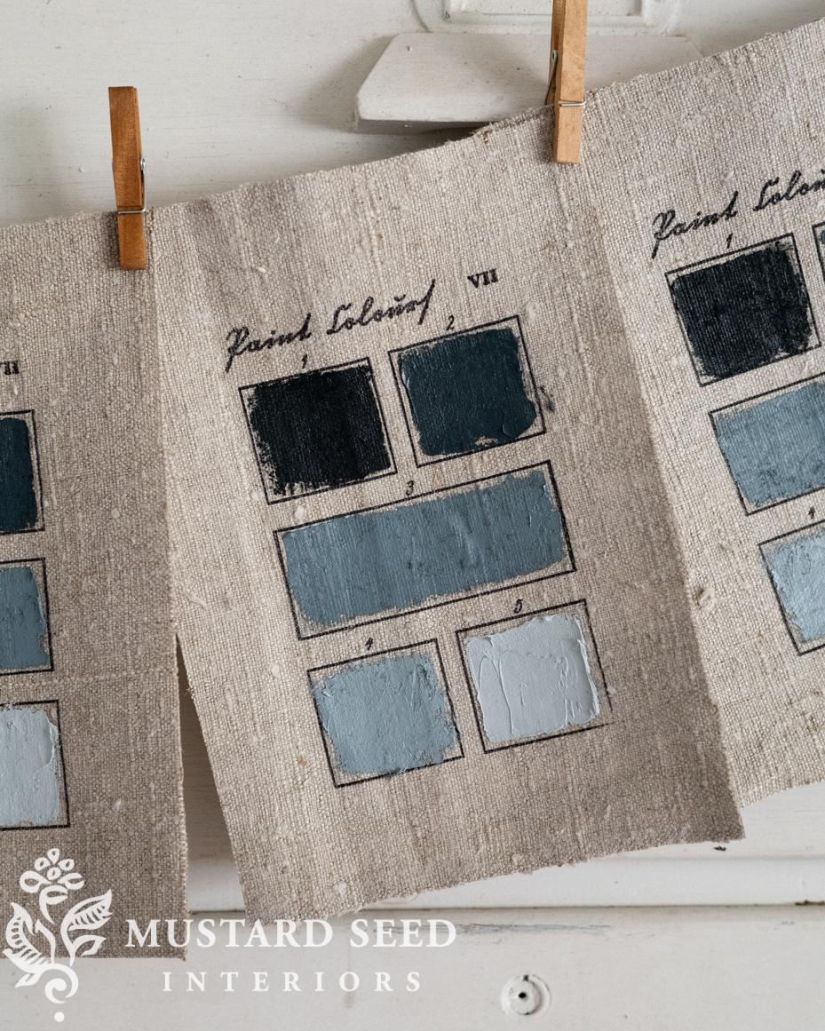
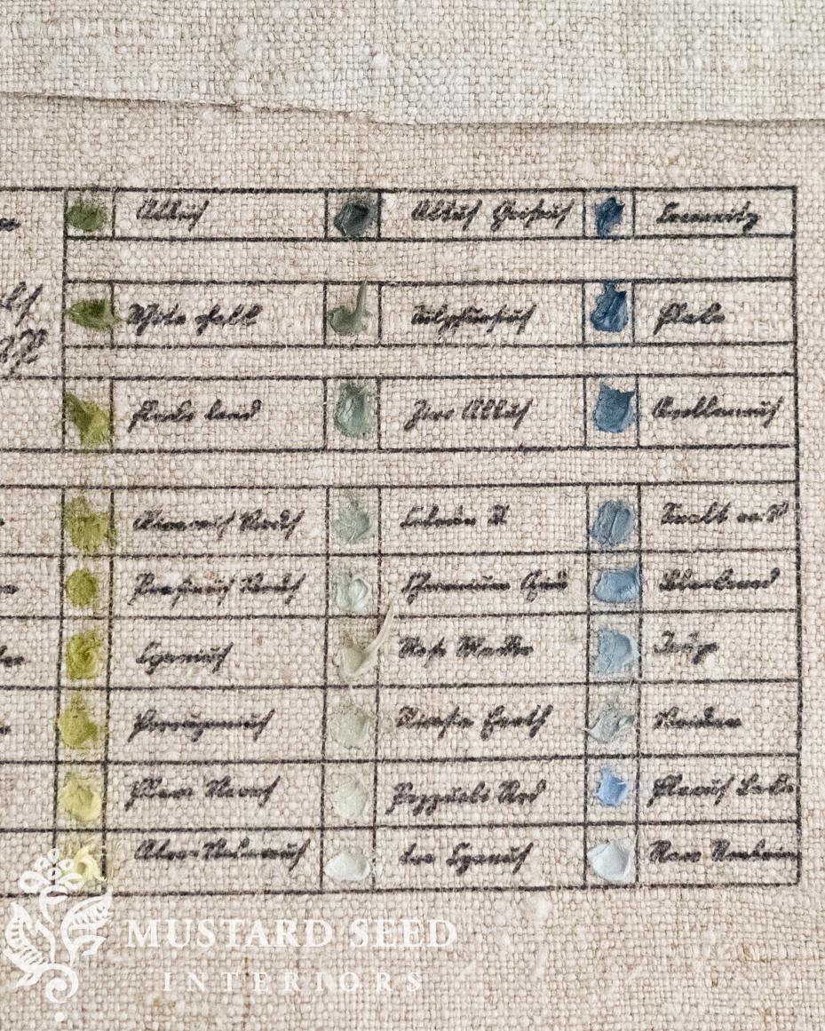
The second stamp I made is based on Richard Waller’s “Tabula Colorum Physiologica”, from “A Catalogue of Simple and Mixt Colours with a Specimen of Each Colour Prefixt Its Properties,” in Philosophical Transactions of the Royal Society of London, vol. 6 for the years 1686 and 1687 (1688).
I made the graph and added text in a font I knew would be illegible, but I wanted it that way. I used words for historical pigments, some of them in Latin. My initials are even snuck into the first box in a way no one would notice unless I pointed it out.
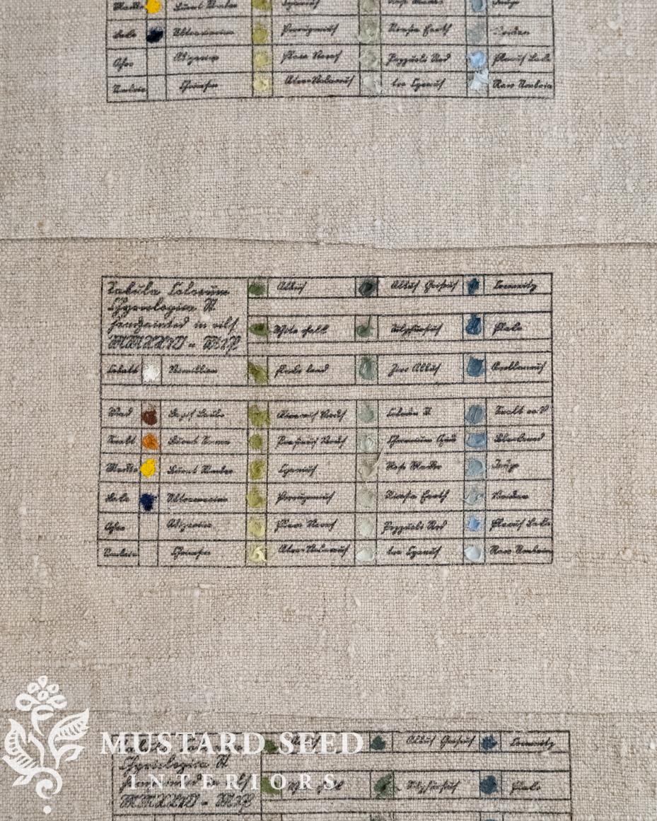
I did a palette study of blues and greens made from the pigments dotted on the left.
As I was making these, I actually thought, I am so glad I get to make things I love. What a privilege.
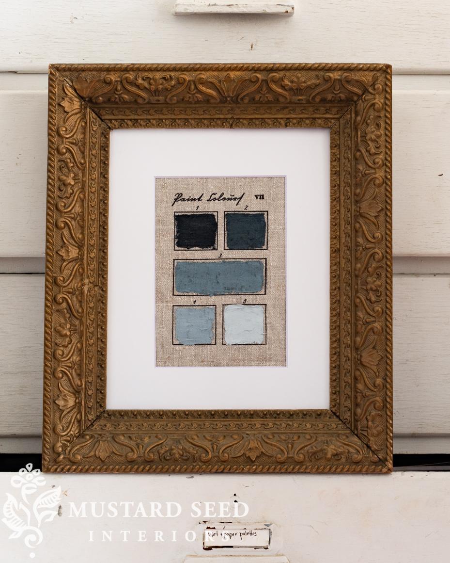
I tried both versions of my hand-painted, antique-inspired color charts in frames I had in my stash for oil paintings. I am so excited with how they turned out. These will be great budget-friendly originals I can put in my art sales. I am already working on a few more designs, and will be doing some of these in watercolor as well…


15 Responses
Love these Marian!
I love these. So clever. And I want to ask if you know anything about the frame in the first framed photo (gold with raised scrolling). I have one exactly like it that came to me in a stash from my deceased aunt and I love it. There’s no information on it so I’m hoping with your diligence to the provenance of all things artistic, that you might know something about it. If you don’t, I understand. It’s just a small frame, probably not even expensive when it was new, but I would love to have a couple matching for myself. Thanks, Marion. I always enjoy your blogs.
No, I just found mine at an antique shop, so I don’t have any further details about it. It’s wood with a raised gesso design and gold finish, probably from the early 1900s.
These are lovely especially in the Latin print. I have printed on fabric for years to make labels for quilts and incorporate into sewing projects. Design your label or “stamp” in Word or app of choice. Iron freezer paper to fabric. Trim to appropriate size and print on an ink jet printer. Works perfectly. Nice project.
I will try to make on my own. I would have thought this was going to ba a HOW-TO. Guess not. Which type of LINEN Can I make mine with GOUAHE >? I stay clear of OILS-bad for health. I await reply Debra Ponte Nantucket,MA. No website- visit me Instagram.com/nantucketsconsetdp E: sconsetdebra@icloud.com I so enjoy your emails.
Someone suggested printing blank ones so buyers can use their own paint, so I’ll do that. For gouache, I would use watercolor paper. Linen would be good for acrylics, though.
Oh my goodness these are a work of art. I would love one unmated and not framed. My husband makes frames out of birdseye and tiger maple that I truly love. You had me at blue Marion……you always have.
They will come in a mat, unframed, but you can simply take it out of the mat. It won’t be mounted but taped in place with removable tape.
These are so beautiful and interesting! I love them so much. Thank you for sharing your beautiful work with us.
Those are so cool! And, hint, hint, I would be interested in buying the blanks already stamped to do my own color studies.
Ah, that’s a good idea! I’ll make some blank ones, too.
A clever and inventive way to paint new creations. Lovely!!
LOVE THESE!!!!!
Such fun.. and I love how you enjoyed making these, Marian!
Cynthia:)
Ooh I’ll be keeping my eye open for the blanks thanks so much!