

Last week, I shared that I was contemplating the fate of the hand-painted dining room mural and unintentionally posted it on April 1, so a few readers thought it might be a joke! It might seem a little nutty, but it wasn’t a joke. It’s not unusual for me to look at something I painted and decide I don’t like it. I’ve thrown paintings away, repainted or stripped pieces of furniture, and goodness knows I’ve painted rooms repeatedly over the years. I used to joke with Jeff that we were losing square footage in our PA house because I repainted the walls so many times. While the dining room mural was a much bigger time investment than just rolling paint on, I’m still able to look at it the same as if I picked a paint color that isn’t playing with the light as well as I’d hoped. I can like something and decide it isn’t right for a room without fretting too much over changing it again.
I’ve shared before that I decided I was going to paint a tonal trompe l’oeil mural in our bedroom in the PA house, and, after working on it all day, I decided I didn’t like it. Instead of giving myself time to mull it over, I painted over it right away. Jeff came home and, despite all of my work, the room looked like it had never been touched and I might as well have watched TV all day for all he knew. Only the faint hint of fresh paint gave me away.
Creativity is risky. Adapting, changing, shifting gears, and rethinking are all a part of the creative process and a part of making something new. I’ve learned over the years to mitigate the creative risks I take, especially when working on our house. So, I make tried and true choices when the stakes are high (expensive to do and redo) and take risks when the ramifications are small. In the end, paint on a dining room wall is small.
What helps me with making creative decisions in my home, though, is to gather up some visuals. I like to collect photos of how the idea looks in spaces I admire, and then I’ll gather physical samples, if possible, and test the idea in my own space. I’ll often take it a step further with mock-ups and sketches. Sometimes an idea looks good in your imagination, but looks different once you have it in the space or draw it out to see how everything will work together. That’s what I’m doing in the dining room to play around with some possibilities.
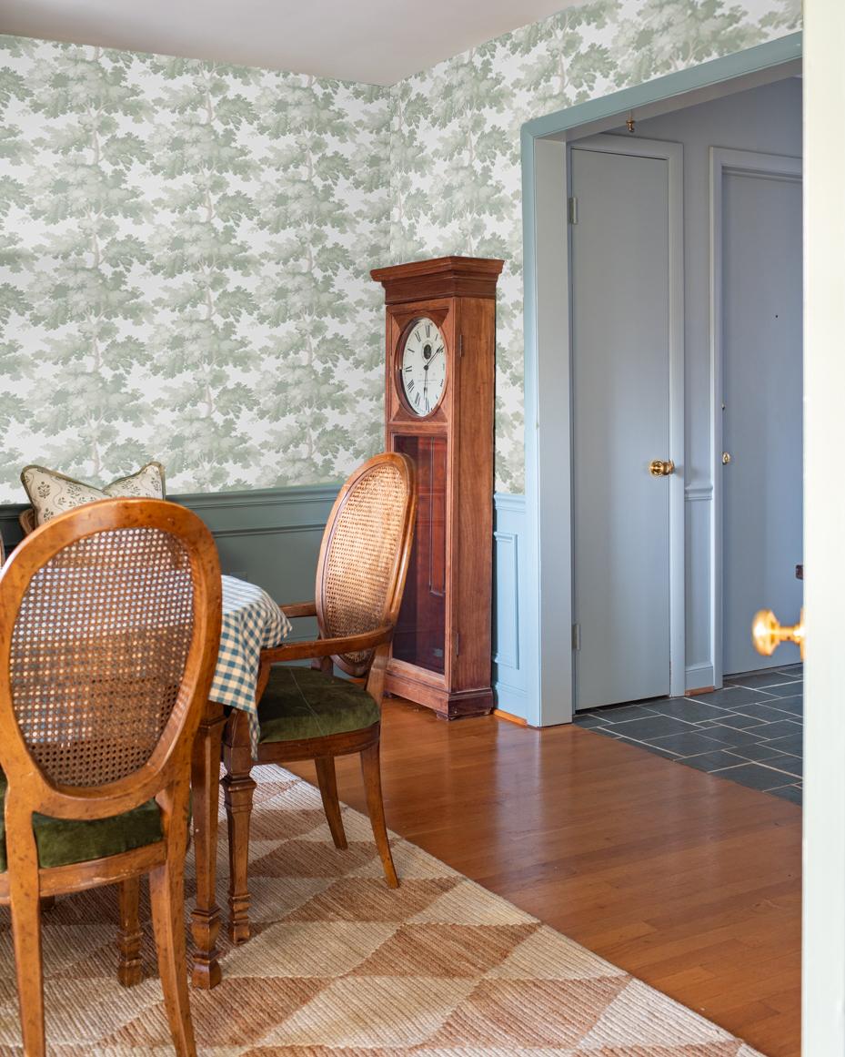
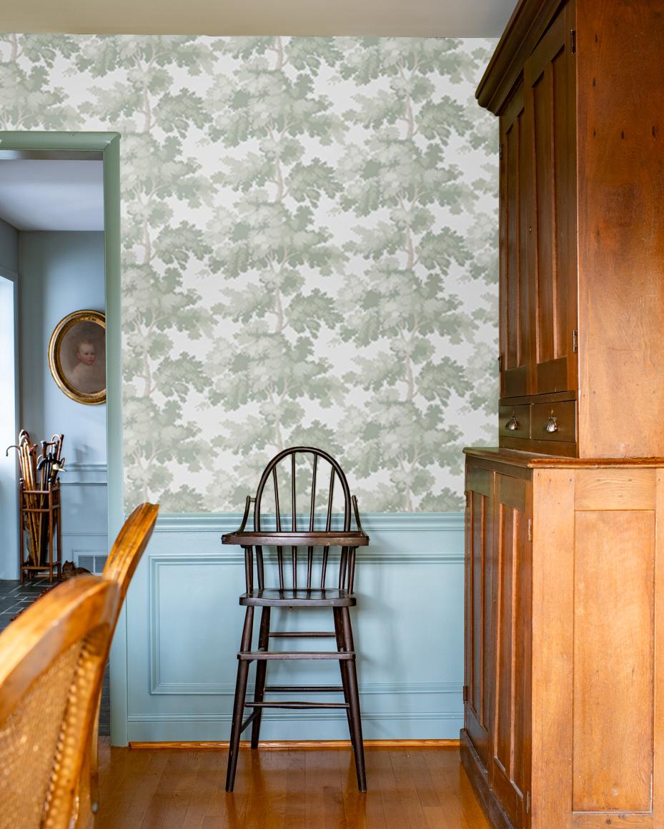
So, the possibility I’m playing around with for the dining room is wallpaper. This house was covered in wallpaper when we first moved in. Seriously, it was in every single room, including the halls and bathrooms, except for two – the living room and what’s now my studio. We still need to remove wallpaper in the ensuite bathroom and the guest room. Despite my battles with wallpaper glue, wallpaper does seem to suit this house and the simple trimwork around the windows and doors. And, despite all of the wallpaper I’ve had to remove, I’m still not opposed to hanging wallpaper again. In addition, wallpaper has come a long way since the 70s and 80s, with glues that are easier to remove and wallpaper primer to protect the walls during the removal process.
This is the wallpaper I’m considering…
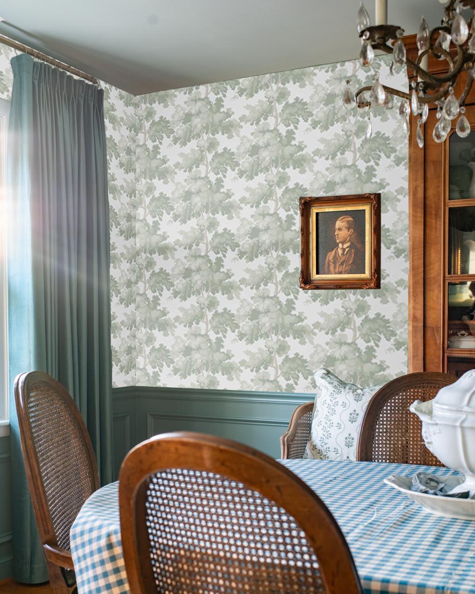
It’s Raphael by Sandberg in Light Green. I have loved this paper for years, even before I knew what the pattern was called. I’ve seen it in powder rooms and bedrooms and loved it every time in all of the different colorways.
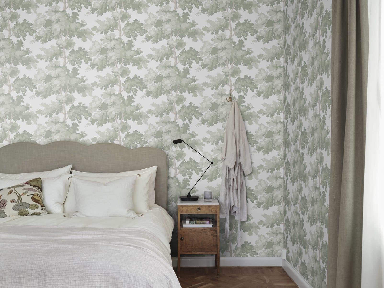
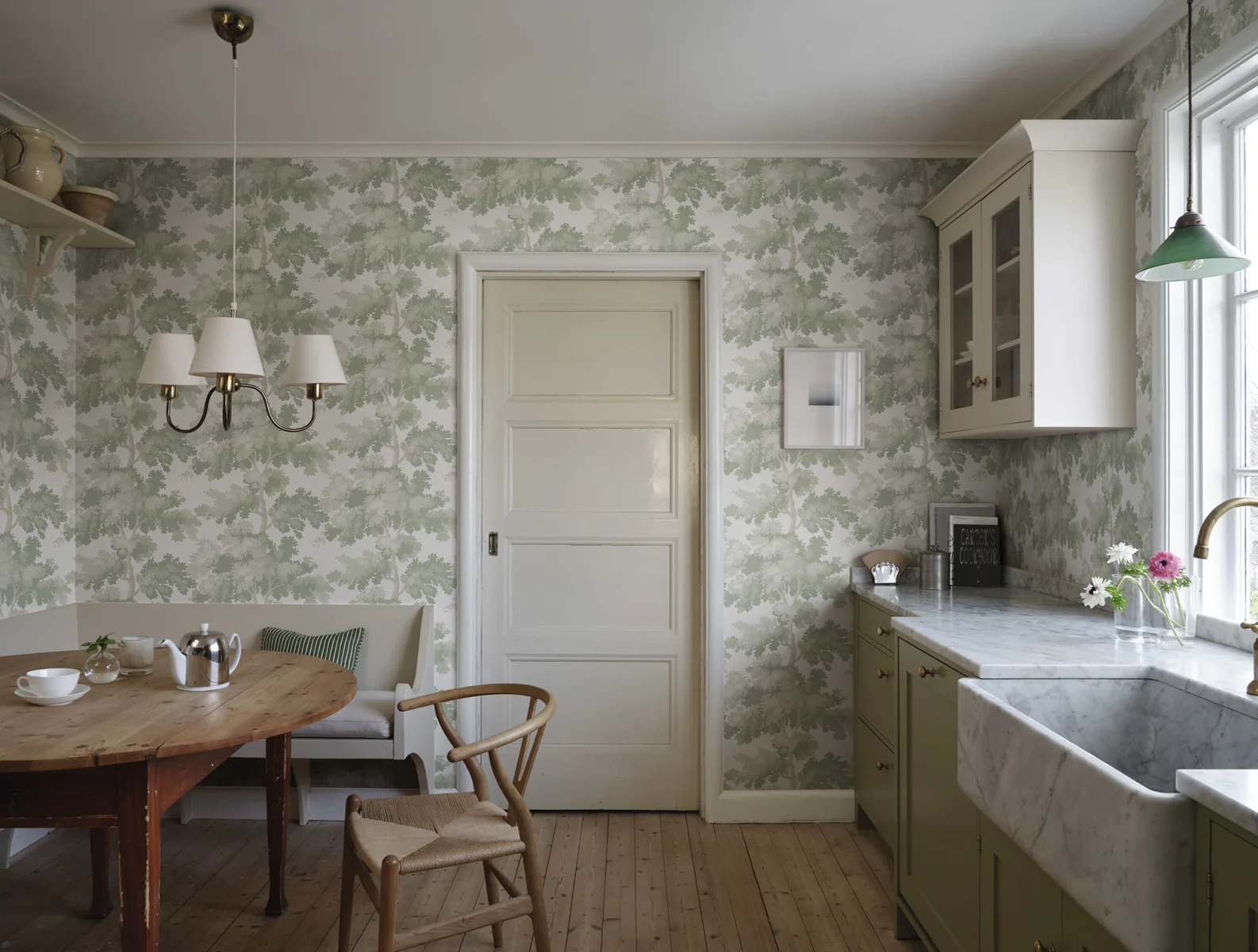
Here is the wallpaper in a couple of different spaces…
View this post on Instagram
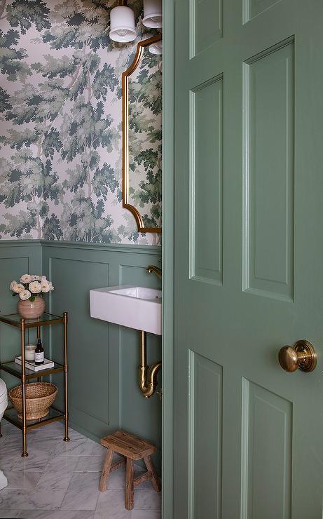
Both of these rooms have a feel that is similar to what I’m going for – painted trim and wainscoting with a pop of the wallpaper pattern.
I knew it would be tricky to find a wallpaper that went perfectly with the blue/gray/green of Oval Room Blue, so I decided to look at green wallpapers that would complement and not clash with the paint and curtains. I asked my assistant to do some quick mock-ups just to get an idea of how it would look, and this is what she came up with…
Overall, I think something along these lines works better with the furnishings and overall style of the house. Since it’s a repetitive pattern, I can also add some of my portrait paintings back in. Most of them haven’t found a new home after I took them down to paint the landscape mural and it’s a shame to have them leaning in a closet.
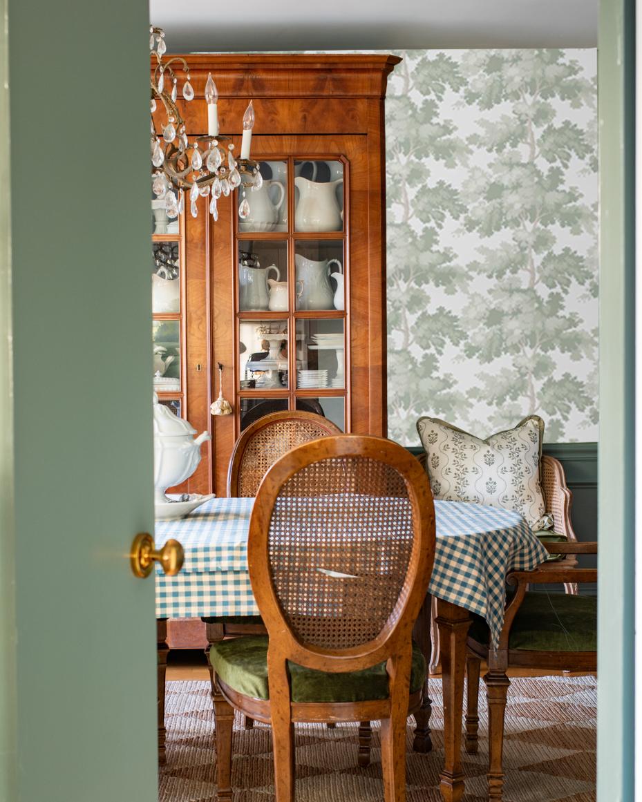
You can see the paintings in the photo below…
Even if it’s just a mock-up, isn’t it great that we have tools like Photoshop available to test out ideas before taking creative risks?
So, it’s an option that I’m considering. What do you think?
Do you have a hard time making changes when you’ve taken a creative risk in your home?


68 Responses
I loved your mural when I first saw it, but I know you are always one to outdo yourself so I trusted your instinct as I began reading this post. At first I was skeptical, but when you mentioned hanging your portraits and taking into consideration the style and age of your home this is a beautiful choice.
I like it! The color palette goes nicely with your curtains, which I adore, and the Oval Room Blue trim color. A good choice in my opinion.
Aha! What I think is happening here is that the house itself is “telling” you to use some wallpaper! Houses do that kind of thing.
It is great that you can do a mock up and get a much better idea at how it will look in your room. It is also going to be a big bonus that you will be putting on your wallpaper using all the up-to-date technology in primers and hopefully it will be a blessing to a future wallpaper removal job!
I totally get the ability to just paint over, cut up, throw away, etc. any artwork that you don’t like. I have done that myself several times because I didn’t like a painting so much. I didn’t want the ugly paintings to be any of my life legacy of artwork!
I do think that your mural though was probably an attempt at an easier (and less expensive) way to “wallpaper” a room. Maybe it also helped convince you that you wanted to take the plunge and actually hang some paper.
I’m thinking your artwork and furnishings are enough in the dining room. It’s a place for your portraits to shine in their own space. The wallpaper is just too busy and not much different than the mural. Perhaps my computer is not color true, but I’m not sure about the blue woodwork with the green wallpaper either.
I agree with Kay.
I agree with Kay.
I agree with Kay.
I also agree the colours aren’t quite working (perhaps it’s my phone). Personally I like the mural. But I would tweak it a bit by softening the edges and creating more of an “oil paint” look..it needs some depth. Just a thought as I am no artist.
I agree! I think if you just softened the lines and added some depth it would be perfect! I think it’s beautiful!
It’s very pretty paper, but I think it’s still a bit too bold. Something a bit more subdued would make your dining room portraits really shine.
Check out Emily Henderson’s blog of picking out wallpaper for their Portland farmhouse foyer.
That may have been 1 1/2 years ago but she had numerous samples that were more subdued but still beautiful.
Hi!!! Since you asked our opinion I will say I do not like the wallpaper. I love the current look. I am inspired by how you evaluate and are not afraid to try new things.
You live there and see things we do not. I know you will make the right decision for you. Blessings!
I agree 100% with Julia and the others.
imho— the wallpaper pattern is too similar to the mural, which you did a beautiful job on, but seemed intrusive in your room. Smothering. My feeling is that a smaller, less attention-getting pattern that doesn’t shout for attention would be better if you want the framed artwork to shine.
This paper seems great for something like the powder room you mentioned, in which the paper is the feature of the room. —Suggestion—Because it’s a paper you love, why not go ahead and buy it for your new bathroom when you remodel it next year?
I would agree that the wallpaper pattern is too similar to the mural, (which I find heavy) and which is a bit on the busy side. Is here something that could give the room a lighter, more restful feel?
I like the mural better but it is up to you. You should take photos of the mural before you “erase” it and offer it for sale.
I appreciate you sharing your creative process and not being afraid to admit that the mural just didn’t work. I like to think of those kinds of things as a “sunk cost.” In other words, even though you spent many, many hours on it and probably a decent amount of money in paint and materials, that time and money is gone. All that is left is the mural, which you didn’t love. There’s no point in living with something you don’t like just because you spent a lot of time on it. While I thought you did a beautiful job on the mural, I was not a fan of it in your house, either.
I think the Raphael wallpaper is a great choice to replace your mural because the style of the trees is similar and will help you achieve the same “vibe” you were going for, just in a softer way. I also like that it will allow you to hang your great artwork. I look forward to seeing where you land with the room.
I LOVE the Raphael wallpaper. I recently moved to a new house that needs a complete overhaul too, and I have been trying to convince my husband to get on board with that same wallpaper for my own dining room, which is similar to yours (wainscoting and windows facing the front). I also want to paint the wainscoting and crown molding a complimentary color, probably something in a mushroom or taupe since the room leads to my kitchen, which has sage green cabinets. However, like some of the other commenters, my husband finds it too busy, and being that this is his house, too, I want to select something he likes. Some other options I’m considering are Laurel Foundry Modern Farmhouse’s Hundt Toile and Alcott Hill’s Lowery Floral. I can’t find either pattern in a real life house, though!
I’m not feeling it. I find it too repetitive and I feel the room has too much of the same color. But, I know you can make anything look great.
I LOVE this paper and considered it in a different colorway for our dining room when we first moved in. Feels leafy and light and, as you noted, something that wouldn’t compete with anything else you wanted to hang or display in that room. And I just went through something similar in our house with a regret/switch up situation — and I’m feeling guilt-free about the whole thing. I mean, we spend so much time here, why live with something you don’t love? I think your dining room would look incredible with this pattern.
I tried to leave a comment the other day and the bot minder couldn’t unstick itself.
I had said I liked your mural and the risk you took.
I had also mentioned with the direction you’re going, the green of the kitchen would be better suited and would play nicely with the blue in the hall.
This paper is gorgeous, but as others have mentioned, it’s just still really busy. One thing I like about your decor is that you can change out linens and dishes and portraits. But the paper just feels like a lot and that it would compete with table settings and portraits.
It’s a lovely paper. Would you consider one accent wall? Or the back of the smaller cabinet?
I don’t usually like to leave “you should” comments, but it seems like the time to share perspective.
I love the wallpaper pattern and color. I admire your willingness to redo a room’s walls that you don’t love. It is much better to make the change than living with something that bothers you each time you pass by the room. 😊💙
Karen B.
I don’t like the wallpaper AT ALL…the painting was much more dramatic and clever and interesting..Let your creativity shine through, not pick something repetitive and blah.
I love the idea of wallpaper and think it will go nicely in the room, but I’m not sold on this choice. I just don’t think the two colors or style compliment each other. The pattern just seems so much different from what you have used previously, but as the saying goes “You do you. It’s your house.” You always pull out a classic style, so I’m sure whatever you do will look great.
Oh yes! As a lover of wallpaper, especially botanicals, this design just begs to provide a beautiful background for your “portrait gallery”. I did something similar in a powder room that I call the Venice room — it’s a tiny room with 6 watercolors from Venice — delicate citi-scapes with gondolas and cascading flowers mounted against a grayscale tropical leaf print.
I loved your walls after you painted them and can certainly understand why anyone would want a change but think having your walls simply painted some favorite color you’d be happy to hang those portraits on, then just save yourself some time and money and forget that busy wallpaper you’re considering. That’s just my 2 cents worth.
While I prefer your mural over the paper, if you do decide to go with the wallpaper, read up on the “paste the wall” technique you will need to use with the Sandberg paper. I used the same paper in the blue colorway in my laundry room. And while the paper and the special paste you’ll need are expensive, it is as easy a wallpapering job as you’ll ever do! I absolutely LOVED how simple it was to hang this paper: gone are the days of soaking paper in water or pasting the back of long sheets. Now all you will do is roll the paste on the wall and hang the paper. Omg–so easy! Have fun if this is the way you decide to go!
I am sorry, but I think the mural is more classy. The wallpaper is much too busy. n.
Honestly I think you should keep the mural. I’m all about originality and I hate when someone walks into my house and says, “Oh, I have that.” Nope. I make every decorative decision based on not having anything someone else has.
I love the mural! I like the colors in the mural and the scene itself. I’m not a fan of the wallpaper, but I have to admire how you know what look you’re going for.
The wallpaper is busy but it’s also boring. I know that doesn’t exactly make sense. I think that since it’s all one color and uniformly repetitive ( I know all wallpaper has a repeat.), it’s just kind of boring. I think the room needs something a little more dramatic.
I agree totally. To me, the wallpaper is both way too busy and extremely boring, if that makes sense. I also think it clashes badly with your paint color, though that could of course just be my monitor.
As someone already pointed out, I think the wallpaper has a similar look to it that the mural had but that’s not necessarily a bad thing. It is beautiful and goes very well with the colors. If you love I say go for it!
I like the mural a thousand times better than the wallpaper. Before you do anything, please paint a glaze over the mural on just one wall to see if you like that better. The wallpaper is too repetitive and too dark.
Marian, what is really bothering you? I have to ask this not to be offensive but rather as an admirer of your work and accomplishments. I am rather critical of myself and can be hyper focused and not see the forest for the trees. This mural is very beautiful and it inspires discourse which is what Art is intended to do. Yes it is different and yes it is not a technique you usually do however it is perfect. It suits the room and as I looked back at you Christmas pics the room looked great. You’re not asking for advice but imo stay the course, you might just be surprised where it takes you. I often remember a conversation I had with my daughter (who is a classically trained portrait and figurative artist btw studied with the masters in Italy), I had just finished a hugh historical restoration of a 1928 Tudor Revival and was not satisfied with some of my choices and end results in the dining room. She took a big sigh, looked me in the face and said ” Mom, you cannot improve on perfect.”
Ha! I commented on the dining room reveal post how much the trees you painted happened to look like my favorite Sandburg wallpaper. 😉 While I’m a big fan of your painted version, I will always love the wallpaper version!
Hello Marian! Your choice of wallpaper is nice but a bit blah. It feels like a compromise between what you envision and something that will merely work. I adore the uniqueness of your mural. A reader had described it as a paint by numbers mural and I wondered if you had considered softening the colors of the mural with a light colored glaze? The mural in your MN dining room was lighter with more detail. I’m confident that whatever you choose will be simply beautiful. Good luck!
i always loved the mural of the soft trees/ethereal wall mural you did in a previous home. in fact, i copied it for my own dining room ….painted by a muralist not me. xo
I agree. That was hard to beat.
I love many things you do – truly inspirational stuff – but as perfectly brilliantly done, to be completely honest, I never loved this mural as I loved the work in your last house. Maybe it’s the hard edges, deep color. The wallpaper is nice and looks great but for me you sure do have a LOT of pattern going on. There’s just no resting the eyes and taking in the subtle art and collections. It’s just so much pattern. I do enjoy tranquility in my living spaces, so I am always going to be a hard sell. A simple plain wall to accent your buffalo plaid, your artwork, your blue painted trim and fireplace……..let them be the shining stars. Patterns just take so much away from their design perfection. (just my preference, not intended to offend, I promise.)
ps: if you put that wallpaper in a small space like a bathroom I’d be all about that, though.)
I personally do not like it. I say leave your mural and hang your pics or go to a solid wall color. I do not think the wallpaper does anything for the lovely color you have on the wainscoting, trim and your beautiful drapes. I really loved the mural you painted in Minnesota but the wallpaper is a mistake.
WOW! Lots of opinions for you to consider, Marion! I like the wallpaper better than the mural however both a too busy for my taste and because you will have portraits and other framed works of art on the wall. How about something in the same color palette as the floral paper in the samples but much more subtle……a soft stripe? Or just paint? If you want the framed works to stand out, don’t dismiss them with a busy background.
I’m not a fan of the wallpaper – too busy and repetitive.
I loved the mural but understand how you felt it intruded too much on the room. Are you thinking of any other options?
I think Sandberg wallpaper is an excellent choice. That being said, this selection is a bit on the tamer side. You seem to be traveling in a bit of a bolder selection that may make you happier as time goes by.
What about trying a white wash over your mural first…?
I Iike both the wallpaper and your mural on their own. But I find both of them too busy for the room. There is already so much to look at that it would feel better with a serene beautiful paint color on the walls. Regardless of what you decide to go with, I think the art work of yours should be non-negotiable. Make that your focal point(s) and let the wall be just a backdrop. It has so much more personality than wall treatments.
The wallpaper is very pretty, but in my opinion just okay in your dining room. The mural is so much more attractive but should be toned down a bit and the foreground , as is, reminds me f a golf course – you can do better.
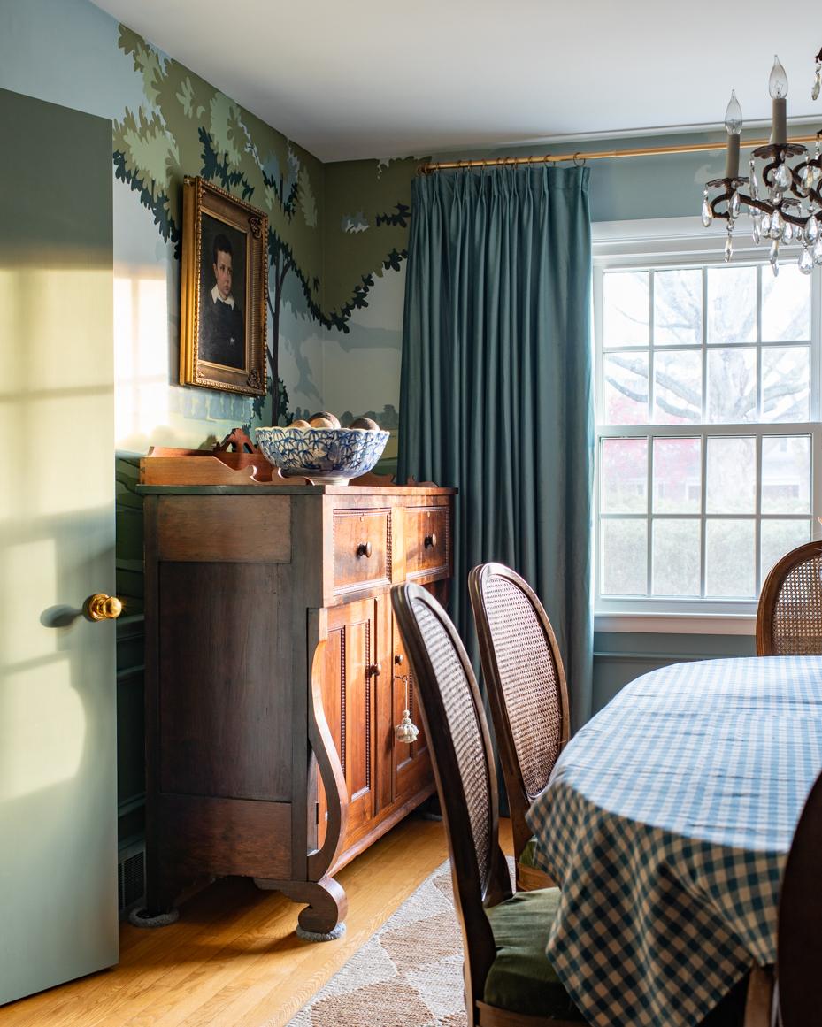
I’m sorry to make a negative comment, but I agree with others…I don’t care for the busy wallpaper. I actually like the mural better. I feel like there’s already so much busy going on in that room with the diamond pattern rug, blue check tablecloth, ornate chandelier, dark velvet seat cushions & curtains, the caning on the chairs, the heavy orange-toned furniture and the colonial-style artwork. Each item individually is beautiful, but put them all together, and it’s just too much. I’m sorry! I think the photo with the white walls and the artwork looks beautiful and showcases the artwork, just like the white walls in your kitchen showcase the beautiful green cabinets, the faucet and farm table. I do think this wallpaper would be really pretty, though, in a bathroom with painted wainscoting. I still love the beautiful soft, muted mural from your MN home. Would you consider doing a smaller version of it somewhere in this home?
Holy Moly, you certainly got a bucket full of opinions. LOL
I personally have never liked murals and have rarely seen one that I felt did a room justice. That being said, I have always liked your oil paintings and choice of art for your walls, and I like them best on solid walls. I have always felt you need to decide who you want to take center stage – the wall paper, mural or the art work you hang, because one will dominate. Lovely art work and a busy background is too much competition for my eyes, not allowing either to shine at their best. My favorite photo is your Christmas dining table where everything pops except the background walls.
I don’t think the mural- while it is beautiful- is a good look for your home. It seems dated. And the wallpaper is too busy, as several have noted. Why not just hang the art and live with it for awhile? In 6 mos, your taste and “Marion look” may change and lead you into an entirely new direction.
The wallpaper is beautiful and so is your mural. I think what’s happening here is that many of us so admire your artistic ability that it would be hard to imagine the mural gone. It suits the dining room so well. As these are often the lesser used rooms one won’t tire of it. Perhaps there is a perfect spot for the wallpaper, powder room, guest room? I love the color way options.
You’ll know Marian.. you always do. I can’t wait to see the direction you take!
(I didn’t sign off as I’d lost my post 3 times while I was typing.. boo…)
The right decision will be all yours!
Cynthia 💕
I love the wallpaper pattern but have you considered it in the grey color. It’s much quieter but gives the same warm feeling and to my eye goes better with Oval Room Blue paint. Just my opinion but you did ask! BTW the mural is still beautiful, but I get it!
It makes me sad for the mural to disappear. I realize your opinion trumps mine of course. Also , I have checks on table cloths in our country style kitchen , but am not comfortable with them in your more formal dining room. This would be a five minute fix of course . It is so exciting following your journey making this house a place you and your family love!
Sorry, I cannot agree. I love what you painted on your walls vs the wallpaper. However, since it’s your house you need to do what you love!
Since you asked, I don’t care for the green wallpaper and its pattern with oval room blue wainscoting. I honestly prefer the plain painted walls in the dining room with your portraiture, I think it shows the artwork to its best effect. If you really want to mix it up, perhaps a wallpaper that’s not as patterned and has more of a bare field. No doubt you’ll make the best decision for your home, Marian. Just my two cents!
Here’s another opinion 🙂 Tweak your mural, let it shine. Look at places where a little light might be needed.
The colors are perfect.
This is you. No pictures or big furniture to hide MP.
Here’s my two cents. I think I’d be tempted first to antique glaze over your mural as you had suggested in a previous post and see if that “fixes” it in your mind. I am not a fan of that wallpaper….not the color with the blue paint and I believe it’s just too busy. Very expensive to put it up and then not be happy with it. I really liked the photo you posted of the plain white/ivory paint on the walls with all your portraits hung. But I also remember when you were considering a “library” aesthetic for your dining room. I loved those inspiration photos. So many choices!! Good luck.
How about a grass cloth or linen-look wallpaper? Something with subtle texture and interest, but nothing that would take away from the portraits.
I do not like the wallpaper in that room. It may be just my screen but it looks like it doesn’t go well with the blue trim. Having said that, your choices have proven me wrong before. You may never ask our opinions again lol!
My two cents worth…..I love the mural you painted. I find the wallpaper too busy but yet boringly repetitive . Why do something that everyone can have? When with your own art work you can have a unique look. You’ve mentioned in the past that this house cannot have crown mouldings due to settling/uneven walls. Your mural took care of that….like it wasn’t even missing. With the mock up pictures I feel the moulding is really missing and just comes to the top of the ceiling and then stops….weirdly. It would need the crown to complement the room, your antiques and your style. Your portrait art looks fabulous on the mural walls. Since you have so many other projects going on and soon it will be “pool time” ,maybe you should live with it a bit more. Maybe it would make you feel better to go in and tweek the areas you have mentioned. I love it as it is!!! It is “totally Marian ” Not mass produced out of a book.
It is a unique beautiful work of art!!!
I am going to join the chorus that feels like the Sandberg in light green is not complementing your other paint colors. Again, perhaps it is our computers or photoshop image itself, but other available colorways seem more complementary. There’s nothing wrong with wanting to revise your ideas in order to get closer to your vision for the room, but somehow, I don’t know if the wallpaper you chose is the answer for all the reasons already mentioned.
That being said, I love the colors of the mural and think they are spot on with your house’s palette. When I paint or draw I often have a specific feel I am going for and if the final work doesn’t match the image in my head, I am very disappointed. I wonder if there is something specific that you don’t like about the mural that you could address. If I were to be hypercritical, I could see where that corner where the tree crosses over from one wall to the next could be lightened up with more sky. Actually, the sky, clouds and land are my favorite part and really carry your eye around the room. I think you said they were yours as well. Would it be worth it to lighten up or eliminate some of the heavy tree foliage and let more sky shine through?
Thanks for sharing this deliberation with us and I hope you find what you’re searching for.
Yes – the wallpaper since you love it so much but in a different color way, perhaps.
Have loved almost every decorating idea you have ever implemented; however, this wallpaper looks very similar to your existing mural. The paper seems too repetitive whereas your mural pulls your eyes up and around the room. I’m a huge fan of wallpaper (the smell of its glue makes my heart race), but I say stick with the mural–it’s a keeper. Perhaps try swapping out the tablecloth with a smaller print??? In the end, it’s your home.
I love the mural. It reminds me of colonial times and showcases your talent. I’m not fond of the wallpaper but think it would suit a bathroom. Have you thought about how the wallpaper would look as you decorate and photograph for the Christmas season? I think it would clash and looks like it would be more suited for Spring and summer seasons. Just my thoughts.
I love the mural! The colors, design and the feeling it evokes. It’s stunning and also unique and very artsy. Wallpaper could never complete with this mural. I understand that as the artist you are critical of your work but I doubt anyone else would see imperfections. Besides I also love a bit of imperfection. I hope the mural stays….
How does the “sky blue” version of the wallpaper look? It still has the soft green foliage but a blue background that might / hopefully better connect the wallpaper with the F&B Oval Room Blue.
My goodness. Pandora’s box is open:) I think you are incredibly talented and will make any space look lovely. I’ve painted murals only to repaint or paper over them. It’s a mood we’re going for and creatives don’t rest until it feels just right. Personally, I love the wallpaper and I always tell clients it doesn’t have to match, it just has to go.