
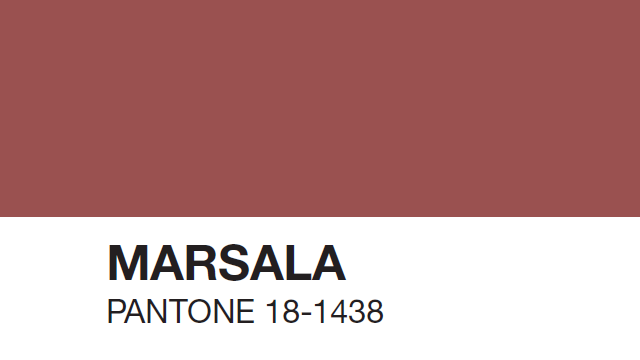
If you’re plugged into the design world, even a little, I’m sure you’ve heard about the color of the year announced by Pantone. In 2015, it’s Marsala…
In episode three of Design Ramblings, Kriste and I decided to discuss the 2015 color as well as the whole idea of a color of the year…
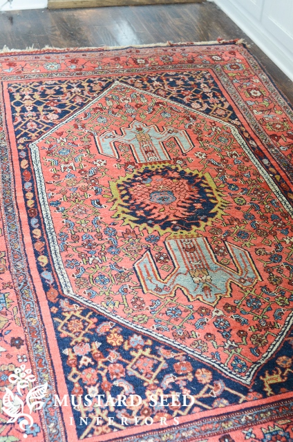
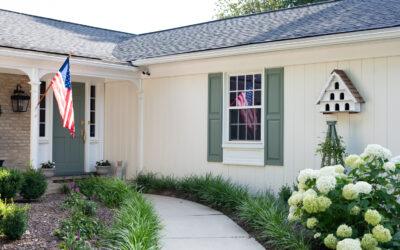
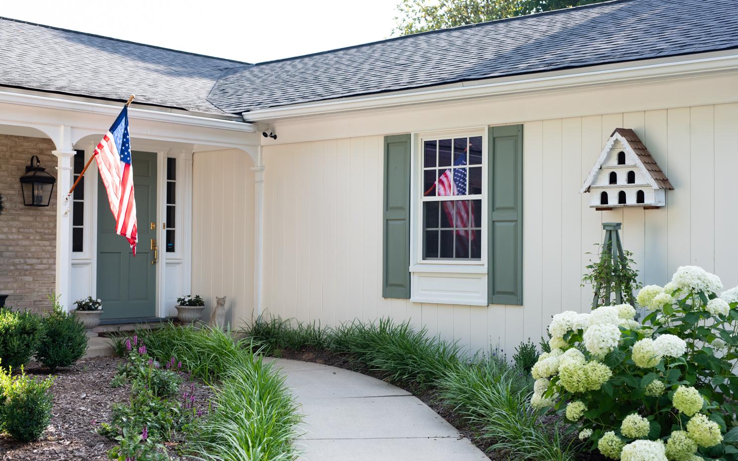
I realized after I talked about the bluish/green paired with Marsala that those colors are both in the rug from my Opa’s house. It actually looks amazing with the navy, cornflower, brick and even that pea green! Whoever put these colors together had a wonderful eye. I always feel like rugs are a challenge for me, but I do think they can be a great jumping off point for the design of a room.
As I mentioned in the video, we mixed our own version of Marsala with MMS milk paint just for fun. The Pantone Marsala does have a bit more brown in it, but they’re pretty close.
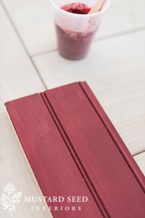
Here’s the recipe, if you’re interested. The number before the color name refers to the amount of parts in the mix.

And, as a side note, I started the Whole30 plan yesterday. (You can read my post about it HERE.) As I was seeding a pomegranate and thinking about this post, I noticed that my snack of choice was perfectly coordinated!

Well, the seeds are a brighter red, but the skin is pretty close.
Anyway, what do you think about the color of the year? Are you a Marsala fan? Does the color of the year influence your design or style choices at all?


47 Responses
Different subject, but still having to do with color…as I pulled up your blog, I was so happy to see the sampling of fresh colors in the different header photos…pinks, green, blue, red. It was a nice change from all the blue & white. Don’t know if you planned it, but think it represents your paint palette much more fully! Pretty eye candy!
I love listening to your video. I find myself having a love, hate relationship with the color of the year. It’s pretty. But, usually despresso to do my own thing. Or create my own favorite color of the year.
I am not a Marsala fan. It reminds me too much of Valspar “canyon bedrock,” which is the color my kitchen used to be. I am not ready for anything from 2000 to be in again. I much prefer the blues and greens that have been prominent the past few years. I also love pops of yellow and muted red, but Marsala is much too earthy brown to feel fresh to me. My fear is that this color is a sign of a shift in the popular palette, and that everything is getting ready to swing back toward muted earth tones. If that happens, it won’t matter if I want to have that color in my house or not. It will be there because it will be all that’s available in the stores where I buy stuff for my house. Wah. I hope I’m wrong about all that, and designers and manufacturers keep producing lots of happy (a.k.a. primary-ish and coastal colors. 🙂
I love it. It is easy to wear in lipstick, blush and nail polish and flattering to most women in shirt fabrics. In design I see it paired with cream and gold for weddings or think old, worn Spanish tile. It is warm and worn and comfy feeling. I am working on a church sanctuary and we have chosen a brighter version for pew fabric, cream walls, weathered brass lighting fixtures.
The color of the year impacted me more when I was a floral designer and wedding consultant. I worked in a very trendy store and we were always looking for new inspiration in color. We usually had at least one vignette in the store featuring the new color. I think it applies more to fashion and fleeting trends than furniture and applications that are more long term.
As someone mentioned above, I might wear the color in cosmetics or clothing, probably won’t have it in my home.
I have learned to be true to myself and finally decorate with the colors I love (thankfully hubby likes them too!) and no, I won’t be jumping on the color of the year bandwagon. I am not much of a trend follower.
On it’s own, I am not crazy about it but when I see it with other colors, I like it quite a lot – like your Opa’s rug! It reminds me of nail polish, wrap dresses and leotards from the 70s and very early 80’s – I am thinking of Debbie Allen in Fame!!!
When we moved into our current home fifteen years ago, the kitchen cabinets were the “burgundy” color, and the doors were pink/rose. I lived with it for five years, but with the family room also painted rose, I was so happy to finally paint both rooms in a more neutral color.
I’m thinking that this color of the year is still dated and out. It won’t be anywhere in my home! 🙂 I’m loving fresh and crisp colors. I’ll just ignore this one, just like I did the year that emerald green was supposedly “in”.
I also agree that it is dated. Also a college color herein Texas. Done with reds and maroons for a long time here.
As far as my own home is concerned, if its not a neutral or light color I wouldn’t even consider it. I guess designers think that grey has been done to death but I cant image this is a color that would appeal to the masses.
I do happen to have a sweater in that color that I pair with a dusty pink tank and its really pretty together. Its just not a color I would use in my furnishings and home but I could see a wedding designer using this as a alternative color to pair with pink for perhaps a Valentines wedding.
While I think it is a lovely color, it isn’t one I want to have in my home. To me it feels more vintage instead of dated. Last year the Pantone color of the year was an orchid color that I had hoped would be everywhere in fashion and I never saw it once. Also, simply because designers/retailers put it out for consumption doesn’t necessarily mean that people will buy it.
When I first saw it, I thought FINALLY! Finally a color I love. Pantone has picked so many over the last 10 years that I’ve just hated. And then you find that color everywhere. So 2015 is a great color year for me!
I agree with those who say “recycled”. I think we used to call that “mauve” and it was everywhere. My bedroom was once ‘raspberry’ and now it’s blue, and it feels so much better. That color feels like ‘been there, done that’. Love your rug, though and the ramblings. Looking forward to where your path takes you in 2015. Thanks for sharing.
Touches of the color of the year will update things quickly!
I think naming a cat is the best use for the color, so far.
I wonder if Pantone is trying to pull us away from the fresh, clean, crisp airy colors that are so in style right now. I am not ready yet to go back to muddy tones. (I never went there in the first place.)
I predict this one will be a dud. I do find the announcements of the COTY to be entertaining and look forward to them.
Without even knowing Marsala would be Pantone’s color of the year for 2015, I have incorporated quite a bit of it into my house interior while decorating last year. Living room has quite a few touches of it (semi-sheer paisley curtains, accent color in the rug, pillows on the daybed…), and the bedroom has some too (accent color in the duvet cover and shams and in an area rug). Hmmm…. Maybe I should apply for a job with Pantone. 🙂
Jelena, I think your touches of the color sound beautiful in your home, especially the semi-sheer paisley curtains. I think this is a pretty color when used as a touch here and there.
What is old is new again. Does anyone remember mauve? Yuck, and double yuck!
Just helped our daughter in law pick up some used “girl” furniture in true white for our grand daughter, but it was lacking a night stand. I happen to have a little French 3 drawer stand that would work. Instead of pure white, we thought about a pop of color… T
his might be perfect. Am anxious to ask her mama. Thanks for the continual inspiration!
I had a rug like that…..antique, hand-knotted, pretty. Mine was a bit on the pinker side. Turned out that that section of the rug had been bleached! Originally that area had been a certain shade of maroon that the Victorians liked but which was now repellant. You could see shades of the original color on a few of the adjoining yarns.
I like your color but not the Pantone one.
I remember mauve and Marsala is not it! Mauve has much more of a purple tone to it to me. I do respond positively when I look at Marsala, but I don’t think I would want large amounts of it in my home. I think it could be very lovely in small dabs here and there. A wall or walls–no. Too overwhelming and hotish for me. But I guess I would have to live with small amounts to really know.
As for the idea of having a color of the year I think it is ridiculous! I don’t like being dictated to about what colors are available to purchase. I think it’s for the convenience of the paint companies .
I love your rendition! -Don’t like the Pantone- too much brown! I see your version as an accent color with my mostly blue and yellow French Country look. It has such a nice muted tone. Although I try not to follow trends, I like to see a third color as an accent. It seems to bring a room to life.
I, too, have a love-hate relationship with “color of the year.” I HATE it that I cannot always buy periwinkle blue towels (periwinkle being my favorite color). I hate it when I use vintage fabrics (which I love to do) and cannot find a “match” for a particular shade of green, etc. I LOVE it when “my” colors appear on the list — and I can “load up” on things in my favorite shades. Right now, I’m doing up a bedroom using vintage fabrics featuring a shade very close to Marsala, so perhaps it will be useful to me that this is the color of the year. It’s a complex shade, and I like that (although this is the very thing that makes it difficult).
I agree with many above.. I like the idea of it in cosmetics ( lips), but really don’t see using it in my home for a year round color. However, I do see it possibly popping up around the holidays. I have an old collection of ornaments that my grandmother passed down to me, that are the traditional red and greens. This color would look amazing thrown in with red/cranberry and white transferware. But, when the holidays are over, I will quickly resume my all white and gray pallet. 🙂
I must say, your version is much more attractive than Pantone’s, which to me looks unfortunately like dried blood.
No, the Color of the Year does not influence how I decorate my home. I just use the colors that I love. I do love this Color of the Year, though, and I have a few items in my home that have a bit of this color in it. I use a lot of powder blue, green, and white in my decor, and I think this raspberry red looks great with those colors as a nice accent. This red looks great in shabby chic throw pillows, curtains, and other textiles and wall art. It adds a bit of warmth and vibrancy to rooms that are mostly cool greens, blues, and whites.
I think the whole idea of Pantone setting a “color of the year” is pretty funny. I like this color, but would only use it as an accent if I ever used it! It is all so funny, because do people really need to be told “THIS is the color of the year”?? Too trendy for me!
I don’t think Marsala is Mauve at all. Mauve is a purple/blue pink. Marsala looks great with other colors. Williamsburg, VA has a beautiful fabric with Marsala, black, green and white. So, I am liking the color this year. I don’t think I will run out and buy it just to say I have it in my home, but I find it attractive. http://www.pinterest.com/pin/406590672583414152/
I like your paint formula!
Pantone is a company that SELLS paint. The Color of the Year is a marketing tool to sell paint. I hope people will not be swayed into using the “color of the year” instead of their own preference. If you are lucky to live long enough all colors cycle in popularity. I cringe at the 60s avocado and harvest gold combination and now we’re seeing Marsala, which is the 70s-80s Burgundy. Let’s hope that people will think for themselves and choose colors they like.
I’ve always enjoyed the COTY concept and ballyhoo, and I understand how the color houses control the palettes we see – with decisions made years before the products hit the markets. However, I celebrate when the COTY affirms my favorites / Tangerine and Emerald Green, but it hardly matters when they choose something so dissonate as the Orchid of last year and now this most dreadful Marsala which reminds me of the 90’s color combo of mauve and country blue or of a “smear” of something quite offensive! Hopefully next year, the choice will reflect the fresh and clear colors with rich undertones that are popular in our homes now.
I am absolutely in love with this color, red has always been one of my favorite colors, i like to decorate patriotic style. will you be caring this color?
I don’t know if you planned it but your lipstick coordinates with Marsala perfectly! As far as the color of the year trend is concerned… it bugs me as I use what I like. Oddly enough I already have a bit of this color in my decor already and keep saying I am going to move away from it but it is a color that draws me even if it is only for accessories. I love your design ramblings!! I watched all three videos today because I needed a distraction after dropping our middle boy off at the airport knowing there is a good possibility it will be a year before we see him again as he might be deploying in April. ugh…
UGH! I just moved into a fixer upper and the color of the front door matches the color of the year to a T… and I don’t like it. LOL I will be painting as soon as the temperature reaches above 55%.
My husband and I have been buying fixer uppers since our children left home. We are on our 3rd flip!! We both love remodeling and live in the home for a couple years while we work on it, then sell it and start again. We are having a blast as empty-nesters!
I will weigh in on “Marsala”, which should be called “Merlot”, like you said in your “Ramblings”, Marion– when I think of Marsala, I think of the wine, which is an amber color.
I LOVE red and I think this is my favorite shade of red. I am a Pottery Barn fanatic – they set my trends!! PB uses this shade of red every season blended with goldy mustard, greens, pale aqua blue, darker and lighter reds, camel, taupe, cream, etc, and they show it with dark or light wood or white/cream colored furniture. I am looking at the pillows and rug in my living room, all from PB – no one, in my opinion does better color combos than they do!! Years ago I did my dining room wall in a Ralph Lauren color very similar to “Marsala” (I have since repainted it in a neutral creamy tone), but I loved it and got compliments on it all the time.
I think almost any color can be termed a “dated” color, there is nothing new under the sun…even blue and white, but they can be timeless colors as well if they are coordinated appropriately. I love how everyone has colors that make them feel at home and happy!!
I love Marsala as the color of the year. As you said, it goes nicely with some of the blues and greens they are using, and let’s face it, it’s time for some of the jewel tone colors to come back but with different names. So instead of maroon, it’s Marsala. I think as long as you keep it fresh with newer colors and temper it with some white or cream, it will be great.
Thank You for doing your post on the color of the year ! The color marsala is a good match for one of the colors I use in my living room/dinning room. I pair it with sunflower yellow and veranda green.
Thanks also for the recipe for the color, can’t wait to mix some up!
I love this color! I especially like your version. I will use it in accents, not because it is the color of the year, but because I like it. I agree with the comments that this is not what I remember as mauve. I have always had a base of shades of blue with shades of white, and this works great as an accent. On a funny “use of color” note, I have a mid-century white/grey brick ranch with a charcoal roof and black shutters. To add color, I painted my doors a stormy grey/green/blue. (Not at all interested in period authenticity…) When I had some renovations done, I put in a new door with a full glass panel. The contractor commented, “I’ll bet you’re are glad to be rid of that awful green door”. To each his own!
What a fun topic for your ramblings! I have never been a fan of COTY because who has the time and money to re-decroate or re-do or buy complete new wardrobes every year? Certainly not me. I do see it used by designers quite a bit, and not just in the decorating or fashion world. It hits the crafting world…I have seen the COTY incorporated into scrapbook supplies, jewelry supplies, etc. It can be fun to try a bit here and there but usually I already know which colors I am drawn to so it doesn’t really matter.
I really am enjoying this series. It’s fun to see the two of you interacting with each other and it’s always great to hear voices to put with the words you both write each week pion your blogs.
I just have to say you guys crack me up! I am really enjoying these video ramblings, keep them coming! 🙂
http://newyork.craigslist.org/wch/atq/4821981781.html
Hi Marian the above link made me think of you. Some g uyinmy local area is selling a German sign that is right up your alley
Check it out. If you can’t get your hands on it maybe you can make one
I never even KNEW there was a color of the year until a few years ago watching David Bromstead on HGTV – I still don’t pay much attention…..I am always either ahead or behind the color schemes…..whichever way you want to look at it. My home is the colors I like – right now, happy pastels. It makes me happy to walk into a room that is done in pastels and that is all that counts. Like other readers, though, it’s very challenging to find things you want to buy for your home, that’s why I end up vintage most times. I have been looking for a nice color kitchen throw rug for years…all that are out there are dark earth tones. ugh. No matter, I still like what I like when I like it!!
As they say…”to each his (her) own”…nope, don’t like that color one bit. I do like a pop of color mixed in with neutrals but, for me, this ain’t one of ’em….
Well, we painted this color (or something similar) and it darken our hallway so much that we are constantly turning on the lights to see. When we painted we went over a yellow and stopped with two coats which was Valspar’s top-of-the-line (primer included) and it really could have used three, so maybe it’s a way to sell paint!!!
You guys are so cute. Love the color, especially for fashion. Burgundy is one of the colors I wear best. I definitely think a bold colored statement piece in this color of Paint Would be fun….but then bold color is kind of my M.O. 🙂
Sorry I’m not a fan of the new color
I have been transitioning into the “reds” lately…I even did a post about finding my “frosted berry” for my master bedroom…http://beckwithstreasures.com/journal/2014/7/1/im-a-mess?rq=frosted%20berry ….which looks to be a little less “brown” than marsala. In my dining room I am using a “poppy” red. I do think it is going to be the next big “accent color.” Like with most colors, I like to infuse the “newest” into things that are easy to change out…picture matting, pillows, rugs, etc. Not sure I would jump out and buy a “marsala” couch, but no harm in mixing things up with accent pieces and furniture that can be painted down the road!
I’ve heard it before about Marsala. But purple is my favorite color.