
When I painted my home office, I mentioned that I used Benjamin Moore’s Stonington Gray mixed at 50% and I got a lot of questions asking what that meant. I explained it years ago, but thought I would do a refresher post, explaining why I love to customize colors on the paint deck.

I do acknowledge that sorting through a paint deck containing thousands of colors can be overwhelming enough. Why would you want to muddy the waters even further with the option to customize every single color in the paint deck?!
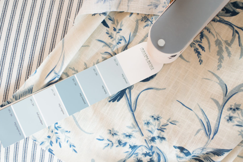
If you’ve ever had angst selecting a paint color, then you know that, even with all of the options, sometimes a color is right, but not quite right.
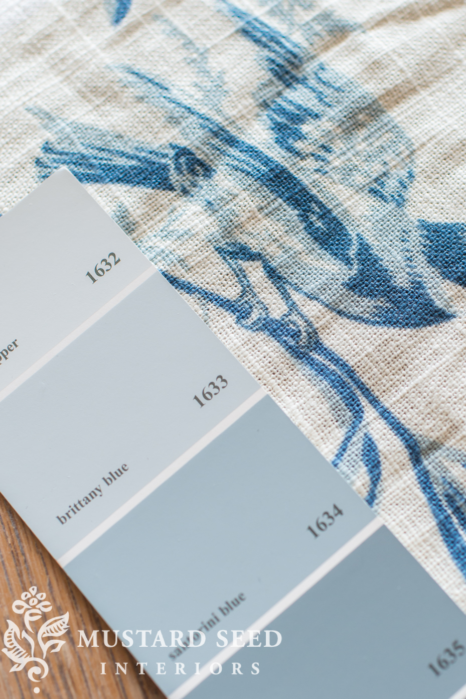
When looking at the gradation of hues on a paint deck, one might assume that it’s the same color in different values (light-to-dark), but that isn’t the case. The colors are in the same family, but they are distinct colors. This can make it tricky when one color is too light and another is too dark and one is perfect, but it’s too green, etc. Customization can fix that and make a color you like work for you. This is especially helpful when you’re trying to match a fabric or wallpaper.
In the case of my office, I wasn’t trying to match anything specific. I liked Stonington Gray, buy I wanted it to be softer. So, I asked to have the color mixed at 50%.

What this means, is the paint store puts in 50% of the pigments that make Stonington Gray into the base. The result is the same color, but a lighter version of it.

If the color was too dark, I could ask for 25% or 30% or whatever I wanted to try.
This is particularly helpful when choosing whites. The tricky thing about whites is being able to see the undertones on a small paint chip or even a swatch painted on the wall. It’s not always easy to determine until you get on all of the walls of a room and you realize your creamy white looks yellow or your cool white is reading as baby blue.
It’s much easier to see the undertones of a color when it’s a mid-tone. You can see if it’s a blue with green undertones or purple, for example. So, if there is a color you love, like Stonington Gray, have it mixed at 5% or 10% to make a custom white that has undertones you know you love. It will take some experimenting to find what works, but that’s what sample pots are for! Also, I would suggest starting a little lighter, because you can always take the paint back to the store and ask them to add more pigment.
Speaking of adding pigments to paint, if you’re on a tight budget, you might already be familiar with the “oops” shelf or bin…colors that were mixed that weren’t the right match, were returned, etc. Sometimes you can even find paint that is about to expire. If you find a pale color or white, you can ask them to add pigment to it to make a mid-tone or darker color! It won’t be a perfect match, but you can adjust the color, which is a nice option.
So, next time your picking out paint colors, remember that you can customize each color and design your own unique palette for your home.


26 Responses
I’ve painted ceilings with 10% to 25% tint of the wall color. It looks white, but it makes the ceiling less glaringly different than the walls.
I love that Stonington Grey so much.
what a great idea. I never paint the ceilings “white” but have always looked for a white to match the wall color. nevertheless thought of doing this. thanks!
thanks, autocorrect. I meant I never thought of doing this.
….and then there are French greys, cool greys and warm greys…just love colors ~ so much play in them! Thank you for the info ~ off to make a custom mix! My grandfather was a wallpaper’r and painter as a tradesman…I enjoy his Dutchboy Deck and have his paint speckled glasses…..in his day….mixing custom was much needed with only 10 colors on a deck! Love watching your home progress!
Thanks for reminding me about this. Subtle differences can really make a big difference when the paint actually goes on the wall. And you are so right about undertones in white! The master bedroom in our house was almost a “meatlocker frost blue” until we corrected it with a creamier white.
—and I am loving those wall lamps flanking the bookcase, btw!
This post is also a reminder to me not to trust my monitor about colors. In the photos above Stonington Grey appears to me to have a slight blue undertone. When I saw it in one of your earlier posts, I thought oh, that’s a bit cool for what I want.
It was only today that I connected the dots and remembered that my living room is painted in Stonington Grey full strength! And based on my room, if I had to identify an undertone I would say green. This is a room that gets a lot of bright southern light which also impacts the color. Once again I’m reminded to see a large sample of the color in my room, and preferably at the time of day I’ll mostly be using the room.
Thank you, thank you, thank you! My hubby and I just had a big round last week on this particular subject. We are painting our bedroom and I wanted to stay with a similar color. I matched up a color called BM Lemon Ice but it had a tad more yellow tone to it and I told him we could customize it and try 25% which would make it a little lighter to match whats on the wall.
He didn’t think that could be done and it wasn’t that far off. Well, after he started painting he could see it was more yellow than what we wanted. Now after I just read him this post he is heading to the paint store to have the BM Lemon Ice mixed at 25%.
Sorry I meant to say mixed at 75% (25% reduction).
Didn’t know that! Mind blown! Do most paint colors start off with white as a base and then have pigment added to it?
Most start with a pure white base, but darker colors start with a darker base.
Yes Dee. All paint starts out as a white base.
Remember, you don’t have to mix a whole gallon for choosing your color. Benjamin Moore paint at our Ace hardware will charge $5 for sample of your color. If that color is to your liking bring the sample back and they will deduct the $5 charge from the sample toward your gallon purchase. Mary Lou
Thanks for the info. I painted my bathroom Stonington Gray (because you did…lol) and love it! Grays are very hard to get right. If I can put a plug in for another blogger…….Kelly from the blog “My Soulful Home” has a great post on picking the perfect gray. It is different info from what you have Marian, but still so helpful in learning about the different grays. It helped me so much! You have too Marian! Thanks for your inspiration and sharing your home with us. Blessings!!!
I love doing this – I have 75% and 50% tinted Benjamin Moore paints throughout my home; it can really make a difference when trying to adjust for the light, fabrics and furniture in a particular room. Another thing I like to do when choosing color is to get small sample pots (if available) of paint (or have a batch mixed up in the smallest amount possible). I’ll paint a 2 foot square of my choice(s) on the walls, so that I can see how the light affects the color at different times of the day. I also find it much easier to determine how a paint’s undertone (pink, grey, green, etc.) is going to work in a room when I do this, versus just working off a paint chip (or even a larger designer’s sample.) A color can look very different on various walls of the same room (and may differ further at different times of the day, depending on how much natural light vs. lamplight there is, where the light sources are – ceiling fixture, table lamps, sconces and floor lamps – bulb wattage, and whether the light is cool or warm), which is why I find this so helpful.
I did this kind of customization years ago in several rooms for wall and ceiling color, but I learned something valuable. On some colors that only have a small amount of certain undertone pigments to begin with, if you go to a low percentage tint like 25% or less, you will completely lose some of the undertone pigments because they can’t be divided that low. The resulting color will not only be lighter, it will lose a pigment that is part of what made the original color especially beautiful. So, just be aware and ask if all the pigments can be reduced to the percentage you want without losing any of them. I hope this is helpful!
Love the gray tones from Benjamin Moore. I did my kitchen and living room in their gray. It is soft and goes with everything.
This is one of my favorite tricks, especially in in smaller or north facing rooms with few windows. I can pick just the right color and have it mixed to 50% or 75% and get the right color without making the room feel darker. Just a note though, when having a shade color matched (say Benjamin Moore color matched at Home Depot, they may get the original color to look incredibly close, but when it’s diluted, the tones might be off – it’s happened to us twice – so I think it’s better to go to the original brand if you’re going to ask for a custom mix.
Thank you! I am about to redo one of my bathrooms . The shower curtain is going to be made from Aviary Toile–I had upholstered a chair in the brown version just before you showed the blue in your blog; I love it. I have always used Benjamin Moore paint, but I was skeptical of using a color with gray in the name for a cheerful bathroom, but I’m going to try this.
It looks really nice, you chose right! Love the 50% mix…
I never liked grey paint because I thought it was depressing, but I lived in Seattle where its grey nearly all year! of course grey wouldn’t work….you need color there or everything is grey and blah. But since moving to Virginia, into a small house the builder painted all the walls in a pale grey, I have become a big fan! The lighting here is so much better – there is actually sunshine and the rooms actually glow. They also provide a really good back drop to my blue & white, and the pale pink and yellow accents I add really work well played against the pale grey walls…
Paula,
Welcome to VA!!! Its great to have you in our beautiful state. We promise Spring is coming as its most unusual to welcome the first day of Spring in VA with cold, slushy snow!
Your office turned out really lovely. I love the rug- it looks a little like the rug from your last home but I don’t think it is. Is it new or vintage, please?
Hmmmm, I’m wondering if I can do this with a Benjamin Moore Navy (Gentleman’s Grey, but it really is a navy) that is just a shade darker than I want but that is the perfect tone. I’m thinking 80% may be just right, though I’m wondering if the darker base will throw off the ratios. Have you ever done this with a darker base?
I’ve worked for ben moore retailers for close to a decade and there’s three things I can tell you with certainty:
1) having a color lightened 25% doesn’t really make that much of a difference overall.
2) dark colors don’t lighten very well–gentleman’s gray at 80% strength will look nearly identical to gentleman’s gray at full strength. even having gentleman’s gray mixed 75% lighter won’t make much of a difference.
3) getting colors mixed at lower strengths can radically alter the tone of a color because of the way the colorants intermix (it’s much more complicated than it seems). for all intents and purposes, by having a formula mixed at lower strengths, you’re creating a completely new color, with a completely different value and tone than the color you started with.
I used a medium tone blue-grey in my living room which is fairly open to my kitchen. The kitchen has white painted tongue and groove paneling so I painted the ceiling a 25% mix of the blue-grey on my living room walls. Looks great and pulled the two rooms together.
What is a good white that is not harsh for a large great room with not a lot of natural light?
I love this idea and Benjamin Moore paints are my favorite! I also use oops paint mostly outside! My stores will not touch oops paint so you have to do that yourself which is also a experiment I enjoy playing with