

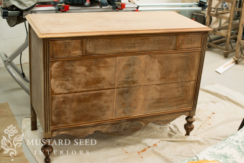
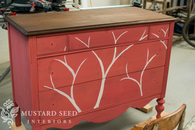
Here’s how this dresser started…or pretty close to it. I sanded it, stripped the top and removed the vertical trim pieces on the bottom two drawers. One was loose anyway and they bugged me a little.
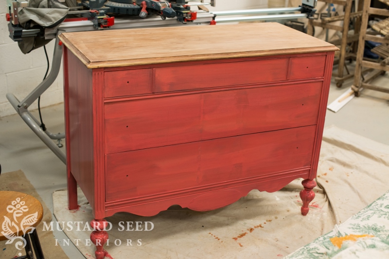
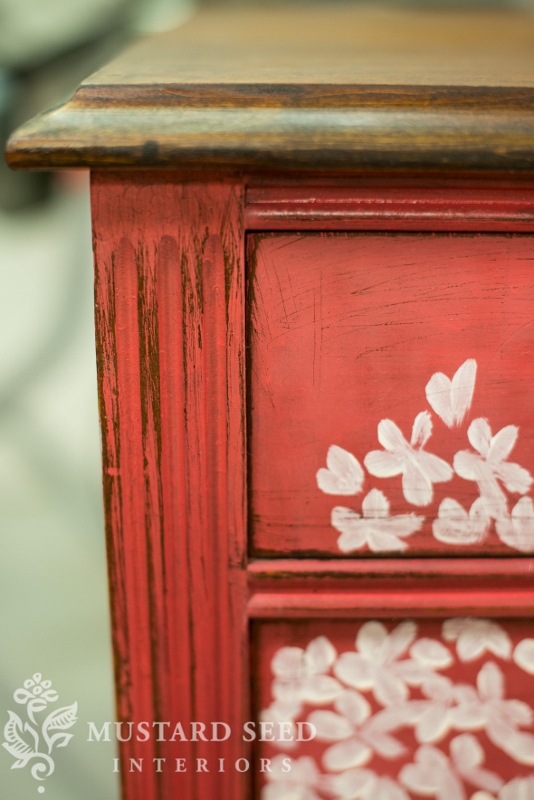
I painted it in two coats of MMSMP Apron Strings (one of the new colors coming out in November) without any Bonding Agent added. Sanding really does a world of good with helping Milk Paint stick. As you can see, the finish still looks a little uneven. That’s okay. That variation is normal with Milk Paint and it will look lovely once it’s finished.
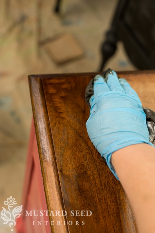
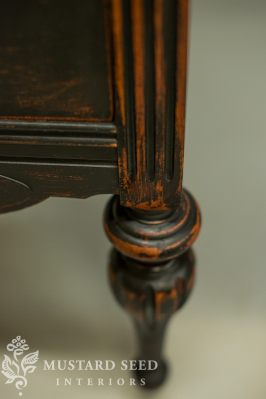
I stained the top with Dark Walnut stain by Minwax…
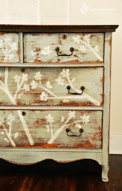
…and decided to do some decorative painting. When I have a large, flat surface and, in this case, a strong color I want to break up, I just can’t help but grab a brush. I immediately visualized this piece with a cherry blossom motif.
I’ve done this pattern on a few dressers in the past, like this one…
…and this one…

It’s one of my favorite designs and it seemed fitting for this gal.
For decorative painting, acrylic has always been my preference. I started my business as a decorative painter & muralist, so acrylic paint was my first go-to paint medium. It has the perfect texture to flow off the brush onto a piece of furniture.
When painting a cherry blossom pattern, I start with the branches. Yes, I paint it freehand, but it’s a simple design. You can always sketch it out with a piece of chalk first, which is how I often tackle more complex designs.
I then add bunches of blossoms around the tips of the branches. I keep them loose, tightly bunched together, but with enough space, so they don’t look like one big blob. I also vary the intensity of the paint, so some are done with a fully loaded brush and others with a dry brush, which adds depth. I used a filbert artists brush (that is about 1/2″ wide) for all of the decorative painting. A filbert is a flat brush with a rounded top, so it’s perfect for things like flower petals and leaves. I turn it sideways for the branches when I need a straight edge.
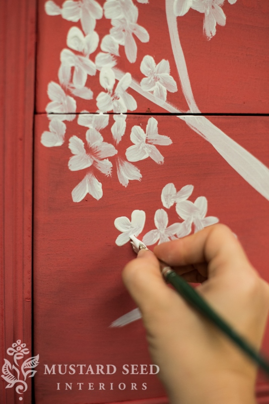
There is actually a post I did in the wee early days of my blog about the comma stroke, the basic brush stroke I use for the blossoms. There’s even a poorly made video tutorial, if you care to check it out. All of the information is still the same and those of you who have a baby blog would probably be encouraged to see how much I’ve grown over the years!
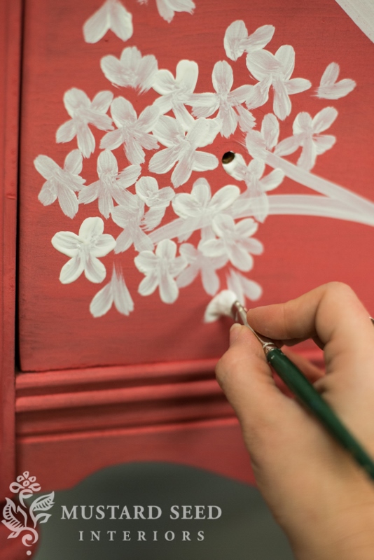
Every once in a while I step back to see how the overall look is shaping up, but I try not to over think the design.
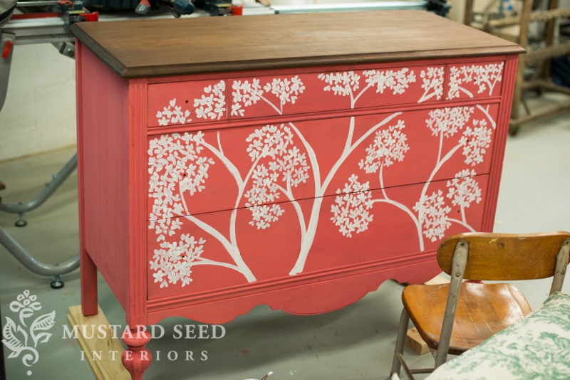
I finished it off with some “scratchy-styled” distressing and hemp oil. Here’s a peek…
And here’s a look at the matching, but not matching desk/vanity…
I’ll haul them up from the basement for a photo shoot tomorrow before they are packed up to take down to Alabama for The Chapel Market (along with the Trophy dresser.)
![]()
On another note, I got some beautiful fabric in the mail today from Online Fabric Store…
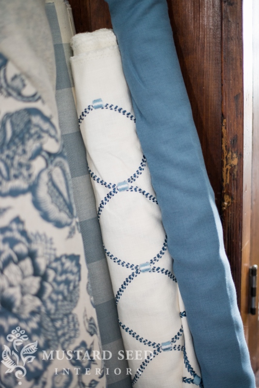
I cannot wait to break out the sewing machine and knock out some of the upholstery projects on my list!


47 Responses
Beautiful!
I think it is amazing how you can take an old piece and the way that you painted it I can see it in a vintage home or a totally zen modern home it has that special timeless look but would totally go in the hippest new york loft as well……once again you have amazed me with your creativity. Thanks for sharing you are so inspiring!
I love the dark walnut stain. What do you out on top of that to protect it?
Hemp oil
Can’t wait to see what knobs you’re putting on! That Apron Strings color is really growing on me, even though I’ve never been a red girl 😉
I just love it when you add the cherry blossom detail, beautiful as always.
is that last picture the piece you did in typewrite? how did you bring out the rust coloring in the legs? Just beautiful!
I was wondering, you get so many projects done and a list of many more and materials for even more on what seems like an endless amount of time. I wonder do you set specific hours for your days work, as if it were a job with set hours so that you can have the remainder of your day and parts of the weekends to be a wife and mother, groceries, helping with school work, being with husband, going to church, participating in other church affairs, etc, etc?? Can you give us some sort of strategy that you use to do ALL of this? Oh by the way, do you sleep?
I second this question! Do tell!
What knobs did you use? I love the red!
Oh…I am sooooo excited that I get to see this beautiful piece in person on Saturday:) So looking forward to the Chapel Market…see ya there!!!
Blessings,
Linda
Beautiful!!!
Here is a blogpost from another that I follow & thought you’d find it interesting in light of recent (somewhat negative) postings.
Paint & design on. Your talent jus impressive!
http://besimplyorganized.blogspot.com
http://besimplyorganized.blogspot.com
Pops!
Love it Marian and your new color!!! I really want to try your cherry blossom technique.
You are such an inspiration. BRAVO!!!
Gorgeous!! I have a question. If you don’t add the bonding agent, will the paint come off later on? Thanks!
I LOVE LOVE apron strings….and it’s gorgeous on this dresser. Inspired…once again! 🙂
Dear MMS, Another job well done! Lovely hand painting, the details are gorgeous. Hugs, Anne Boykin
Oh, be still my heart! I’m so in love with that color – can’t wait to get some!!
Oh my gosh, it is so charming. I love the color! It is a perfect shade of red!
Cindy
First and foremost……….Congrats on the weight loss you look Fabulous!!
Beautiful piece as well. I was going t do a cherry blossom design on a piece I had but chicken out. I will however do it in the future now that I have painted a bunch of pieces lol
Wow. I am not totally convinced about Apron Strings, yet. But I have to say – with the cherry blossom motif – it really is working for me. First time I’ve seen it and really liked it. I think it is the addition of the white –
Looks fantastic – as usual, Marian!
-b.
LOL…yeah, you’re not going to see it all over my house, either, but if the paint line was only comprised of colors I use, it would all be shades of blue and white! The color is a coral, but it actually ended up taking more of a raspberry look on this particular dresser, which I really like. It was a fun piece to paint, but I agree that the decorative painting was needed to break up the color.
I learn so much from you!! Everything you do is beautiful!
Pam
Now this piece I LOVE!
Awwww so pretty! If you’re going to include a “pink” that is the perfect shade! Thanks for including the details on what type of artist brush you use too. Hope you are enjoying this beautiful weather! 🙂 — Pauline
Love her legs and the color is great. On my monitor it looks like a coral color which I love. Would love to paint our bedroom walls that color. She looks really pretty. Happy week
Beautiful! I love when you put cherry blossoms on your dressers.
Can’t wait to see everything at The Chapel Market!! So excited.
I really like the new color apron strings. I like the piece you did but I think the color is so pretty I wanted to see more of the apron string color. I would have liked it better with less cherry blossoms. But that is why pieces sell everyone likes something different.
Hello Marian, As always you take something and turn it into something exquisite. Love the dresser, what did you use for the scratchy look? You are talented not only with paints but sewing as well. Enjoy seeing your transformations!
Can’t wait to see them all styled up!
Love the dresser AND the fabric! Would love to see a barn/americana red in your line! I also have to agree with the others…you are truly an inspiration to others! God Bless!
I love the fabric at the end of today’s blog. Just moved to Collierville, TN outside of Memphis. I would like to have some window treatments made. Any suggestions as to how to find a seamstress?
Thanks
Kimberly
Love your work. Just took a class on Milk Paint at Me and Mrs. Jones!
I used that blue and white fabric you have pictured, second from the right, for a French Bergere chair in a guest bedroom. The upholsterer did not want to give up the chair when I went to pick it up because she loved it so! It is the most amazing fabric and looks great on a Louis XV chair. If you are ever in the Raleigh, NC area you must go to Mill village Outlet. Their fabrics are fabulous and priced right! Here’s a link o their website: http://www.milloutletvillage.com/. Enjoy!
I love, love, love all the pieces!!!!!!
thanks for featuring my painted upholstered chair on Friday! I love love love this dresser!
Love the apron strings dresser and color. I have a very similar dresser but I have decided to try a reverse stencil on it. It’s almost done You can see it here https://www.facebook.com/photo.php?fbid=631824263535811&set=pcb.631826646868906&type=1&theater
I LOVE all your work!!
Kristen
Love the dresser and the color but I’m wondering about the “uneven” finish of milk paint that you said was normal. If you had not added the cherry blossoms, would the was finish have evened things out? I’m planning a project in grainsack with a blue stripe and just wondering what to expect. Thanks for any insight! PS – You must have had the BEST time coming up with the color names….I love them all!
I meant wax finish. 🙂
Yeah, the finish makes the color richer and evens things out a bit more. There are always going to be variations with milk paint, because all natural pigments are used, but it shouldn’t look blotchy or streaky. Grain Sack doesn’t have a lot of pigment, so you shouldn’t have that issue at all.
This is really gorgeous! I love the transformation of this piece.. will have to share it! I love the hemp oiled top too.
Oh I love this – makes me want to go out a buy a brush to make the cherry blossoms with!
Love the color. Love the Look. Love the design. What more can I say but I wish I were closer so I could come and get them. LOL
I love the look of the Hemp Oil, but could you tell me the difference or benefits to that over polyurethane??
Thank you for sharing so much of your expertise!!!
For decorative painting, acrylic has always been my preference. It’s amazing how you can take an old piece and the way that you painted it and looks stunning. You are such an inspiration for me.