
Last week, I shared inspiration and some plans for our dining room. You can find that post HERE. In this post, I wanted to share the fabrics and colors I considered for the curtains and which one I selected.
We have already had these windows replaced, but I’ve been waiting to nail down the curtains until I figured out what I wanted to do on the walls. This room is a game of dominoes and I have been hesitant to commit to knocking the first one down. It’s easier to paint before hanging curtains and I obviously want the paint and curtains to make sense together, but I need to paint the ceiling before I paint the walls… You can see how this goes.
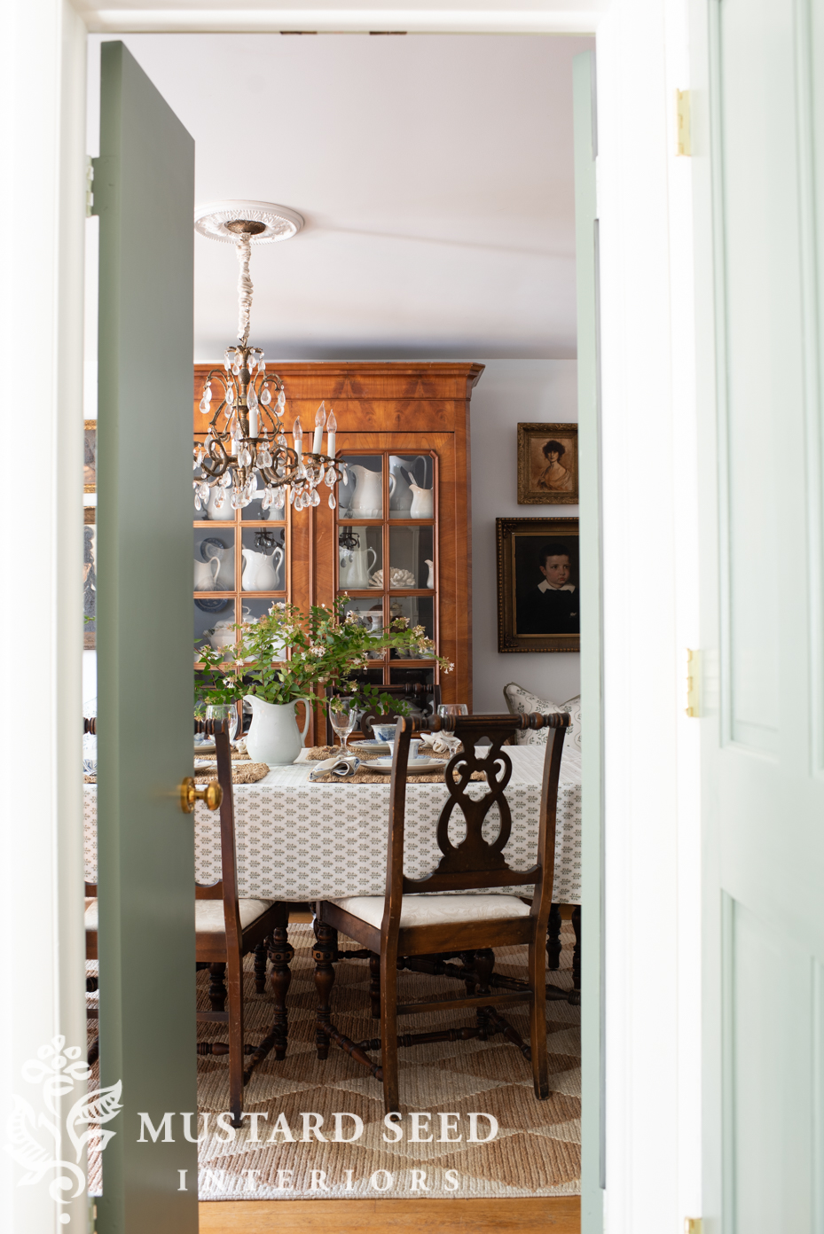
Full-length curtains will add so much to this space, though, so I can’t wait to get them done. They’ll frame out the window and visually give it more importance as well as balance out the height of the French cabinet you can see through the doorway in the photo above. In the photo below, it’s on the wall to the right of the table.

Neutral Curtains reached out to me on Instagram and asked if I would like to partner with them on a pair of curtains. Well, I know just the room!
I am a big believer in ordering swatches so you can see the colors, patterns, and texture in person. It’s not only hard to tell true colors on a computer screen, but you don’t really know what the fabrics feel like or how the texture reads in person. What might look luxurious online ends up looking cheap in person. What you think would be your obvious choice might end up lower on the list and one that was a remote possibility becomes a favorite. All of the fabric swatches from Neutral Curtains looked even better in person than I imagined, which made the choice a tough one! I had more favorites than I expected and, fabric from a swatch book I considered not even ordering rose to the top, You can order the entire collection of swatch books from Neutral Curtains HERE for $1.00)

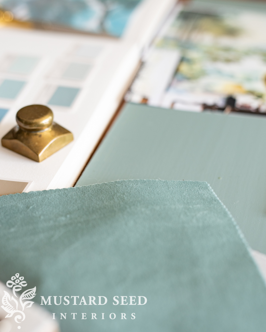
Here are the fabrics that were in the running. I put them all on the dining room table, arranged against a painted sample of Oval Room Blue, so I could see how the colors looked together and in the light of the room where they would be.
Lily Fabric (Linen blend) – Everglade Teal
I thought this one would be my favorite, but I wasn’t sure if I liked how the blues played together. They worked, but I wasn’t sure it was what I wanted. I did love the nubby texture of the Lily swatches, though.

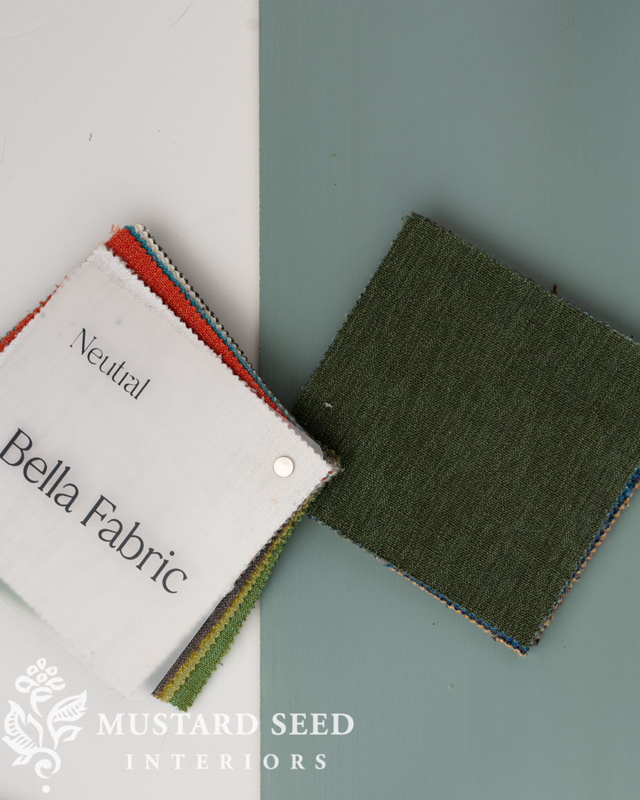
Bella Fabric (Cotton) – Hunter Green
I think this one could’ve worked, but the green was darker than what I had in mind. It stayed in the running, but it wasn’t in the lead.
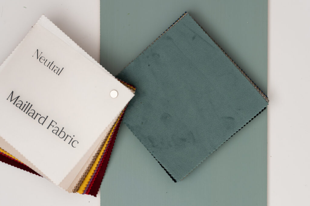
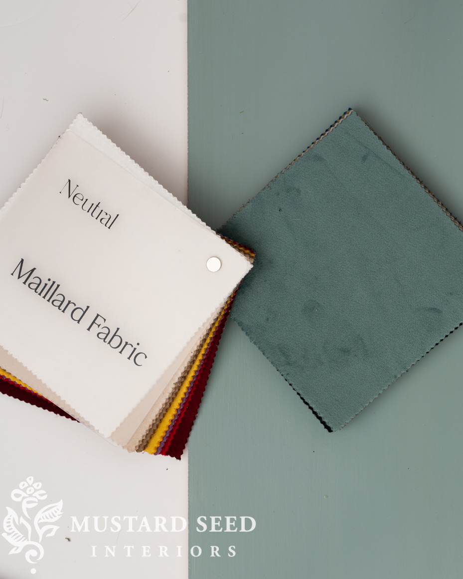
Maillard Fabric (Velvet) – Teal
This is the fabric sample I wasn’t even considering. I envisioned linen or linen-blend curtains, but I kept coming back to this blue/green and how nice it looked against the wall color. I liked the idea of velvet adding some formality to the dining room, too. The color, “Teal” is not one I would’ve even considered from the website, but the swatch was perfect in person.
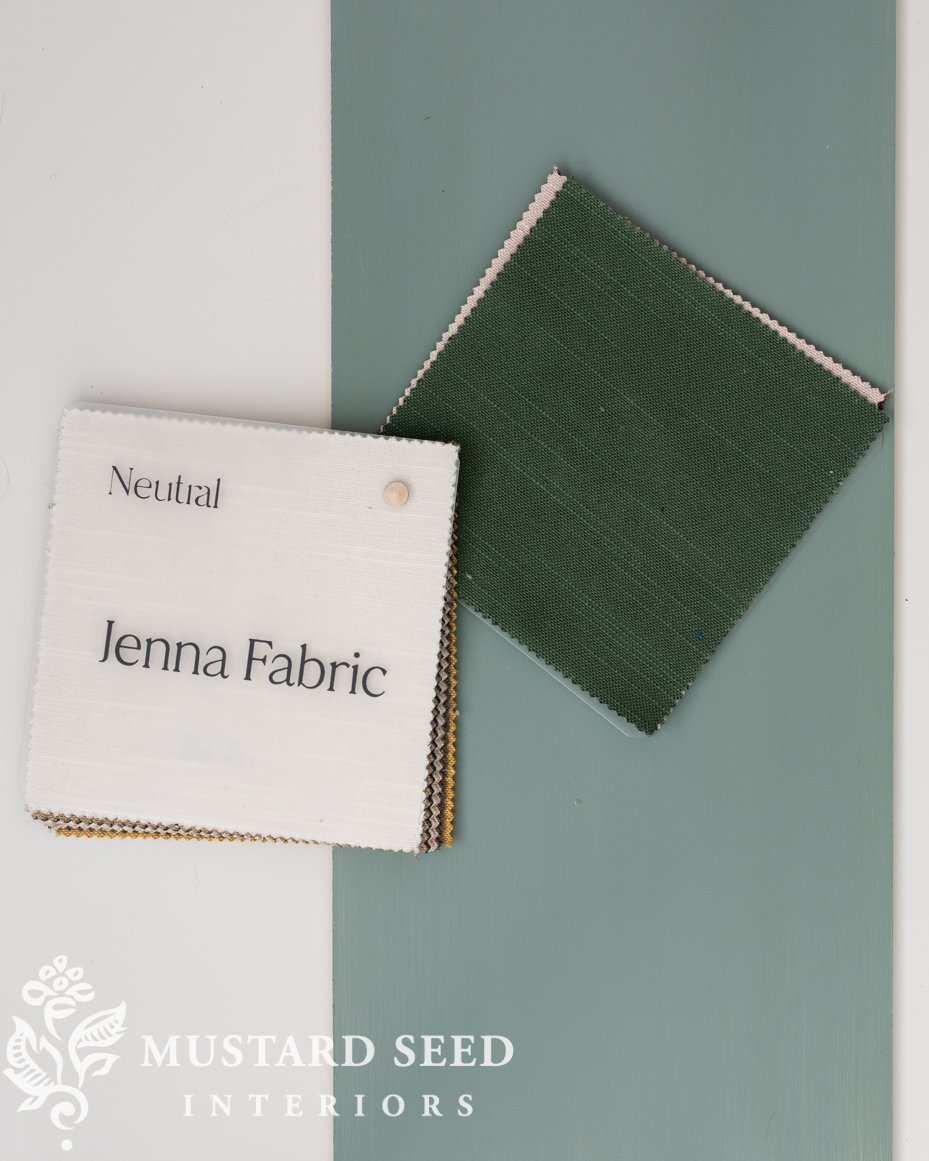
Jenna Fabric (Linen Cotton Blend) – Hunter Green
This was my other front-runner. I really loved the texture of the linen/cotton blend and the green worked beautifully with the blue and tied into the kitchen cabinets. I wanted this room to lean into blue, though. since greens are the feature in the kitchen and living rooms.
I went back and forth between the last two options, but I landed on Maillard in Teal. Once that decision was made and the curtains ordered, I started playing around with colors to use in the mural. I’ll share about those tomorrow…


14 Responses
I’m so thrilled to learn about this company Neutral Curtains! I skimmed through their site and noticed they also offer really, really long and really, really wide drapes! I never thought this would be available without the expense of custom. I’m going to order some samples for my very tall and wide windows. Thank you for highlighting this company!
What color paint did you use on the doors and trim in the first photograph? Beautiful!
The doors are Card Room Green by Farrow & Ball and the trim is Pure White by Sherwin Williams.
Now I wish you would address curtain rods. That’s where is seems to get really expensive to me!
I love the colour of the velvet. It is soft and will look completely luxurious in your dining room!
Each sample is beautiful! Velvet seems a little winters unless you plan on changing curtains seasonally. May I ask do you do your own wall and ceiling painting?
I love velvet drapes. They lend such a presence! The color is beautiful
So rich, love the velvet! To me, a very regal feeling for your dining room and a perfect partner for the mural. I am obsessed by the colors you are choosing. It’s going to be fun to watch.
Congrats on your weight loss!!
Excellent choice. I love the subtle variations made by the shadows on velvet. I chose gold velvet for my dining room and they finished the room spectacularly. I never would have selected gold but that color brought a pizazz that I really love.
Your posts still jump around a lot. It’s difficult to read a post in order. I don’t have this problem with any other to whom I subscribe.
Oh man, I’m sorry! Are you looking on a phone, tablet, or computer?
Absolutely love your choice, the color is perfect and the velvet will be great for the room. CANNOT wait for your mural.
Hi Marian, Thanks for the information on the caning of the dining room chairs I bought from you so very long ago. I’m still trying to decide what to do. My skills aren’t that wonderful when it comes to caning a chair and I received an estimate of $300 per chair so I’m looking at alternatives….stretchy covers for the backs of the chairs..from Amazon. They will be arriving soon and I’ll have to decide if they look good, ok or just tacky. Thanks again.
I was hoping that would be your choice when I saw the photo of all the swatches against the blue paint. I am so excited about the mural.