
Yesterday, I worked on making some paint sample boards to nail down the colors I’ve been mulling over for the main living areas of our house. Usually, I would just slap a swatch on the wall, but this house has slowed down my typical go-for-it approach. The biggest obstacle has been all of the wallpaper and wallpaper glue still on the walls. Several steps have to happen before I can even paint a swatch! I also need to live with and learn the light in this house, which is so different from our last house. I can’t just assume that what I know works will actually work in this house. I have to take time to relearn what I think about color. So, making paint sample boards was the way I could make some decisions.
The colors I have selected to test out are Light Blue, Oval Room Blue, Calke Green, Card Room Green, Skimming Stone, Blue Gray, and All White, all by Farrow & Ball. I have ordered a sample of Skimming Stone, but I had sample pots of everything else, so I could make paint samples boards to play with, move about, and see what I like best in which room.

For the boards themselves, I used some MDF boards I had cut a few years ago to make color charts for my studio. I ended up doing those mostly on paper and canvas boards, so these have just been hanging about. They were a nice size for a paint sample board, so I could tuck them next to the fireplace, against the trim, and lean on a piece of furniture. I would suggest using something rigid so it doesn’t bend or flop over and can stand up to being moved around. You also want something smooth so the texture doesn’t affect the look of the paint. MDF or thin, smooth plywood really is a great option and can easily be cut to a reasonably-sized rectangle or square. (Come to think of it, a 16 x 20 wood artist panel like would be great, but likely not as economical as MDF from the hardware store.)

Here are all of the supplies you’ll need to paint your paint sample boards…
- Wood or MDF panels
- Primer (I used )
- Sample pots of paint
- A good synthetic paintbrush. You want nice, smooth strokes to make a paint sample board. is my favorite for painting trim and cutting in and it’s what I used for this project.
- You don’t need these, but I used cardboard boxes to prop up the panels to make them a little easier to paint. Painting a flat panel on a flat surface can be a little tricky.
And, I have some tips for you when it comes to the process of making paint sample boards so you end up with a professional result.
- You noticed primer on the supplies list, right? Well, my first tip is to use the primer! I know priming isn’t fun, but it is so important to prime a raw surface. This isn’t about adhesion or making the paint more durable, but it’s about creating a surface that will accept the color more like your wall will. The color will read differently if it absorbs more or less than an average wall. Priming the board will give you a more uniform finish that will be a better tool. Remember, this is about giving you the best idea for what color will work in your room, so you want to set yourself up for success.
- Apply at least two coats of paint. Again, you want the color to be uniform and a good representation of itself. Even if it looks passable with just one coat, I would suggest doing two. For very dark or very light colors, you might want to do three or even more if needed.
- Label each board. This might seem like a no-brainer, but I wanted to point it out. You might think you’ll remember the colors, but I know I’m not the first one to paint swatches, not label them, and then forget which is which!

To use the paint sample boards, put them in the rooms where you want to test them out and watch them. Watch them in the morning light, afternoon, evening, and night. How does the color look in natural light, under lamp light, and under overhead lights? How does it look next to your furniture? Your fabrics? Any pieces in the room that are staying, like the floor, a carpet/rug, brick, stone, built-ins, etc. One of the biggest DIY bummers is when you paint a room in a color you like and then everything else looks all wrong.
And don’t just leave the panels in one place. Move the paint sample boards around the room to really get the most out of them. Lean them against the wall on the floor, on a piece of furniture, on the sofa, on chairs, on shelves, or even temporarily stick them to the wall with some .
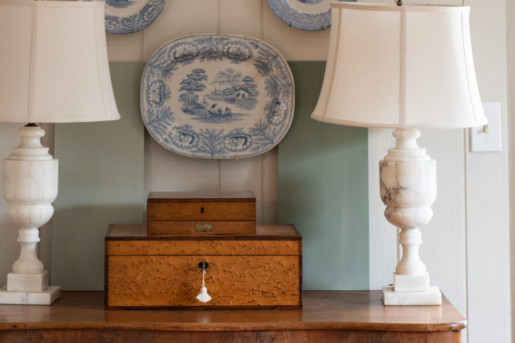
I wasn’t very excited about the painted sample of Blue Gray when it was in my studio, but when I leaned it up next to the fireplace in the living room, I really liked it!

I am not planning on painting the brick, but we’ll be building a new fireplace surround and will paint that, so the color has to work with the brick. We’ll also be painting the built-ins and trim in the color we pick. I say we loosely because Jeff defers paint color choices to me, but I have taken an unofficial poll to see what colors he likes.

I was also looking at Card Room Green for this space, but that might take it a little too dark. I do love it, though, so it’s still in the running.

And, I am following my own advice and moving these all around the room, trying to imagine how everything will look against the color.

It’s going to be a tough choice, but these paint sample boards are helping me narrow it down and be more confident when I’m ready to purchase paint.


30 Responses
I like using foam core for making paint samples. It is lightweight, easy to move, and very affordable.
I love Card Room Green, and I’m looking forward to seeing what you choose!
I like both… I also like moodier colors but with your wood furniture tones and what I imagine the overall feel of your what I am sure will be a lovely room, I think the blue gray is so peaceful and may be more complimentary to fabric changes etc. Anxious to see the end result will look like.
Good luck,
Eileen (North Carolina)
I have found that painting a foam core board with latex paint does warp it if not weighed down flat. Other than this issue, I agree it is cheap, light and be easily moved around.
I liked the first one until I say the second one. Either will be so pretty, good luck. Can’t wait to see all the choices you make.
Such a smart way to select colors! I have seen tv decorators paint samples on brown cardboard…certainly not a true representation of the color since the brown surface will influence. the end result. With all the work necessary to paint a room you want the most accurate information to make the best selection.
I believe I would choose darker. It looks pretty with the brick and would be very pretty on the bookcases. I imagine it looks well with the floor too.
Either will be pretty because your spaces always turn out lovely.
Card room green would be choice especially with your furniture! It looks classy and soft. It will be easier to coordinate with other colors too. I know you will make a good decision and it will look beautiful. Have fun decorating your new to you home.
Appreciated tips aside—good luck. Those are beautiful colors making for a difficult choice!
As always can’t wait to see how it turns out.
I got your beautiful book and am going to be working through it on the redo of my vintage camper Bayou Belle. Thank you for so much insight and wisdom.
Great advice! In my experience, after deciding on a favourite colour using the big painted swatches, it might be worth buying a quart of a favourite colour to paint one wall before committing to buying a five-gallon pail or more. The last time we repainted our interior, I found the colour had different undertones on the wall compared to the big swatch. Or maybe I didn’t paint enough coats on the swatch? Next time, I’ll do even more testing to be extra-super sure!
The darker colour would be lovely for a study or library but perhaps too dark for a living area? As you mentioned it’s all about the light though so hard for us to comment based on a pic
Ok, so I have a question for you..would you recommend choosing a wall colour first or your fabric (sofa colour), furniture etc before you choose the wall colour? I’m decorating an addition on our stone farmhouse and have heard conflicting recommendations. I trust your opinion so much!! Such helpful info on the sample paint boards! Thank you!
Forgot to say that I love, love the blue gray with the brick! I think it compliments the colour so well. Dreamy!
In South Carolina our light changes with seasons too, not just the time of day! Rethinking some of our colors now that the tree leaves are gone and the sun is lower in the sky. Thanks for the tips and for sharing!
It’s hard to tell what your natural light is like but for an entire room the Card Room Green is too dark. Also, I don’t think it works as well with all your blue & white dishes. The Gray Blue works great with your white pitchers and blue & white ware. Good luck!
I can see your paint samples are from Farrow & Ball paint cans….that’s good you didn’t use another paint company paint with Farrow & Ball color, a mistake some people do. The paint color wouldn’t match the true F &B because every paint company has a unique base that would change the color. I like your use of color in your decorating…just a balance of not using too much of green or blue.
Marian,
I love the idea of painting potential paint color candidates on board. I’m going to follow this tip for the bathroom I’m thinking of painting.
I hope you will email me with the answer to this question…did something happen to Sebastian? I always admired his beauty, and he seemed like such a sweet dog. I noticed you didn’t mention him when your power went out.
I hope he’s still with you.
xo,
Karen B.
I’m glad you asked! He’s still around, but he wasn’t as much of a concern because he travels so easily. He would just come with us to my parent’s house. With the cats, we would have to put them in carriers, bring their litter box, and they would be very out of sorts in a new house. It was best to keep them in our house if we could.
Hi Marian,
I love all the colors you chose. I suppose that living with them for a while will help you make a decision. I know your home will be beautiful!
Marian, wanted to ask you for the directions for making a cloth covering for journal books .
Many thanks!
I was almost giddy when a Farrow and Ball “stockist” opened near me. F&B colors (and quality) are the best, and I especially love their blues and greens.
I love the blue gray with the fireplace brick which is beautiful in the pictures. Very soft and warm and ties in with your foyer vintage rug. Everything flows. The green is beautiful too but may be too dark and too much green since the kitchen will have a lot of green.
Love how they accent your antique woods.
Btw. Where do you watch TV? You mentioned sketching while watching TV? I would love to see a floor plan. It helps when trying to understand how the rooms and views flow. Thank you for sharing.
I think the gray is pretty but the Card Room Green makes your blue transferware pop while the grayt doesn’t, Just my humble opinion.
Based on the information you have given, I think the blue gray would be less “bold” and more subtle. Of course, factoring in the floors is important as well. Whatever you, choose, I’m sure it will be lovely.
If those 2 colors play nice together, perhaps you could do the walls in the lighter shade, (I’ve aleady forgotten the name of it, so good advice to always label) and the built-ins the darker shade for a bit of contrast and to give the built-ins a bit more importance
WHAT!!!??? NO Stonnington Grey in the bunch???? lolo….you’ll get there….
I like the lighter colored one better. I feel the darker one is too over powering…but could be used as an accent color somewhere. The lighter one looks perfect with the bricks, the plant and the blue and white dishes. Actually looks like the bricks have a blend of it in there. Of course, being in person might be a lot different than on the computer. Paint can be so tricky when it bounces off each of the walls to one another. The darker one might also make the room appear smaller.
I know you will figure it out….you always do. Thanks for taking us along.
Of course, I always choose anything that has “BLUE” in the description.
I have never used much green or gray on walls.
Just wondering if you’re planning to trim or remove the trees that you previously mentioned block light before you paint?
Good question! The tree trimming is in the front and the “bedroom” side of the house, so it won’t affect the light in the living room, kitchen, or dining room. The light will definitely be changing in the house as we cut back trees and bushes, add recessed lighting, and we’ll likely add some skylight tubes as well.
I would like to add in that you should also, if possible, test the paint swatches in different SEASONS of light. Where I live it is winter 8 months of the year and so we really have more white light coming in the windows vs. the green light of summer reflecting off of the grass. And as was mentioned above, think about the light-changing effects of deciduous trees. Also worth testing rainy vs. sunny days.
I absolutely adore that lighter blue grey green – it looks amazing with your brick – and your bricks are perfect. So timeless. I wouldn’t paint them = they’re so natural looking and gorgeous.
Not that you asked our opinions, haha. But I felt compelled to tell you because that is one of my very fav colors.
My choice is the Blue Gray. I’m in the process of changing the Pavement Gray in my house to a lighter gray with a blue undertone. What a difference .. still gray but softer and lighter. Fun.. lots of work … fell off the ladder today… aauuugghhh….