
You would think that selecting a wall color would be really simple. Right? Well, if you’ve ever strolled into a paint store and picked a color based on a little chip and spent a day painting, only to realize that the color was much brighter, darker, bluer, greener, pinker, whatever-er than you thought it was in the store, then you know it’s not as simple as one would think.
I’ve gone through the scenario described above enough times to know that it’s worth taking my time when selecting a paint color.
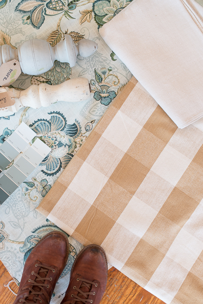
Start off by going to a paint store and pulling as many chips as you want that are in your desired color palette. (Since I qualify as a “designer”, I have paint decks from several major paint stores, so I just pull those out.) Even if you’re just painting the walls white, get lots of paint chips, because there are lots of different whites! (Some “whites” even end up looking like colors once they are on a large surface.)
And don’t worry about brands at this point. Just look at the colors, because any good paint store can mix whatever color you want.
Once you have your paint chips, match them up to the “springboard” of your room. This is usually a fabric (whether it’s curtains, bedding, upholstery, etc.) or a patterned rug. If your room is neutrals, this step is still important. You would be surprised how different warm whites and cool whites can play against fabrics.
You also might be surprised how colors that look white, really aren’t at all! Both of the colors I selected for my mom’s room look almost white in the pictures, but are clearly blue/green when you hold them against a piece of bright white paper.

Hold the chips against your trim, floors and even neighboring rooms if you have an open floor plan. Set aside the ones you like the best and then compare those to one another. I would suggest narrowing it down to your 2-3 favorites, so you’re not too overwhelmed. If you like more than three, set those aside to try if your top three favorites don’t work for you once they are on the wall.
Paint swatches on the wall in various places in the room. I like to paint a swatch against window trim and against a baseboard to see how the color relates to the trim and floor.
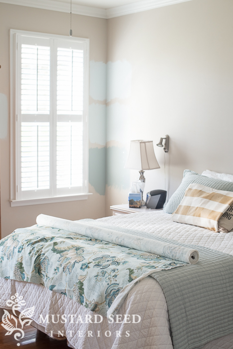
Live with those swatches for a few days and take note of how each color looks in the morning light, afternoon, evening and under artificial lights at night.
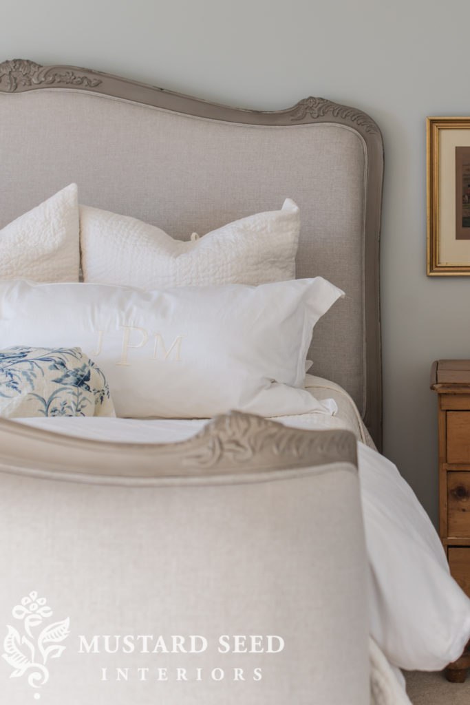
The swatches we painted in my parent’s room are Benjamin Moore’s Whispering Springs, In Your Eyes and a custom mix to match their new bedding. (Just a note: You usually can’t get a custom mix in a test pot, but they can determine the color in their database that is closest to what you want to match.)

The bottom color was pretty, but too dark. The top color was a bit too icy. We all liked the middle color, which had a bit more gray in it. It looked nice with the bedding, fabric and all of the other elements going on in the room.
“In Your Eyes” by Benjamin Moore is the winner. It feels fresh, calming and definitely coastal.
While I was in the room looking at swatches, I decided to roll out the fabric to look at it with the bedding. I also folded the buffalo check around a pillow to get a sense of how it would look. I like to do this as I work on a space to give myself visual confirmation of my choices before I put time into the sewing projects. If something’s not working, this is a good time to shift gears before you’re neck-deep in a room redo that you don’t like.
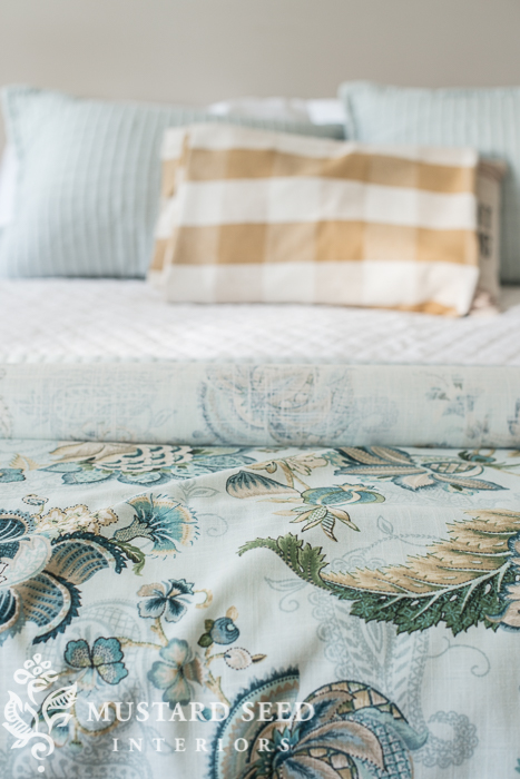
The floral fabric is just going to be the bedskirt and a few accent pillows, so I tucked it under the quilt and let it hang down against the rug.
So, I am working with my mom on this, since it’s her room and as soon as I put the fabric under the quilt to let it hang down, she looked up at me and asked, “Well, isn’t it going to be a gathered skirt?”
I admit that I rolled my eyes. “Yes, mom! I’m just draping the fabric to get an idea of how it looks between the rug and bedding!”
The sarcastic side of me wanted to tell her that my plan was to leave the roll of fabric under the quilt and every night they have to kick it off the end of the bed to sleep and then put it back in the morning. Voila. No-sew bedskirt.
But I refrained.
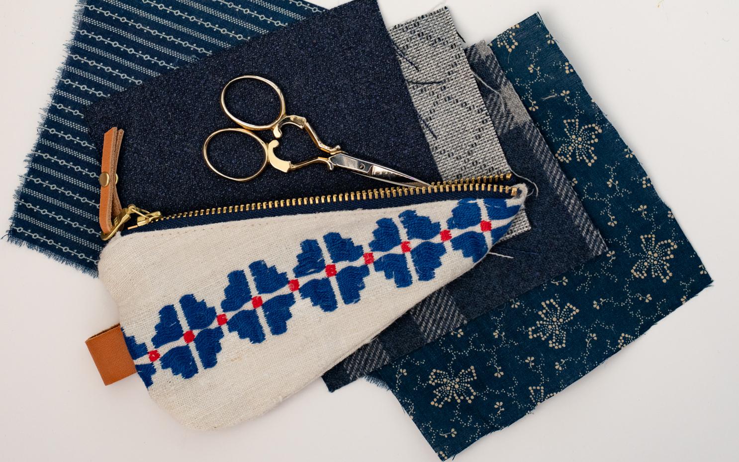
PS. Sorry, I listed the source in my previous posts, but the fabric is called Adelaide Mist by P Kaufmann.
![]()
If you missed the first two parts of this series, here they are…


39 Responses
Hi Marian, I love the color palette! I know that using fabric is a good way to pick your paint colors. But, what if you don’t have that kind of choice? My dining room is in the middle of my house, no windows, neutral floor color (carpet). There isn’t any type of “jumping off point”, which always gets me stuck when trying to pick a paint color. Any suggestions? Thanks so much!
Most paint stores rate their paint chips with a “light reflective value” – how much light bounces off the paint. Obviously, in your interior space, look for a color with a very high reflective value. After that, you can have fun looking at a whole range of colors. High reflective value does not mean bland – there are many highly reflective colors with distinct personality. Hope that helps.
Thanks Mary!
I had to laugh when you mentioned kicking off the fabric to sleep then putting it back each morning. I have a throw on the end of my bed that my husband and I end up kicking off each night and we put it back in the morning when we make the bed. It annoys my husband but it looks good!
Your mother and mine must be long lost twins.
lol! Love the interaction between you and your mom. Reminds me of my 30-year old daughter and me! Mom!
So glad to see a mention of “In your eyes.” We painted our foyer, stairwell, and hallway this
color 20 years ago and never tire of it. When the afternoon sun hits it, it is soft and inviting.
More on the blue side than green, it is soft and easy to live with. Looks great with wood floors, and even in a room carpeted in a light green/grey. A nice neutral background
color that blends with a variety of colors. Our trim color is BM Super White. All your choices look
good. Love the fabrics.
I love the worn look of the blue fabric and the paint color choices look so good. Picking a white can almost be trickier than picking a “color”. Right now my favorite is BM Cloud White. Whenever I’m picking paint colors I paint them on a piece of White foam board (the really super stiff poster board). That way I get a true read of the color and I can move it around the room easily taping and propping it up. Plus, if you have flat walls you don’t have to worry about getting that “line” that will occur from painting the swatches directly on your wall. Sanding away lines from paint swatches is just too much of a hassle. I can’t wait to see it all come together. The room is going to look great!
This is very interesting! For one, I feel validated that my experiences with having to paint samples first are what someone who is actually a designer does! I used to paint them on lightweight board first, to skip having to put primer over them on the wall. You can also move them around that way.
For two, the colors look different on my computer but our concerns are the same! The swatches look gray to me and the middle test sample on the wall is the one that looks icy to me. Thank goodness you are there!
Another trick I use is to close one eye and hold the sample [of anything] up close to my other eye. This maximizes it’s effect.
One more trick is to wet a paint sample to see what it will look like in semi-gloss or gloss.
The tan buffalo check fabric must be for the curtains and will be balanced by the wood and rug in room, right? [It does not look right on the bed.]
I think this is a fascinating series!!!
Marian, this is such a fun look. I so enjoy watching you put a space together. Good choice on the paint. Your mom has helped you out with your business so much, it must be hard to just stand back and let you do what you do best. I think she will be very pleased with the end result. This looks like it should be a feature in a magazine (“Rooms For Relatives”, or some such thing)!
Reply to Judy….
Here are some ideas….
— Pick one of your favorite colors. Pretty much anything goes with neutrals except other light colors. Light yellow and beige look terrible next to each other.
— Pick a shade of red since it stimulates appetite,
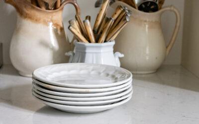
— Pick a color that compliments plates or framed prints in the room.
— Pick a decorating style and then pick a color that is often used in that style. Do a search for that style and then look at images.
I love your choices. Can I ask where you got the fabric? I’d love to make some pillows out of it!
She got it at Sailrite. It was on an earlier post.
Would you know the name of the fabric?
Thanks
Yummy fabrics and colors, and good advice!
Cindy
Judy,
Marian put links in for the fabric in an earlier post in this series. All I remember offhand is that they are from Sailrite.com
Hi Marian,
What paint finish did you choose for this space?
Love everything about this room!
Best,
Jess
It’s going to be so nice with those colors…Can’t wait to see the big reveal.
Lol, the last part made me laugh! I like the paint color too. It looks like the perfect choice. It’s coming together!
I love that color check with the main fabric you chose. Great combination!
You ARE a designer, Marian. You may not have gone to school for that. But that is who God made you to be. Just saying. 🙂 And your conversations with your Mom made me laugh. 🙂 Thanks for sharing your journeys as always!
hahaha. You literally had me laughing by the end of this post. But in al seriousness the room is shaping up to be soooo pretty! I guessed and hoped you were going with the middle paint color!
Love it all! Can you share the name and source of your fabric!
Thank you!!
I found Sailrite but cannot find the exact fabric. Can you share the name of the fabric?
Thanks
Hi I just love all you do- I’m really in love with your fabric choices can you share where you purchased please and the name if you have it
Thanks
I love the fabrics and think it will be a lovely room when finished. I would just suggest that when trying paint colours you paint the sample on a heavy paper not the wall. Then you can move it to different places in the room and if you put white paper under it you won’t be influenced by the colour already on the wall.
Marian, I look forward to opening your emails every time they come. I have enjoyed them even more-so since you decided to get input from your readers. I anxious to see your mother’s bedroom completed. I don’t usually keep email for very long but I thought you told your readers where you got the beautiful large-print floral fabric that you’ve showed us(the blue patterned). I somehow was thinking Sailright, but, could you remind us again where you got the fabric? Thanks. Carlotta
The thing I’m really good at is picking paint colors. I love it. And I love to help people pick the perfect color. I can’t wait to see this project develop – it’s so pretty.
The room is going to be wonderful. I cracked up, my mom would have said something similar and I would have had to fight the urge to provide a sarcastic retort! Mom’s and daughter’s, always the same everywhere!
Karen
The fabric appears to be Sailrite P/Kaufmann Adelaide Mist 54″ …I found it on the website. Great choices…it will be lovely!
Had to chuckle!!!….Love all of your choices Marian…going to be a most beautiful room!
Marian & Kim host the Oscars a la Tina Fey & Amy Pollar!!! Seriously you should do a comedic sketch of what it’s like working with family who know all your quirks etc. The funny thing (maybe only to me) is that I think of Kim as a 30-something name and Marian as “the mom” name.
Here’s the fabrics Marian chose for the room:
The Sailrite fabrics for my mom’s room makeover arrived last week, so I rolled them out today to find some wall color candidates and review the milk paint options for the furniture. (The floral fabric is Adelaide Mist by P/Kaufmann and the check is Covington Reagan Burnished Bronze Buffalo Check.)
Good daughter! Best to nip the snarky in the bud with mothers, speaking as one!
Seriously, I really like the elements you’ve chosen for Kim’s room. The colors you are using are some of my favorites. I can’t wait to see the finished project. Could you PULL-eeze come to Michigan and redo MY bedroom?
You really have guts. When I redid my mom’s room I waited until she was out of town for two weeks. She had NO idea what I was doing and I didn’t consult her on one decision. Thank GOD she loved it…unlike my teenage daughter whose first words out of her mouth when I did her bedroom while she was at camp were “I hate it.” I have zero patience for someone questioning every decision (I do enough of that on my own) or stupid questions. You are a saint.
I had to laugh when your mother Sao that to yo because it sounded just like something my mother would say to me.
The room is shaping up nicely. I can just picture it in my mind. Keep up the good work and bless you dealing with mothers.
I haven’t read all of the comments to see if suggest, but foam core poster board from the dollar store is a great thing to paint and move around.
Just a thought, the built in wall is going to be painted what color? If it’s the same as the trim it’s a shade of white. That is going to make a big impact on how the paint color is going to look in the room too. You might want a paint color that has more impact. Between the wall with windows and shutters and the built ins, you basically only have 2 walls that will show the actual color. Using a lighter color paint may make it look washed out. Not that I necessarily know what I’m talking about but, we painted our son’s room a rather bright shade of yellow. One wall was basically closet doors which were white and one larger wall was filled with a desk, dresser, shelving unit that was white. Throw in a white headboard and some furniture and there wasn’t a whole lot of yellow showing and it was great. And then he grew up, moved out and took the unit that filled the one wall and now I have a very bright yellow soon to be painted! 🙂
Lots of eye catching sections in your post. Nice selection of floral fabric for the bedskirt. Loved your choice of colors.