
Over the past few days work days, I’ve been getting the studio ready for our first workshops (happening later this week.) It’s been good to have an imposed deadline to get things spruced up. Otherwise, I just work on whatever I’m most interested in and leave other things hanging. Kriste is always a huge help, but in this case, she was really good at keeping me on track. I’ll meander around the studio, working on this and that and she’ll say, “Okay, what are the priorities? Should we get this finished before the workshops? I’ll work on this while you take care of that.” It’s so helpful.
So, a few weeks ago, I painted the oak hutch that’s behind the shirt counter…

I painted the outside in one coat of Shutter Gray and then got busy with other things, so I never applied a finish. After living with it that way for a few weeks, I realized I really liked the matte finish of the milk paint on its own, so I decided not to put a finish on it.


The inside still needed to be painted, though, and Kriste decided to take matters into her own hands. She’s becoming very proficient with milk paint now, so she’s comfortable with diving in.

She emptied the hutch of all of the paint and products and painted it in Mora, the color I had been talking about using to play against the Shutter Gray. (Mora is the final color in the European line and I’ll introduce it officially in a few days.)
The colors look amazing together, by the way. Kriste forgot to add the Bonding Agent, but I ended up really loving the chipping that happened and it didn’t get too out of control.

Since this piece doesn’t get heavy use, I didn’t loosen the chipped areas, but just left them alone.

And I didn’t even distress this piece. It was just paint and go.


I am so in love with this hutch and sort of want to take it home with me, but it’s really big and super heavy and, after moving this beast twice already, Jeff will certainly drawn the line. (Meaning it’s not going anywhere until absolutely necessary.)

I filled it up with some ironstone just to take some pretty pictures before I loaded it up with MMSMP products again.
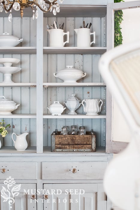


This was a really beautiful piece before, but I am over-the-moon about it now that it’s painted. It just may be in the running for one of my favorites painted pieces ever…
…and that’s saying quite a lot!





21 Responses
Absolutely beautiful! I love the combination of those colors!
Wow, Marian, you are so brave and sure of yourself- you amaze me, again!! How did you decide to paint the wood on your beautiful hutch?? I am always so torn between leaving a piece in it’s “wooden” state or painting it. I paint if it has serious issues with the wood but I would have had a hard time painting your hutch- it had a lovely rich patina, at least in the pics. What are your criteria for painting, or do you just paint when you feel the urge? I am curious to know- I know you love wood as well and leave some of your pieces untouched.
BTW, I just bought a 1920″s hi boy today for resale and am going to paint it MMS Linen. It has issues with the wood and will look fabulous in Linen!!!
Love this colour. So excited to try your European colours. I’ve ordered one of each!
I thought you always had to seal milk paint?
Oooooo, this is so charming. I do love the matte finish too! Have a great week of workshops. I wish I lived closer. I would love to come!
Oh Marian I LOVE this piece! It looks so amazing now, I can understand why you want it to go home, but it looks gorgeous in the studio. I am still amazed at the power of paint! Great job ladies! Wendy – Front Porch Mercantile
That is so beautiful. Mora looks like another color I would love to have in my home. If you put a base coat of milk paint on a piece with the bonding agent and then put a top layer on in another color will you get that wonderful chipping? or will milk paint stick to milk paint? I have a project that I want to do and I was just wondering if that could work.
I meant another color without the bonding agent added on top. I wasn’t very clear in my question after reading it again.
Hi Karen,
I am somewhat of a novice at using milk paint, but I had success with painting a base coat in one color, then using the wax puck in spots, and then painting over the piece with a second color of milk paint. I did not use bonding agent in either coat of paint on my piece because I was starting with previously unfinished raw wood, but the wax puck really helped to create some resist with the second coat of paint. My finished piece allowed the base color of trophy to show through on the second color of grain sack. I was really pleased with the final result. You can see the results I obtained here:
http://seasonalchapters.blogspot.com/2014/11/toy-chest-becomes-end-table.html
I hope that gives you another idea for one way of getting your base color to show through. Good luck.
Oh my gosh, it’s wooonderful! I love it too1 The colors are perfect, and it looks so pretty with the chandy in front of it, and with the ironstone inside… That has to be a favorite of mine too!
Cindy
aw, seems criminal to loose that lovely wood tone on purpose…i think we need wood tones here and there and preserve pieces like that. I say paint up all the old 60’s-70’s junk and keep the good stuff natural,
I agree with you, Gilda! They don’t make beautiful oak furniture like that anymore!!! What a lovely piece, huh?!
You sound like a true ADD ARTIST. Flitting from one project to the next. I do the same. Drives my family nuts, me too to an extent. The cabinet looks great!
Oh noooooo, another beautiful wooden piece sadly obliterated with trendy pale paint. I will be so happy when this (inevitably) goes out of style and beautiful old wood is again appreciated in its original form.
If you don’t like painted furniture, you have come to the wrong blog! 🙂
What a lovely job on the hutch! I love the way the ironstone looks displayed in it. That is one of my favorite things, too. Actually, old dishes in general are my weakness. I can’t really tell the difference between the color you used on the outside of the hutch and what you used on the inside in the photos. Is it mostly a lighter shade of Shutter Grey, or is it a shade of white or a pale blue? It looks so close to the Shutter Grey–maybe it’s my eyes!
I can’t wait for warmer weather to get started painting SOMETHING. I don’t have a space indoors to really do any painting, although, I am thinking maybe I’ll use the bathroom in my basement with the vent fan on.! Can you tell I’m chomping at the bit? And the more I see you doing on the blog, the more I am chomping!
When I read that you had painted that beautiful wooden hutch at the beginning of today’s post, I thought, “oh no, it is already beautiful, and it cannot be improved, especially with paint!” but, of course, within a second or two I reminded myself of whose blog this was! And, yes, this piece is amazing in this color and in the matte finish!! “Over the moon” is exactly the way I feel just looking at it!! Love, love, love!!! Can’t wait to have a piece in this color myself! Beautiful! Once again, well done!!
This is just delicious! I have been dragging my feet about using this process. This has tipped the scales! I also love the way you style your pieces. Such inspiration, thank you!
Beautiful! And if painting old furniture is a “trend,” I hope it’s one that never ends! It’s extremely rare for me to prefer a wood tone to painted. This hutch is so much better now. As I said, beautiful!
The hutch is Beautiful and the studio is looking perfect! Did you make the white bunting or is there a vendor you can recommend? Thanks in advance…Priscilla
It was made by Jill of Sew a Fine Seam
Hi Marian, I just came across this painted hutch on pinterest and was wondering if you used straight shutter grey or cut it with another colour? It seems very light but I like it! I have a hutch I will be painting soon and love how this turned out. I have an old pie safe that I used shutter grey on but it seems much darker and more blue than this hutch. Thank you, Jean