One of the projects I’ve been working on lately has me thinking a lot about the design process, specifically as it relates to putting a room together. I’ve been pondering the order in which choices and purchases should be made and I’ve realized that most people, including myself at times, go about putting a room together entirely backwards.
Think about it with me… You’ve been browsing the internet or flipping through decorating magazines or perhaps binge-watching your favorite design show and now you’re ready to tackle your room. It’s time for a makeover! What do you immediately do?
I think it’s fair to say that most people pick a paint color.
Right?
You pick out paint chips and paint swatches on the wall and the room makeover has begun! I think we all go straight for the walls, because it’s the easiest, biggest bang for our buck. We want big change right away and this is a way to do that.
The problem comes when you then want to pick out bedding or curtains or buy a rug and you have picked the only shade of blue that doesn’t match anything else in the world. I seemed to have a knack for picking those colors.
I am going to propose a radical thing and suggest that painting should be one of the last things you do (or at least the last piece of the decorating puzzle that you put into place.)
So, which decorating decision do I think should come first?
no. one | the inspiration piece
This can really be anything…a piece of furniture, fabric, a rug, a piece of artwork. It just has to be something that you love and want to use as a jumping off point for your room. This piece can give you color and style cues and work as your compass and you make other decisions.

![]()
no. two | the primary pattern
This should be selected with the inspiration piece in mind. The primary pattern might be a print on an upholstered piece, it might be a busy, colorful rug, wallpaper, curtains, etc. This is the print that is dominant in the space.
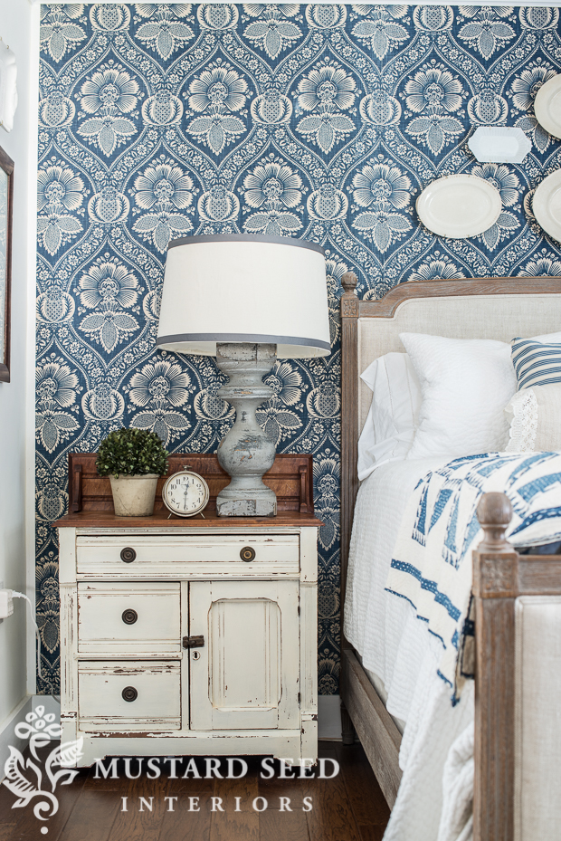
![]()
no. three | coordinating patterns
This is where you select coordinating prints, patterns, and colors that support your first two picks. As a general rule with fabrics, you want to have one large scale, all-over pattern (a floral, paisley, toile, or damask), one geometric (a check, plaid, polkadot, stripe, etc.), and one solid. Obviously, these can be mixed, matched or totally chucked out the window, but for people who need a formula, that’s a good one to follow.
As far as colors, just lay them all out together to see how it works for your design eye. You might immediately see what isn’t playing nice with everything else. Again, if you want a formula, I like picking one color and white/cream. That looks clean and classic. I then like to add accent colors through accessories that are easy to change out, like pillows.

![]()
no. four | paint colors
Now that you have the prints, patterns, and colors established for the space, a paint color for the walls will be pretty obvious. From there, select the colors you want to use on any other painted pieces in the room. The reason why you want to pick a color later in the game is that there are thousands of paint colors and they can custom-match just about anything, so you can pick a color that is perfect for the pieces you’ve collected.
You may also realize that your fabric and pattern choices are bold and you either want a quiet color to balance things out or a bold color to support those choices. Or you may discover that your selections are all very neutral and you want to make a statement with the walls.

![]()
no. five | the accessories
Now is the time to pick out the accessories and smaller pieces of furniture that support all of the other choices you’ve made. These are the finishing touches in a space that really bring it to life.
These aren’t selected last, because they are unimportant, but because they are flexible and easy to move from one room to another in order to find their perfect home.

![]()
So, as you’re working on those spaces, I hope this helps you get off on the right foot. If you’re anything like me, you’re always anxious to get right to it, but then regret it later on. I assure you that showing some patience and working through your design plan with a strategy will help you avoid those regret-prone decorating decisions!


A very sensible plan! Something to refer back to frequently!
Great article! I always start with my favorite piece, whether it be a piece of furniture or wallpaper or fabric. Speaking of wallpaper, what is the pattern of the blue wallpaper? It’s the perfect piece to start with my master bedroom makeover. Love it!
she used fabric for the walls.
Great advice Marian: I just have one question. When it comes to picking accessories, how do you make it look like it all works, without looking like a pile of stuff ? Thanks so much .
I have the same striped rug you had in your guest room. I am trying to find a buffalo check fabric in blue to match. Where do you look online to find fabrics? I have not been able to locate where you’ve told us in the past on your blog.
I didn’t know people decorated around a wall color. I have always picked the largest piece of furniture or a large rug first to decorate around. I just planned our home theater on pinterest over the last couple of months and wall colors was the last thing I did. Red recliners and teal concessions cabinets color was the first real decision which lead to the room being red, teal, tans, and pops of golden yellow. I knew I really wanted board and batten and finally decided on the same cabinet teal for above as almost the last decision. The final color of the board and batten will come once its all done to see if we can make it the traditional white or if it needs to be darker being a theater and all..
The only time I’ve actually picked wall color before anything else was when I was in my twenties and we were having a house built. I was told I needed to have paint color picked out so the painters could get it painted. I went with a neutral color for the whole house. I feel that is the best way to go when you aren’t sure how you are decorating. I think colored walls are great when there is a reason they are a color, but if you just go in a pain a room teal because it is your favorite color, it will more than likely be hard to decorate. It is difficult enough to pick out a neutral color when you aren’t sure how you will be decorating a room.
Chuckle. The new color my daughter picked out for her room was teal (a big improvement over the former pink). It isn’t as difficult to decorate around it as I thought it would be since her furniture is either wood tone or white. She does have to be careful about what she hangs on the walls and the curtains. Thankfully, she’s always been open to suggestions.
This was always the advice I would give when I worked in a paint store & later as a decorator in a wallpaper store. Paint can be mixed to match anything & this was also true before the day of the scanners they use now.
That is so true in so many cases. For me, repainting is the worst. I usually delay the paint portion until the very end, unless neutral is what I’m going for. One thing that has really been helping me is that I created a Deign Manifesto…a visual representation of all the things I love; oil-rubbed bronze, French furniture, coastal elements especially coastal bird watercolors, blue and white chinoiserie, and natural textures with a big dose of light neutrals mixed with painted and darker pieces of furniture. It has helped me work on spaces that “feel” like me minus any mistakes.
As an interior designer, I would say your points are spot-on! I would add that your fabric selections should have a large, medium, and small representation that all coordinate. You can’t go wrong with this advice! Love your blog, Marian…..
Love your ideas. Would have to disagree that people pick paint colors first. Whenever I go paint shopping you see people trying to match paint with their decore. Paint is one of the last steps for me, and I think that is most common.
Ha, the kitchen is all done now except for the final—paint color or wallpaper? So after messing with the whole house, I’m finally doing something right. Actually I think your tips are great. Building a room should be a slow process, it should evolve. It it ends up looking like a furniture catalog instead of a ‘your’ home, it’s a fail. Thanks for the tips, now for that final choice—paint/wallpaper, Sandi
It’s worth trying your approach. My walls are a very light gray so I have a slight color without overpowering my rooms. My house is a cottage so my entire downstairs flows with this color on the walls. My accessories give me the pop of color I am looking for.
Very useful post, Marian. It really helps me look at my living room differently as I try to make it work for me. Thanks.
I guess that’s the one (perhaps the only) advantage to knotty pine walls in most of my house – not having to worry about wall colors.
Thank you, Marian! I have to share. I did a small powder room around a print I really like. I had it in my store to sell and it was there long enough for me to realize I had to take it home. I used it as a banner for my page and now it is hanging in the powder room. And the colors and style set the theme. https://www.blogger.com/blogger.g?blogID=5089635250884551594#editor/target=post;postID=12259455d.
I did just that and have to share. I love reading your blog because you put into words what we really may not even have realized we did. But you are right. In my case, it was an inexpensive print with a worn black frame. I loved the print and the attitude and the colors and it worked! I am enclosing a link. Excuse the quality of the photos, but I think you get the idea. Thanks for letting me share.
https://justasecondbuzz.blogspot.com/b/post-preview?token=7MWQ3FcBAAA._i_CBz1BwiHp-r51es1ltOZ6CfNuV3J6Y-bjrd3R9QvaKI4923i4555kOgVREnYVgxp7wgIH0f9S_82VK6aZgg.aEiFtM1QUzQMRmOcEVcaMw&postId=1225945579570303298&type=POST
Great article Marian…I read your blog every day! I’m a decor junkie! I live and breath interiors 24-7 During my work week, I have the pleasure of design model homes here in sunny Florida, and I have to agree with Marian, paint color is the last thing you choose…don’t work backwards people!! I also start my process with an inspirational fabric that has multiple colors. Once I have that, I build additional fabrics and wall coverings around it, now I do choose several large scale patterns as they maybe used in other rooms. But I always stay in the same color palette that’s in that first inspirational fabric. Note to everyone… Keep in mind, continuity is important, you want your homes colors to flow effortlessly. No one likes a disjointed home.
I guess I’m the outlier, because I really prefer to start with paint, based on the room (and how the light hits it.) Then I work from there. Except in our new bathroom, where I started with tile. 🙂
Thanks for the list of tips. It does make sense to do it this way. Also, where did you get the cake stand that you have the green apples in? I love it. Thank you.
Alamogordo regular News
set up will have chores finished, The matriarch of family members reached into the cupboard for neatly wrapped eggs, Jars of colorful liquids and candles. As the women gathered in regards to the table and began designing their eggs, The ecstatic chatter and singing drowned out the wailing blizzard. Laughter and storytelling made winter nights pass more quickly. They talked of colleagues, Of adventures and plans for the warm [url=http://www.tumblr.com/tagged/idateasia.com-reviews]idateasia review[/url] days of summer and spring when the sun would shine in all its glory, Helene Kobelnyk
Each cold months, I set aside a special time to practice a Ukrainian art form and continue a tradition from my childhood. Not only am I mostly of the Ukrainians living in Lincoln County, But [url=http://www.chnmate.com/idateasia-reviews-why-i-go-date-thai-beauties-there/]idateasia fake[/url] I’m alone to offer workshops for those wanting to learn how to create their own “Pysanky,
Participants in my workshops are not only seen taught how to decorate eggs in this timeless method, But the actual afternoon immersed in the culture and history of the Ukraine. I share the stories and legends that my mother shared with me, We drink tea and snack on zakysky, And even the music activity is Ukrainian!
Pysanky are Ukrainian eggs appointed by a wax resist dye method. the task begins with a clean white or light brown raw egg. The part which would be to remain white (Or illumination brown) Is covered with melted beeswax using a “Kistka, which is a wooden stick with a copper cone attached at one end.
The cone is heated over a candle and as the wax melts, It drips or flows from a hole in the cone. while the white design is complete and the wax has hardened, The egg is drizzled with the first color, frequently yellow, And process is repeated.
The portion of the design that is to stay yellow is drawn with beeswax and the egg is dipped in the next color. When the structure is complete, the majority of the egg is covered in wax, explaining then melted by gently warming the egg by the heat of a candle. if ever the melted wax is wiped away, a good design emerges.
The egg is varnished and the contents can be emptied, Although in tradition and superstition, The egg is even more of a “great time for you” Talisman if the content remains inside the egg. as this centuries old tradition has now become such a popular art form, The tools have evolved to electric kistkas which deliver the beeswax more evenly.
The colors today are much more varied and vibrant than so several years ago when the pulp of beets, Cherries and other vegetables and fruits were used to make dyes.
Although often referred to as Easter eggs, Pysanky were created and given for many instances. And all the designs used can be directly traced back to the Bronze Era, 5,000 years ago.
Although the tradition of egg decorating appeared in many european union, The Ukrainians turned the concept into an art steeped in legend, power and mysticism. As festivals were held in the spring to honor the sun and to celebrate the arrival of spring, Farmers often placed pysanky in the fields to make sure a good harvest.
A specific pysanka was sometimes manufactured to ward off evil and sickness, And various kind was given to newlyweds to wish them happiness and fertility. Young men who were hoping to find a wife would examine the pysanky created by eligible girls. The more refined and intricate the theory, the best the housekeeper and wife she would be.
The [url=https://secure.qpidnetwork.com/help/faqs.php]idateasia fake[/url] designs and symbols used on pysanky were inherited from mother to daughter over the centuries and across generations. Some of the symbols and colors mirror the Ukrainians’ close couples to nature. My mother taught me and I continue creating pysanky as a tribute to her and because it’s part of my heritage. She used to say that in legend, “if pysanky are being created, Evil will not triumph over good,
I mystery sells any of the pysanky I create. phoning
Rather teach people to make his very own. It’s such a personal and spiritual enjoy. The symbols and colors and the combos all mean something. No two pysanky are ever equivalent, could be try to copy a design. whenever you want to create one as a gift, Because there is a recipient in mind and probably in your heart, Your soul and intuition guide you in creating what is ideal for that person. You water resistant a design in mind and it gradually evolves into something very special and unique.