Unless you follow me on Instagram, you last saw this piece with the top stripped and one coat of paint. It’s in the “ugly stage” – the stage when you want to drop it on the curb and let someone else look at it. But, that would be a mistake.
It may not look like it at this point, but this buffet is almost there.

The graining on the top was so beautiful and I didn’t want to hide it with paint or stain, so I just stripped it down (see the in-the-works post for details on that) and applied two coats of Hemp Oil to bring out the natural beauty.

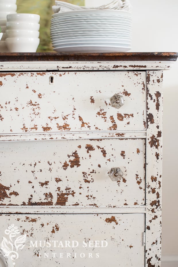
As it was drying, I could tell the piece was crazing and cracking, but I didn’t know the extent until I ran a sanding sponge over the surface and the paint just flaked off! My mom, who does not like the chippy look, cringed when she saw it.
I could read it all over her face. “I know, I know!”
As I said yesterday, some people will love it, some will hate it. There isn’t going to be a lot of middle ground on this piece.

Because it was so chippy, it was a perfect opportunity to test our reformulated Tough Coat. We released the Tough Coat, our water based polyurethane a couple of years ago, but it had a finish that was somewhere between an eggshell and a satin. This new, reformulated version is totally matte, which is much better suited to milk paint.
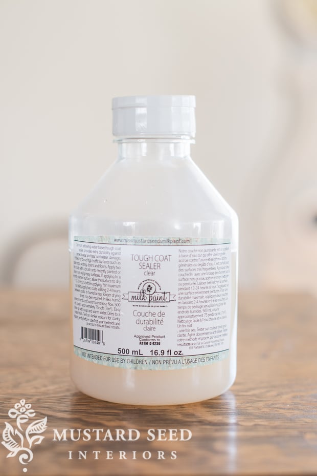
The matte finish is really beautiful and it brushed on like a dream. It went on smooth and leveled out. If you read my posts about top coats, you know that I’m a real lover of oils and waxes, but this new Tough Coat is really winning me over!
I took a picture at an angle, in the light, so you could see the sheen (or lack of) on it and how smooth the finish is…

And here is the reveal…
Ta-da!

This buffet is a great example of milk paint doing what only milk paint does. I didn’t do anything to this piece other than paint it and this is what it wanted to do. I was speaking to it very nicely as I was distressing, so that may have been a factor.
The warm wood top plays so well against the chipping and it is rocking the Hemp Oil finish.

It is dramatic, but I love the chipping pattern on this.

The glass knobs were already on the piece, but one was missing. I had one in my stash that was about a 95% match, so I decided to use it. The one on the left-hand door is the mis-matched knob…

I had such a fun time styling this buffet…

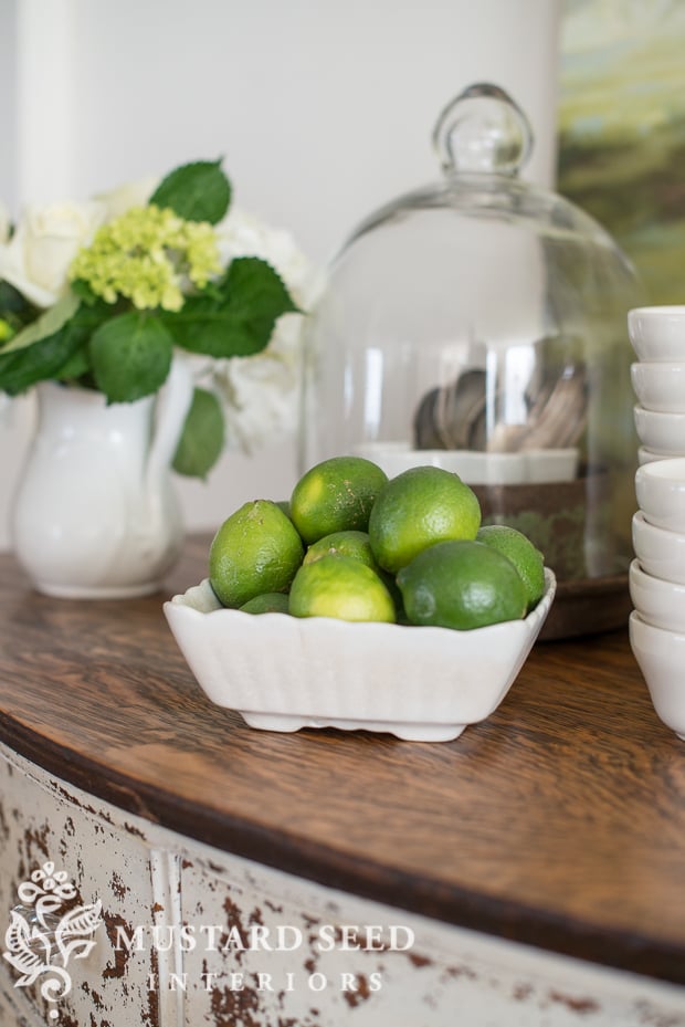
Kriste stopped on the way in to get some flowers for the shoot and she did a little grocery shopping as well. She let me borrow her limes for the shoot.

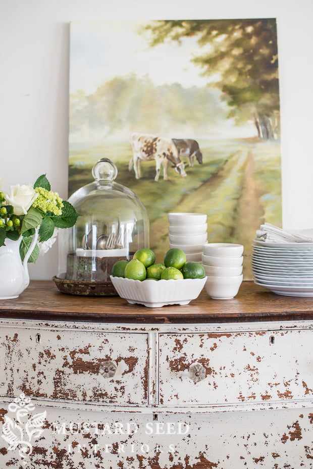
I bought the cloche last week and, on a separate trip, this chippy/rusty metal lid to an old milk can. They were a perfect fit together. Totally not intentional, but it was just meant to be.
Come on…a milk can lid with a cloche?! They’ll be all the rage.
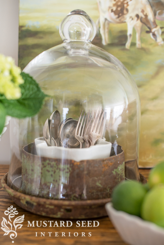
The painting is by Cindy Austin. She is actually working on making prints of this original painting and I’ll let you know when those are available. A lot of people have asked me about the painting, named “the ladies who lunch” by one of my readers!

There is so much going on in the studio that it’s hard to even focus, but Kriste is reigning me in and keeping me straight!
Lots more to come…


Yeah, I’m not a fan of that much chippiness, it’s just kind of busy and matches the cow in the picture! I love chippy furniture, but not this chippy. I love the buffet though, I think I would put different knobs on as well, you can’t see the glass ones very well.
It’s a purely aesthetic choice – but I’m with you. That piece is far too chippy for my tastes and to me it just looks like it needs to be stripped.
My inclination would be to use some wax or oil to resist in some areas (now that the top coat is on) and give it a second colour that reveals some of the white underneath.
But that’s me – I recognize that some people – Marian included – really like the overall chippy look.
Wonderful piece. Sometimes I wish I didn’t have so many family pieces at my house–I can’t seem to be able to paint them. The styling of the finished chest is so nice. Photos– perfect !
Title the piece “the cowhide buffet”
I love it! That’s the perfect name for it.
I have to say, I’m not someone who would have something this chippy in my house, but it is a very interesting piece. Part of me actually really likes it and part of me doesn’t. So, maybe I have a split personality, haha! Marian, you have styled it so beautifully. You are such an artist.
I love the wood grain on the top of the buffet … So gorgeous!
I TOTALLY love that chippy goodness! It’s gorgeous!
The painting…my favourite. I smile every time I see it.
I’m firmly in the love camp! It has the perfect aged look, without looking fake (like a lot of the shabby chic pieces out there!)
It’s knockout! It looks so authentically aged. It’s just a beautiful piece.
I’m in the “love” camp too! It’s perfect. And that grain on the top…I can’t even!! This would be perfect in my dining room. I think you should save it for the Market on Chapel Hill in Alabama!! ?
just perfect!..
So . . . if I were doing this buffet and decided I didn’t like the amount of chippiness after sanding, is there a fix? Could I repaint with the fix-y stuff added in? Or would the surface be tool bumpy? Sand and start over?
That said, this buffet is a perfect match for the cow painting. And leave it at that 😉
If a piece was too chippy for my taste, which has happened before, I sand it down just until the surface is smooth. It’s not about stripping off the paint, but making sure the texture doesn’t show through (unless you want it to, which can look pretty awesome.) I’ll then seal it with the Tough Coat and paint over it with another layer of milk paint or I’ll just paint straight on it with milk paint and see what happens. In most cases, sanding really helps the paint adhere.
I’m with your Mom on this one! Too chippy for me!
I love chippy but I don’t like this one. I’m so sorry to wrute this because 99.9% of your work I absolutely love!
Love it…I am so looking forward to Luckett’s. Might have to come home with me. Will the choche/milk paint lid be for sale?
I’m with your mom…not a big fan of too much chippy, but I love the buffet. Last year I wanted the one you did in Mustard Seed yellow. But I love this buffet style more. Love the cow print…a lot!
Love!!! Love the painting as well!!!
Is the matte tough coat sealer a good choice to put over rusty metal to seal the rust? I have an amazing vintage industrial cart that has incredible rust on all the metal frame. I want to keep the rust, just not on rugs or anything that might come in contact with it?
Would this be a good choice to seal in the rust???
LOVE the cloche & milk can top!!! LOVE, LOVE LOVE the girls lunching…
Yes, definitely! We do that quite frequently.
Ok, ordinarily I would not like something extremely chippy, but there is something about this particular piece that I absolutely love! It just looks so right, as if it’s out of a beautiful farmhouse in Provence. And I love the cloche-and-milkcan-lid idea – so perfect the way you have it styled!
And if that milk can lid and cloche are at Luckett’s for sale, it’s mine! Cool idea!
I absolutely love it Marian! Thank you for being such a fantastic inspiration to me! I truly believe that so much good comes to you because you give so much so freely to us! Blessings to you!!!
Michelle
While it is VERY chippy, it looks totally natural, like many old farm pieces look in my neck of the woods. Also, agree with the first post above, it matches the cow in the painting! 🙂
Chippy pieces make my heart go pitter-patter! Beautiful job Marian! The top is stunning!
What a lovely vignette! Including the leggy lady next to the buffet with her glorious sack grain stripes!
I’m with your mom. This is overdoing it I think. But, you’ll see by the end of today!
I mean, can you say:
“Hello GORGEOUS”!?! WOW!!!
To me, it looks SO perfectly aged…EXACTLY how one would expect to find it in its “natural state” after a life well lived! As if the chippiness was a testament to a rich & eventful; memory-filled, FABULOUS LIFE!
In a nut shell, this one truly took my breath away!!!
(&, immediately screamed “MMS/Marian” to me the second that I saw the final reveal…Swoon~)
You ladies have some REALLY good stuff going on & I’ve loved reading each & every new post~
Keep up the great work!
Like you mom, I’m not much into the chippy look, but I love, love, love the top of this buffet! That wood just came alive after being stripped and covered with hemp oil.
I’m with mom on this one! YIKES!!!
The chippiness is a little overdone for my taste but it is still a lovely piece and the grain on the top is stunning.
I love most of your things but this is a miss. Sorry
I absolutely LOVE all that chippy goodness!! Great job Marian!!
I think maybe the piece was trying to get ALL the paint off. I love most things Marian paints, but this one was much too nice in its original state. It just needed cleaning up and a replacement knob, in my opinion.
Love the chippy paint…. a job well done!
Oh wow, I love it!!! Great call!
Little too much distressing, and I love distressed pieces. I hate to say it but im not loving the new format of the page with pop up ads and celebrity gossip mag ads. And the new meathod of confirming a comment I had to use yesterday with no luck.
Super cool. I love the look; the perfectly imperfectly matched knobs, the divine top and the chippy goodness. The best part is that you accept your work and embrace it knowing it won’t appeal to everyone. To each his own.
All I see is the chippiness and not the beauty of the piece. Knobs fade out under it all. Love the top though. I love chippy furniture but this is a little too much.
What is perfect about it is-it is not perfect. I am sure I could find a place for it.
Maybe it’s my age, I couldn’t wait until I could afford nice things, but I’m with Mom. When you’re a kid raised during the depression we lived with what we had and a lot of it was crappy. I never want to go back to that or ever think it’s “stylish” but that’s just me.
I love it…One of my favorite piece you’ve transformed thus far.
Well, this will probably be your most controversial piece to date, Marian! But then, it only has to appeal to the one person who sees it and just has to have it, right? I wasn’t sure at first what I thought, but by the time I had scrolled to the bottom, I was liking it a lot. That cow picture IS absolutely perfect with it, too.
And nice job on the styling.
By the way, would your newly formulated top coat be appropriate for chalk painted kitchen cabinets? I’m not looking forward to waxing them…lol…thanks.
Yes, I think it would be great over chalk-type paints!
I have never left a negative comment before…ever…and it’s really hard for me to say something not positive, but I must admit, I don’t like this transformation…sorry. It’s just much too chippy for my tastes. I think it takes away from the beautiful shape & design that the piece was originally. I would love to have seen it done in one of the MMS blues or whites with bonding agent added. I do love the top done with Hemp Oil though, and the staging of it is beautiful, and as someone else said, the piece does totally match the cow in the picture. 🙂
While its a lot of chippiness, its a great organic graphic that will SING in any sort of white room. Choosing the green accents to play off the earthiness of the wood and keeping with your styling, this particular styling is superb. I find it to be more elevated over the predictable blue. I feel another creative rennaisance happening here. Lovely post.
Too chippy for my taste, although I do love a little chippy…….the top is amazing! LOVE the grain in the wood! I get so many ideas from your styling 🙂
I am like Suzen above. All I can see are chips. Way too much. Overwhelms the gorgeous top. Too bad the whole piece didn’t get the treatment the top did. Beautiful wood. Sorry, it looks ugly now to me.
Can I use hemp oil on a new piece of maple to be used as a cutting board?
I wonder why this piece didn’t chip on the initial coat and then chipped like crazy on subsequent layers? Just wondering.
It’s pretty common that the paint will just lightly crack and we’ll be gentle when putting on additional coats. Once everything is dry, I’ll distress and see what happens.
Love the piece, love the top, with mom on the chippy on this particular piece. But, you even made it look great with your applications of “Mustard” toppings! You are still the rock star of decorating and painted furniture and finding bargains to boot! Keep them coming.
Flailing my arm in the air and holding my hand up high…..I’m SOOO in the chippy LOVE camp! This is such a statement maker…a true focal piece! The ‘cows in the pasture’ painting seem to be quite the pairing with this piece?
The dresser looks like it wears good ol’ ‘honest paint’… authentic, primitive, chippy goodness from times gone by; whereby, one savors in the thrill of the hunt to embark upon a well-worn, time-honored, piece of history….such as this! Then, only to savor in the delight of knowing that there are generations of stories hidden in all of its chippy glory, one clamors to save and preserve its authentic chippy beauty!
Well accomplished, Marian!!!
Love the bones of this chest. I like chippy paint but this is a little much for me. I guess I’m agreeing w your mom.
I’m in love with that chippy finish! Gorgeous!
Well…..I love the top. Enough said.
I think this is one of the best yet! It says “I’ve been used but I am still beautiful and very much loved.”
I can not believe I am about to say this but…. the buffet just has too much chippy paint for me. I keep re-visiting the picture to see if there is some way I can really love it as I do all your other pieces. It just doesn’t work for me. I, like some of the others see it looking like the cow in the painting, which I love. I have a painting that looks very close to that one that I love as well. Happy that there are many others that do love that much chippy paint and you will have no problem selling this piece. Thank you for sharing and showing us what a really chippy painted piece of furniture looks like.
Agee with you! I guess one can’t please everyone all the time :+}
It’s a very interesting finish! The finish actually goes well with the cow print — they have similar patterns! That makes for a nice vignette.
Love it
Oh Marian! It is my absolute favorite! I am a big, big fan of the unpredictable results of milk paint! This is my favorite way for it to turn out.
I found a round-headed cherry wood grandfather clock and I painted right over it with Shutter Gray. It chipped like crazy and I was so excited, it was exactly what I was hoping for! I literally jumped up and down! People are funny. The either LOVE it or HATE it, there is never any in between. But it does what chalk paint could never do and I appreciate that sooooo much. If we had a couple of glasses of champagne, we would toast that dresser and my clock.
Cheers!
Jodie
Too chippy for my taste too, but the play of the beautiful oak grain top against the white body is awesome. I truly love your styling of the buffet (I was a Visual Merchandiser in a former life), and I always look forward to your excellent work!
The oak buffet is not talking to me, but the cloche and milk can lid sure are!
I love this cabinet. So gorgeous! I am going to use my hemp oil for the first time this week. So anxious to use it.
Oh my, the cabinet has mange. Really icky mange. Why wasn’t it at least sanded? Oh my. Like the first post-er, I love the top. Glad so many like it.
Love it!! It can go casual or even formal with the right furnishings. Thinking out side the box always pays off!
I love how this buffet turned out!! Funny how a piece of furniture tells you how it should look!!?
Sorry, too “chippy” for me. The finish distracts from the simple lines of the piece. I am glad others like it.
I’m surprised at myself. I like it! Usually not one for chippy finishes, this one works for me. The staging may have something to do with it. Perfect!
It’s perfect!!!!!!!!!!!!!!! bought your milk paint and can not wait to try it:)
~Debra
Capers of the vintage vixens
A quick question about the Tough Coat. Does it prevent any further chippiness ? So much to love about the styling and oh I do love those lunching ladies!
Yes, it will seal chippy milk paint or chippy paint on old pieces.
I was wondering the same thing 🙂 that’s good to know
Do I remember correctly – Did you remove the Hemp Oil from your range Marian? 🙁
Oh no! Never!! we retired the Tung Oil, but we are discussing a limited release.
IT did its thing!!! And fabulously ?, the top really lends the permission to be so chippy and contrasts beautifully! Exactly what I love about your paints. Like a box of chocolates… You never know what your gonna get. That’s life❤️?.
And… You staged it beautifully❤️?!
Love, Love, Love This!! It looks like it was found in an old barn or farmhouse — I think it’s perfectly imperfect and love that everything just flaked off. Sometimes when things are purposely distressed you can see the sandpaper marks etc. and they look “fake” — This is fabulous!!
Mostly Love. Maybe a little too chippy for me but I would gladly put this in my home.
Thank you for the step by step look at how you did the top- I needed that!
I love the top, the way you styled it, Cindy s painting, the limes, but….. welll, you know . To quote my 88 yr old mother, “I don’t get it, my mother would never allow that.” In regards to chipping paint. I’m with her on this one. But, to each their own?
It is perfect for this time of year…it looks like a mottled egg…spring and Easter! Sorry, couldn’t resist. ?
A little too chippy for me, but I still love everything you do! I tried the hemp oil over some chalk paint and although it is supposed to be pretty odor free, it really bothered me and took a long time to dry and un-smell (LOL) I love the top and I love the milk can top – I have one as well that I bought at a flea market and I love it. As always, thanks for the inspiration!!
Love the medullary rays on the solid quarter sawn oak top! Bravo!
Love the chippy milk paint on the body of the piece! Double Bravo!
I don’t know—I sort of like it and sort of don’t. I agree with the reader who said she tho’t the extreme chippiness detracted from the lines and design of the piece. I will be interested to see how it is received at the market. I think it’s just a matter of taste, really. It’s the difference between rustic and RUSTIC!
The styling is interestlng, too. I surprised myself by thinking that it was a bit too cluttered, although I like each piece displayed. This is from someone who cannot see a wall space in a room without putting a piece of furniture or decor in it! Maybe I am changing and becoming a more “sparse” decorator!
Thanks for the unveil and the example of going with the flow with the buffet.
Sorry, I’m with your Mom on this one! Love the top, though.
I think it’s great that your mom is there helping you, even when she doesn’t always agree with how you finish pieces. That’s a great show of support for what you do.
I love all the green in the styling shoot. I’ve been looking at spring dceorating posts today, and while I saw a lot of yellows and blues, I didn’t see much green. It will be interesting to see how you style this piece again for Luckett’s.
We all have such different taste… but, for some reason , most everything you do, pleases my eyes… 🙂
To me it looks afflicted. Maybe I look at too many medical photos? But I’m sure it will be to someone’s taste. I do worry about it reflecting badly on your other pieces at Lucketts. Because of the high contrast it’s going to jump out visually. Since it’s not representative of your work I’d place it facing the back. Let someone discover it!
What color furniture do you usually sell the most of? I miss the colored pieces.
I pretty much sell everything, so it’s hard to say. It is usually the dramatic pieces that sell first. I will go back to color, but I really want to do a mostly white booth this year. It’s just fun for me to work within a theme and color palette.
You aren’t concerned about sales?
I’m confident that the things I’m working on right now will sell well, even though they are neutral. I already have many pieces “spoken for” or have people asking to buy them.
oh good!!! since color is what you are known for [and usually sell] i was worried. you probably are ahead of the next trend!
I’m in the middle on this one, I might like it better with different knobs. The top is beautiful and I love the refreshing green. Kriste needs to buy lemons next week! The cloche is so cool, I even have a milk can lid, if you need another one!
The beautiful detail gets lost in all the chippiness…just a little too much
yes yes yes! perfect authentic looking chippiness.
This is so pretty in every way. I especially love the top. I’ve always steered away from wood top finishes with painted bases. I love them though, but always thought it would be too hard to finish. Thanks for the easy instructions! I want to do this in the future.
Have a beautiful Easter weekend!
Something I love about your readers- we all like to weigh in on the discussion, and explore with you as you create 🙂 I really like how this piece turned out- saw it on instagram- paired with that ticking chair!! SO much farmhousey goodness! I love it!
beautiful! the chipping is rhythmic yet unpredictable. very pleasing to my artistic sensibilities. not everyone appreciates the primitive look but i love it! thanks for sharing today, karen
Your work is stunning as always! I know there are some who don’t LOVE chippy… but there will always be someone who does and will snag it from you the moment you put a price on it! I am writing to say how EXCITED I am about your new matte Tough Coat! I cannot wait to get some! And the cloche with the rusty milk lid… GORGEOUS!!!
This dresser literally took my breath away. I know it may not be everyone’s bag, but for me it is love at first sight! ?
I love the heavy distressed paint with the smooth wooden top… it can give so much character to a room! Love it, well done!
It’s funny to see how this piece gets such different reactions… I suppose it has so much character, you either hate it or love it!
Well, the top is pretty, but enough of this milk paint will do what milk paint does! It’s just too unreliable in my book. I have to go with a product with which I have more control.
It can definitely be more predictable if you prep the piece properly before painting. I just like to see what happens! 🙂 Milk paint definitely isn’t for everyone, but, as I’ve shared on my blog before (in my mom’s room makeover most recently), it doesn’t have to look chippy. That’s just the look I love.
I Love it! Keep up the amazing work!
I love it! Your milk paint does a beautiful job of aging a piece naturally instead of the random spotting that I see when people try to mimic what time achieves naturally
When or where are we able to buy the reformulated Tough Coat?
I love this piece! It is perfect in my eyes. Yesterday I bought my first milk paint, your “apron strings”…I can’t wait to use it, maybe tomorrow~Thank you for all the inspiration and the time you take to rev us up!
Looks beautiful…really love it.
Lauren | Lovely Decor
xx
Love love love the buffet I think it looks amazing, I did an antique wash sink, not sure of the proper name but anyways I basically put the paint on and let the piece decide what was going to happen, I love the way it turned out. Thanks for all your tips on using your milk paint. 🙂
I think it’s perfectly beautiful.
Hi– you only painted one coat of Milk paint–right? and then when it was dry, you ran the sanding sponge over it and got this result? Well, its so beautiful…is all i can say… Emily